The toolbars
Toolbars group functions together thematically.
Summary of toolbars
All toolbars can be shown or hidden by right-clicking on the menu bar.
The icon bar Main Tools contains buttons for opening, saving and editing panel files and for starting the WinCC OA modules.
The toolbar Basic Objects is an object icon bar, which is used for creating basic graphics objects.
The toolbar Extended Objects is an object icon bar, which is used for creating extended graphics objects.
The toolbar Format Tools provides formatting functions for objects.
The toolbar View Tools is used to configure the panel window.
The toolbar Layout Tools provides layout functions.
If two toolbars are shown side by side and the GEDI window is minimized horizontally, the toolbars are rearranged automatically so that they remain visible and can be used.
Change each of the toolbars into a window that you can drag to anywhere on the screen. To do this, double-click on the icon bar.
Customize Toolbars
The individual toolbars can be arranged by you at will, i. e. you can add, remove or move actions (buttons, which release an action, or objects) of a toolbar. At your disposal are all actions, which you can see after starting the GEDI for the first time.
In order to customize the toolbars, click Toolbars in the Editmenu.
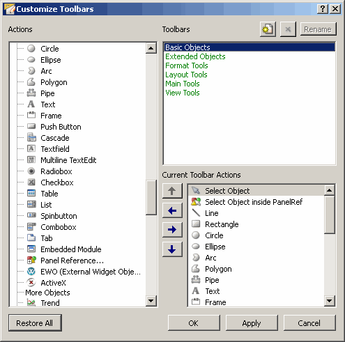
The "Customize Toolbars" window is divided into three sections, which are described in the following:
Actions
The "Actions" section is a list with all available actions, which can be added to a toolbar. The order of the actions in the list is subdivided according to the toolbars. Using the <SEPARATOR> action you can insert vertical separating lines into a toolbar, in order to group the actions of a toolbar.
Toolbars
The "Toolbars" section is a list with all predefined toolbars. Clicking here a
toolbar, its actions will be listed in the third section "Current Toolbar Actions".
With a click on the  button you can create your own toolbars. Only these one can be
removed or renamed.
button you can create your own toolbars. Only these one can be
removed or renamed.
Current Toolbar Actions
The "Current Toolbar Actions" section is a list including all the actions, which are currently in a toolbar. Into this list you are able to add actions from the "Actions" section. How to add, remove or move actions, is explained below.
Example
This is how to create a custom toolbar with individual actions
-
Click the
button in the Toolbars section. A new toolbar with the name "Custom Toolbar"
was added automatically into the list. -
Select per mouse click the added toolbar.
-
Rename the created toolbar by clicking the
 button.
 -
After creating a custom toolbar, is the list in the section Current Toolbar Actions empty.
-
Add to this list the Rectangle
 action. To
do it select from the Actions list the Rectangle action and add it
onto your custom toolbar using the
action. To
do it select from the Actions list the Rectangle action and add it
onto your custom toolbar using the  button
.
button
. -
Additionally add the actions Circle
 and Arc
Tool
and Arc
Tool into this list.
 -
Select the Circle action in the Current Toolbar Actions section and click the icon bar
 for moving this action one position upward.
 -
Select the Rectangle action in the Current Toolbar Actions section and click the icon bar
 for moving this action one position
downward.
for moving this action one position
downward. -
Select the Arc Tool action in the Current Toolbar Actions section and click the icon bar
 to remove this action from the list.
 -
Select the created custom toolbar in the Toolbars section and click the
 button to remove this toolbar.
 -
With a click on Apply and then OK the changes will be applied and the edit window closed.
The  button
restores the original toolbar settings and layout! It removes all custom toolbars,
independent of the creation time.
button
restores the original toolbar settings and layout! It removes all custom toolbars,
independent of the creation time.
The Toolbar Main Tools
The Main Tools toolbar is displayed by default. You can hide this toolbar by right-clicking on the toolbar and selecting the "Main Tools" option.
The toolbar Main Tools contains the most important standard functions that you can also find in the Panel and the Edit menu.
The buttons from left to right in the Main Tools icon bar are explained in the following table.
| Tool | Function of the buttons |
|
Opens a new panel |
|
Opens a panel |
|
Saves the panel. A new panel can be saved as a .pnl or a .xml file. You can select the file format from the file dialog. The default format is .pnl. The .pnl format is automatically preselected. The default format can be changed by using the config entry defaultPanelFormat. If the config entry is used, the specified format is preselected in the file dialog. You can use any file extension when saving a panel. If you do not define an extension, the extension .xml or .pnl is appended depending on the chosen panel format. |
|
Saves the panel and runs it in the VISION module |
|
Runs the VISION module |
|
Runs the PARA module |
|
Opens the System management panel |
|
Opens the topology configuration panel (see Panel topology) |
|
Cuts, copies, pastes objects |
|
Copy Format. The format of a selected graphics object (master object) will be copied onto one or several afterwards selected objects. Select the master object clicking the left mouse button. Select afterwards by using the combination Ctrl key + left mouse-click any objects, which shall adopt the attributes of the master object. The following attributes will be copied: Foreground Color, Background Color, Hover Foreground Color, Hover Background Color, Dash Back Color, Border, Filling, Line Type, Close Polygon, Text Format, text With Border, Text Margin and Text Line Distance. |
|
Reverses, repeats actions |
The toolbar Basic Objects
The tools for creating basic graphics objects are held in the Basic Objects toolbar. You can show or hide the object icon bar by right-clicking and by selecting the option "Basic Objects".

The following table lists and describes the buttons of the icon bar Basic Objects, which you can see in the figure above.
| Icon | Function |
|
Selection tool Default tool |
|
Selection tool for objects inside a reference. |
|
Line tool. See chapter Line. |
|
|
Rectangle tool. See chapter Rectangle. |
|
|
Circle tool. See chapter Arc, ellipse and circle. |
|
Ellipse tool. See chapter Arc, ellipse and circle. |
|
|
Arc tool. See chapter Arc, ellipse and circle. |
|
Polygon tool. See chapter Freehand line and polygon. |
|
Pipe tool. With a pipe you can construct pipe layouts in a 3D presentation including tee or cross connections. |
|
Text box tool. See chapter Primitive text. |
|
Frame tool. A frame is a border with a text. See chapter Frame. |
|
Button with a label or an image e.g. OPEN. See chapter Button. |
|
Cascade (multi-level menu hierarchy). See chapter Cascade. |
|
Text field. Box for input and output of texts or numbers. See chapter Text field. |
|
TextEdit is an advanced WYSIWYG viewer and editor supporting rich text formatting using HTML-style tags. It is optimized to handle large documents and to respond quickly to user input. TextEdit supports plain text and rich text and can be used as viewer (Read-Only). See chapter TextEdit. |
|
Label A Label widget to freely place and display plain text or HTML content. See chapter Label |
|
Radiobox. Radio box. List with radio-buttons. Only one option can be selected from several, for example, selecting adjustment level. See chapter Radiobox. |
|
Check box. List with check-buttons. Multiple selections are possible, for example, switching on three pumps. See chapter Check box. |
|
Table Table is an output format for numbers and texts in list form, for example, for system warnings or status messages. See chapter Table. |
|
Selection list with a few pre-defined values. Only one selection can be made. See chapter Selection list. |
|
Spin button. Spin buttons are list boxes containing two arrows on the right side for selecting values. The window displays only one list option at the time. See chapter Spin button. |
|
Combo box. Combo boxes are list windows containing an arrow on the right side and displaying only one selected option from a list. See chapter Combobox. |
|
Tab. Tabs are used to display detailed information clearly. Instead of individual panels, the panels are managed and displayed using index tabs. These allow several panels to be shown as a stack. See chapter Tab. |
|
Embedded module. An embedded module is a module embedded into a panel to display further panels within this module. See chapter Embedded module. |

|
Splitter object that can be used to display multiple resizeable modules next to each other. |
|
Inserts panel reference. See chapter Panel reference. |
|
An EWO (External Widget Object) is a graphical object (a Widget) created by some external party (customer) and that can be embedded into any WinCC OA Panel. It is platform independent. See chapter EWO (External Widget Object). |

|
Horizontal spacer to enable specific spaces between objects. See chapter Layout management. |

|
Vertical spacer to enable specific spaces between objects. See chapter Layout management. |
The Object menu provides the same tools in menu form. The menu is shown in The menu bar chapter, in The Object menu section.
Three chapters are dedicated to the graphics tools:
The toolbar Extended Objects
The tools for creating extended graphics objects are held in the Extended Objects icon bar. You can show or hide the object icon bar by right-clicking and by selecting the option "Extended Objects".

The following table lists and describes the buttons of the icon bar Extended Objects, which you can see in the figure above.
| Icon | Function |
|
Trend. Display of a series of values as trend curves. See chapter Trend |
|
Bar trend. Display of series of numbers as bar trend diagram. See chapter Bar trend. |
|
Clock. See Clock. |
|
Slider. The slider provides a vertical or horizontal lever. Slider is used for adjusting a bounded value. See chapter Slider. |
|
A thumb wheel is a wheel that can be moved between the start and end value. It is an alternative presentation of a slider. See chapter Thumb wheel. |
|
The Progress Bar widget is a horizontal progress bar. It is used to give users an indication of the progress of an operation. See chapter Progress bar. |
|
The LCD number displays a number as LCD-type figures. Decimal, hexadecimal, octal and binary numbers can be displayed. Numbers in almost any size can be displayed. See chapter LCD Number. |
|
Data point tree. Shows the data point types and data points in a tree view. See chapter DpTreeView. |
|
A data point type from a DPTreeView can be added (dragged) to the DPTypeView. See chapter DpTypeView. |
|
Tree widget is a tree view that can display and control items and provides the possibility to add new items at any time. See chapter Tree widget. |
|
With zoom navigator you can zoom modules. See chapter Zoom Navigator. |
|
With the script editor you can write or edit scripts and libraries. See chapter Script Editor. |
|
The Calendar Widget (graphics object) is a calendar, which is based on a monthly view and allows the selection of a specific date. See chapter Calendar. |
The toolbar Format Tools
The Format Tools toolbar provides formatting tools for objects (formatting text characters, changing foreground and background colors, line width etc.)
The functions of the Format Tools can only be used for new objects. This means that you can create a text with border by selecting the text with border option and then writing the text. You cannot create a border for the text afterwards using the format tools.
| Icon | Function |
|
Set the foreground color of an object. |
|
Se the background color of an object. |
|
Set the line width and style. |
|
Set the fill type (outline, solid, pattern, hatch). |
|
Font style, font size, bold, Italic. |
|
Text with border. |
|
Left-aligned, centered, right-aligned. |
|
Closed polygon |
The toolbar View Tools
From the View Tools icon bar you can set the view of the Panel Window. (set different layers, change the language, enable/disable grid points.
Note that reconfigured object references might be displaced when you zoom in!

| Icon | Function of the buttons | Chapter containing detailed explanation |
|
Set a layer for a graphics object. The buttons from 1 to 8 can be used to show or hide a layer. | The Layers Sheet (Layers Editor) chapter |
|
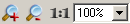
Zoom in or out 1:1 (100%) view. | The View Menu |
|
Enable/disable grid points and guidelines |
The View Menu chapter, The Panel Window chapter. |
|
Enable/disable snap points |
The View Menu chapter, The Panel Window chapter. |

|
Toggle Snap To Shape Nodes | The View Menu |

|
Toggle Line Snap To Shape Nodes | The View Menu |
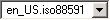
|
Displays the active language of the panel preview. You can also select another language in case of a multilingual project to check the layout o the panel in the different languages. |
The View Menu chapter, |
The selection
does NOT change the active language of the GEDI. It allows to define the preview
language of the created panels. This enables the designer or developer to check the
layout of the created panels with different language encoding.
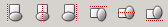
The toolbar Layout Tools
The most important layout functions can be run using the buttons in this toolbar.
The table lists the buttons in the layout toolbar as shown in the screenshot. The function is given next to the icon.

| Icon | Function |
|
Switch to move/scale mode. (you can move an object). |
|
Button for rotation using the mouse. A Snap to every 45 degrees via Shift key is now possible. If objects are rotated truncation errors might arise. |
|
Edit Points, edit contours (corner points of polygons, curves). |
|
Using this input field you can rotate objects by a numeric entry. |
|
Brings an object to front or sends it to back. |
|
Build group. Please refer to the Layout Menu for more information. |
|
Break group. Please refer to the Layout Menu for more information. |
|
Buttons for the layout management. Lay out horizontally/vertically, add or remove objects, break the layout. Please refer to Layout management for further information. |
|
Mirrors one or more objects horizontally. For further information see Layout Menu. |
|
Mirrors one or more objects vertically. For further information see Layout Menu. |
|
Align objects (left, right, horizontally centered, vertically centered, top, bottom). If several objects are selected at the same time, all objects are aligned according to the object selected first. |
The EWOs toolbar
You can add EWOs directly to a panels with this toolbar.
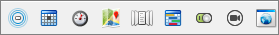
| Icon | Function |

|
Adds the AttentionEffect EWO. This EWO provides four different animations to draw the attention of a user at a given point in a panel. |

|
Adds the DateTimeEdit EWO, which is used to edit dates and times. |

|
Adds the DialGauge EWO, which is used to display measured data. |

|
Adds the GisViewer EWO. This EWO enables displaying and managing ESRI shapes files. |

|
Adds the PictureFlow EWO, which provides the animated display of pictures and panels. |

|
Adds the Scheduler EWO. The scheduler EWO is required for the functionality of the WinCC OA scheduler. |

|
Adds the ToggleSwitch EWO. The ToggleSwitch EWO is an on/off switch and its appearance can be individually changed. |

|
Adds the Video OA EWO, which is used for the display of video streams. Please refer to the video documentation for further information (<WinCC_OA_path>/Video_3.12/help/). |

|
Adds the WebView EWO. This EWO provides platform neutral displaying of web pages inside any WinCC OA panel. |
New EWOs can be added to the toolbar easily by depositing the EWO under <WinCC_OA_Proj>/bin/widgets and the appropriate icon under <WinCC_OA_Proj>/pictures/EWOs.
Please note that the name of the EWO must be the same as the name of the tool.