Check box
Check boxes are lists containing small, square buttons to the left of the options, one or more of which can be selected ("checked") simultaneously. Check boxes differ in appearance from radio boxes that have a round shape.
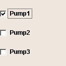
Check boxes are provided to allow selections from several pre-defined alternatives. They are used, for example, for setting data point values or triggering actions such as switching on the first and third pump of the three installed pumps.
 To create a check box
-
Click on the check box tool
 .
. -
Click in the panel work area. Define the size.
-
Open the Property Sheet
-
Edit the object name beside (Name).
-
Enter the options in the List Editor, which is opened by pressing ... .
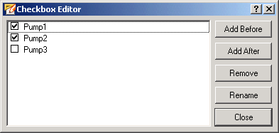
Clicking on the Add After button inserts the new option after the option selected in the editor. Clicking on the Add Before button inserts the new option in front of the option selected in the editor. Click on Rename for renaming an option. Clicking on the Remove button deletes the selected option.
If you have made the check box too wide or too narrow for the options, you can change the width of the box afterwards by selecting the box and dragging the corresponding boundary marking with the mouse.
-
In the property sheet you can assign the hotkey for keyboard selection of the check box. You can specify the text format in the Property Sheet (Font).
A double-click on the checkbox in the panel during engineering opens the Checkbox Editor.
A check box can be displayed vertically or horizontally by setting the "vertical" property in the property sheet.
Example
Different actions can be started depending on the position or status of the check box. Thus the parameters "button" and "state" are passed in the main function. In the script for this example, the value of a data point will be set to 33 or 66 depending on the position and then read and output as a check. You could use a similar script to, for example, specify a valve setting with a check box for the required value.
//Function Checkbox1 Clicked()
main(int button, bool
state)
{
  float x;
  string dp;
  DebugN(button);
  if ( button == 0 )
  {
    dpSet("System1:ExampleDP_Arg1.:_original.._value", 33);
    dpGet("System1:ExampleDP_Arg1.:_original.._value", x);
    DebugN("check box 1" + "State: " + state + "Online value " + x);
  }
  if ( button == 1 )
  {
    dpSet("System1:ExampleDP_Arg1.:_original.._value", 66);
    dpGet("System1:ExampleDP_Arg1.:_original.._value", x);
    DebugN("check box 2" + "State: " + state + "Online value " + x);
  }
}
On the "Standard" tab specify the attributes of the check box like color. (see also the check box functions Control/Control Graphics/check box functions).