Button
A button is a rectangular surface that can be operated by clicking on it with the mouse. A button can include a text or an icon. Buttons do not remain pushed in after clicking but return to their original position.
Buttons as graphic elements of WinCC OA are provided, for instance, for sending data points, and thus messages or for triggering actions. Scripts can be triggered when a button is either pressed or released. You can also operate buttons through the keyboard using hotkeys (see keyboard operation and Property Sheet). The minimum size for a button must be 4x4 pixels, in this case the focus is invisible.
If the focus of a push button is not visible (inexistent dotted border), you have to activate this function in the Windows display properties. Remove the tick in the checkbox under Display Properties -> Appearance -> Effects -> "Hide underlined letters for keyboard navigation".
 creating a button
- Click on the button tool
 .
. - Click in the panel. Define the size of the button.
- Open the Property Sheet
- Edit the object name beside (Name).
- Assign a label or an image.
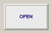
The label is entered in the Property Sheet in the field next to Button label. The text formatting can be edited in the Property Sheet.
A double-click on the button in the panel during engineering opens the Clicked script.
If the attribute isToggle (in the property sheet) for a button has been set to TRUE, the button will remain pressed although you have (physically) released it. If you want to open a button that is already ON (pressed), use the function "toggleState".
No automatic line breaks are inserted if a stylesheet is used. You can add a line break to a button text using \n, for example, PUSH_BUTTON1.text = "This\nis\na\ntest";
To edit and handle the image, press the ... button of the button label property. The PushButton Settings window will be opened.
The image can be edited using "Edit image with image editor" button.
The animation of an animated gif picture can not be displayed when defined for a button.
Stylesheets must no be used if an image is defined as button label.
Use the Hotkey dialog to specify the hotkey for keyboard operation.
The option "shared" is used to share images from the installation directory. This means that the images are not saved separately in your project. If the option "shared" is deselected, an image from the installation directory is saved separately in the project directory images.
For information about button functions see Control Graphics/ Button functions.
Windows Theme Influence on Buttons
Due to the influence of the Windows style settings for current Windows themes the background color of buttons is not displayed correctly as it is overwritten by Windows. To prevent this issue either a different UI style can be selected by using the -style parameter or the background color can be set using Style Sheets.