Table
Tables are rectangular areas divided into a specific number of rows and columns. It is possible to configure the arrangements for individual columns and rows and to hide columns. A table can contain more rows and columns than can be displayed at any one time for the selected element size. Hidden areas can be displayed using the scrollbars. If the entire content of a column is not visible, the column must be widened to show all its contents. This is done by clicking on the right-hand column boundary and then dragging this towards the right. In a similar way, the width of columns can be reduced. Alternatively, for widening a cell, its content can be displayed in a tooltip by moving the mouse over the cell of interest.
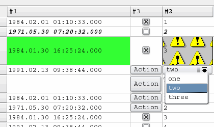
C licking on a column header sorts the rows in the table according to the entries in the column thus selected. The row with the lowest values is placed at the top of the list. Texts ("strings") are sorted by ASCII code meaning that all upper-case letters are placed in alphabetical order before lower-case letters equally sorted in alphabetical order. Clicking again on the column header sorts the column content in ascending order (highest value at the top of the list).
Tables, as graphic elements of WinCC OA, are used for displaying numerical values and texts in list form. Tables are used in alarm screens to show system warnings and general system status information in a standardized format. Tables can also be used for setting data points or triggering actions. An example of this would be the acknowledgement of an alarm that has been displayed in a table.
When using true colors, you can only work with blinking cell colors. An animated background color for the entire table is not possible.
To create a table
- Click on the table tool
 .
. - Click in the panel work area. Define the size.
- The Table Editor opens.
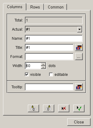
- Number indicates how many columns there are in the table. The first column is created automatically. Enter the following data for the first column:
- Actual: The name of the currently selected column is displayed here.
- Name: You can enter a column name here. Clicking on the button below on the right (green symbol) confirms this as the current name.
- Title: Heading of the column that will be shown in the panel (supports multilingual texts).
- Format: the selected text format for the specific column. The button with the "..." label opens the format selector. For information about the composition of the format string see Format string .
When formatting the table by using HTML it is to consider that only a subset of HTML tags is available, see:http://doc.qt.io/qt-5/richtext-html-subset.html.
- Width: Here you can specify the column width in number of dots.
- visible: The column visibility of column.
- editable: Makes the column to editable.
- Tooltip: The tooltip text. For multilingual projects you separately define the text for each language (see also "columnToolTipText" and "namedColumnToolTipText").
In order to be able to edit a table, you have to add rows with the function "appendLine" or the function "appendLines".
The buttons with the icons are used for inserting a new column before or behind the selected column, deleting or creating items.
- Click on the lower left button (button with the arrow symbol) to specify the next column.
- Open the Rows tab
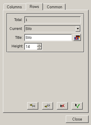
Headers or rows in "pnl" panels are only shown if the column also contains rows added using a script. If you just define headers or rows in the GEDI but do not add any rows with a script (for example, appendLine), the headers or rows will only be shown at runtime in "xml" panels. Also, if you use the function deleteAllLines, all rows including headers will be deleted. When you add rows afterwards, default header texts will be shown and not the texts specified in GEDI.
- Enter values as described above. Specify the height of the rows. This can also be entered generally, even if no row is available or has been selected.
- Open the Common tab.
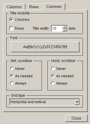
- Title visible: specifies whether the row or column title should be displayed or not
- Title width: defines the width of the row header
- Font: specifies the font of the table
- Vert: scrollbar / Horiz. scrollbar: defines when and whether a scrollbar is created.
- Grid type: Combo box from which you can select whether a grid should be used for the cells. You can select one of the following options: "None" (No grid), "Vertical", "Horizontal" and "Horizontal and Vertical".
- Select the desired options.
- Click on Close.
If you want to change a table, click on the ... button of the property sheet.
A double-click on the table in the panel during engineering opens the Table Editor.
Sort
Clicking on the column title of a table, open at runtime in the VISION module, results in sorting the table in a particular order (top down or bottom-up). During sorting of the table, an arrow will be generated underneath the column title that displays the sorted column and order.
Example
The following example of a script creates rows. The "appendLines" attribute will be used for adding rows to a table (you can also use it as follows: objectName.appendLines();). A new table does not contain any cells and these must be created explicitly by adding rows in the following way:
main()
{
setValue("","appendLines", 6 );
}
Example
In the following example, the graphics attributes appendLine, updateLine, appendLines, updateLines, cellValue can also set any_type variables per cell. The variables can contain the following three elements (elements 2 and 3 are optional. A variable must not contain more than three elements):
- Value of a cell
- Background color of a cell
- Foreground color of a cell
Thus, value, foreground and background color of a table (column1 = first column, column2 = second column) can be set simultaneously.
main()
{
  dyn_anytype x,y;
  x[1]="abcd";
  x[2]="[100,0,0]";
  x[3]="_3DFace";
  y[1]="test";
  y[2]="[0,100,0]";
  y[3]="_3DText";
  setValue("TABLE2","updateLine",1,"Column1",x,"Column2",y);
}
The following script deletes a selected row. The specific attributes are "currentCell" and "deleteLineN". The first attribute contains two parameters of type int. The first parameter is used to query or set the number of the row and the second to query the number of the column. The attribute "deleteLineN" contains a parameter of type int. This parameter specifies the number of the row that should be deleted.
main()
{
  int row, column;
  getValue("", "currentCell", row, column);
  setValue("", "deleteLineN", row);
}
Example
The following script processes the user input in the work function. The parameters contain the row number as an integer, the column name as well as the keyboard entry of the user as string variables. If the content of the cell should not be a string, it can be changed using sscanf(). In this example, an integer value should be entered. This means a value without decimals. If the content could not be changed, an "Error" will be shown. The user input will be saved in the column with "cellValueRC". This attribute contains a parameter of type int that contains the row number as well as a parameter of type string that contains the column header of the cell. The content of the cell will be passed using the third parameter. In the work function, the value that has been entered by the user, will be added together with the value 3 and will be written to the table.
main(int rowN, string columnN, string input)
{
   int ok, val;
   ok = sscanf(input, "%d", val);
   if(ok == 1)
   {
     int h = work(val);
     setValue("TABLE2", "cellValueRC", rowN, columnN,h);
   }
else
   setValue("TABLE2","cellValueRC",rowN,columnN,"Error!");
}
int work(int val)
{
  val = val + 3;
  return val;
}
Example
In the following example rows are assigned to four valves. The script shows the valve flow rate in a column. The function dpConnect() calls the function showRate() whenever one of the data point variables "VD01.flowrate" to "VD04.flowrate" change. The showRate() function sets the values of the column "Flow rate" to the online values.
main()
{
dpConnect("showRate","VD01.flowrate:_online.._value",

       "VD02.flowrate:_online.._value",
       "VD03.flowrate:_online.._value",
       "VD04.flowrate:_online.._value");
/* note that the dpConnect function has to be written on one line */
}
showRate(string dp1, int fl1, string dp2, int fl2,string dp3, int fl3, string dp4, int fl4)
{
   setValue("", "updateLine", 1, "Valve", "VD01","flow rate", fl1);
   setValue("", "updateLine", 1, "Valve", "VD02","flow rate", fl2);
   setValue("", "updateLine", 1, "Valve", "VD03","flow rate", fl3);
   setValue("", "updateLine", 1, "Valve", "VD04","flow rate", fl4);
   setValue("", "updateLine", 1, "Valve", "total","flow rate", fl1+fl2+fl3+fl4);
  /* note that the showRate function has to be written on one line */
}
Example
You can find out what row and column of a table has been clicked as follows:
main(int row, string column, string value)
{
  DebugN("Row",row,"Column",column);
}
Event special cases
When you click a not editable cell of a table, the event "Clicked" is triggered. If a cell is editable, the event "Clicked" will be triggered by pressing Enter or when changing the cell.
The event "RightMousePressed" is triggered when right-pressing on the header. The special row number "-2" is passed in this case.
For table functions see Control Graphics/Table functions.
main(int row, string column, string value, string oldValue)For more information about other events, see chapter Pmon_Consolepanel-25.dita.
HTML inside of the Table
For using HTML inside of a table cell the formatting of the cell or column must be set to HTML. This can either be done using the configuration dialog of the table or dynamically (e.g. using "cellFormatRC").
Example
Following example adds HTML elements (text + picture) to a table cell.
string picPath = "arc.png";
this.appendLine("#1", "<b><i>My Icon:</i></b> <img src='pictures:"+picPath+"'></img>");
this.cellFormatRC(0, "#1", "[h,,,ALIGNMENT_CENTER]");
It is to considered that alignment settings for HTML content must also be made within the HTML tags (=> align attribute, see example below) as settings made via Control/GEDI are not applied for the HTML content.
Example
<div>My content</div>
<table border=1 align="center">
<tbody>
<tr><td>My centered table content</td></tr>
</tbody>
</table>