Trend widget
One of the functions of the Trend diagram is to display value-over-time curves. A trend can contain an unlimited number of hierarchical curve display areas including scales and legends. Both value-over-time and value-over-value diagrams are possible. It is also possible to display a logarithmic trend, which displays the values on a logarithmic scale instead of a linear scale. Trends are provided for visualizing the changes of data point values over a specific period of time or for relating changes in different data point values to each other. Hence temperature changes can be tracked, for instance, or temperatures correlated with pressures.
Basic Configuration
If you want to create a trend element, you can either select the element by clicking in the menu or click on the Trend icon in the icon bar. The Trend Attribute Editor contains the following seven tabs:
| Tab | Purpose |
|---|---|
| Curve - Common | General settings for the trend curve, DP element, name of the curve, color, curve type. |
| Curve - Legend | Settings for displaying values in the legend, value format, displaying the value outside the trend. |
| Curve - Grid | Trend grid line settings. |
| Curve - Scale | Settings for the curve scaling. |
| Common | Settings for time range, legend and tool bar of the trend |
| Area | Here you can append additional trend areas and set the time scale. |
| Options |
On the Options tab you can make settings for time skips. |
The most important functionalities provided by a trend are:
The following example shows how to create a logarithmic trend.
How to create a trend
- Click on the trend object
 in the GEDI.
 - Click in the panel work area. Drag the frame to the required size.
- The Trend Editor opens and a child panel appears for specifying the trend type and orientation.
Figure 1. Child panel for trend type 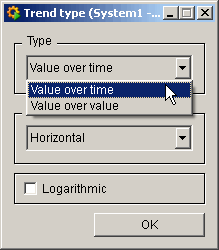
- Select the desired trend type and click on OK.
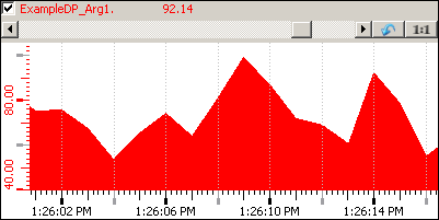
Figure 2. Example of a value over time trend 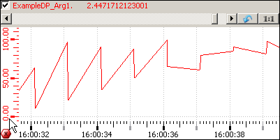
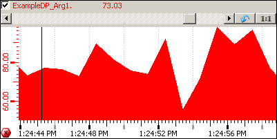
Figure 3. Example of a value over value trend 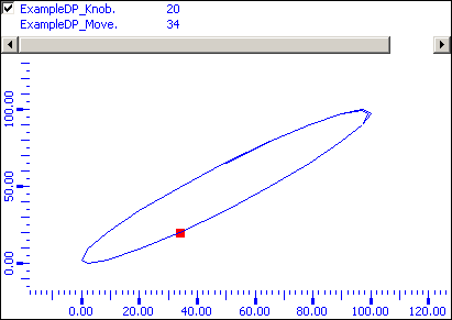 Note:Note that logarithmic scales are possible on the X and Y axis.
 - Enter a data point as the data source, e.g. ExampleDP_Trend1 or a $parameter: For the trend type value over value define two data points. You can also use a CNS name. In this case the CNS name is shown unless the DPE linked to a CNS node does not have a description.
Note:The function openTrendCurves() can now be called with a CNS name (meaning by using the "ID Path" - see chapter Editor/Node ID).
Curve Common tab
On the Common tab the properties of the curve are defined (color, style, name, connected data point element, etc.).
- Enter a curve name in the Common tab of the trend curve. It must be unique and should characterize the curve. Press the enter key to apply the curve name. The new curve name is updated in the combo box above the curve tabs after closing and reopening the trend editor.
- Enter the legend label for the curve. This is the name of the curve as it will appear in the legend of the trend.
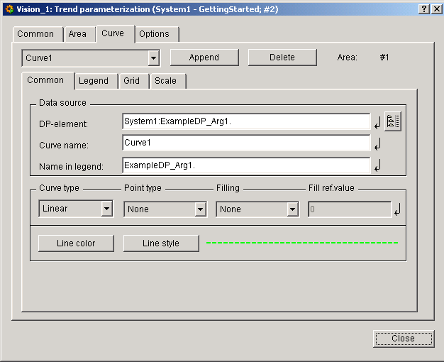
Curve type
This is where you select your curve type from a choice of Points (individual points, curveType 0), Linear (points linearly connected, curveType 2), Steps (points connected in step fashion, curveType 1) and Event (Event curve, curveType 4).
Point type
Optionally, you can select the point format for the curve type or for the minimum and maximum marking (see below). You can select one of the following types:
- Rectangle
- x
- +
- *
- O
- Triangle
- O filled
- Triangle filled
Filling
The area beneath the curve can be filled with the line color.
The fill can be related to a reference value, in this case the area between the value of the curve and the reference value is filled. This reference value can also be above the line to fill the upper part of the curve.
You can also set this by using the functions "curveFillType" and "curveFilled".
Fill ref.value
Enter here the reference value to which the curve fill relates.
Line color
Opens the color selector. Select the color for the curve in the trend.
Dynamic colors can not be displayed inside the trend widget and so they can not be used!
Line style
Opens the line style selector. You can select one of the following line styles:
___________________ [solid]_ _ _ _ _ _ _ _ _ _ _ _ [dashed]. . . . . . . . . . . . . . . . . [dotted]- . - . - . - . - . - . - . - . - [dash_dot]- .. - .. - .. - .. - .. - .. - .. [dash_dot_dot]
Specify the width of the line as well as specify how the line "Join" and line "Cap" should look like.
- Join
-
- Miter [JoinMitter]
- Round [JoinRound]
- Bevel [JoinBevel]
- Cap
-
- Flat [CapButt]
- Round [CapRound]
- Square [CapProjecting]
Buttons:
- Append
- Appends additional curves to the area. Thus, the values of another data point element can be displayed in the trend. Up to 16 curves are possible within an area.
- Delete
- Deletes the curve chosen from the combo box.
Curve Legend tab
On the Legend tab the representation of the value in the legend is defined.
- Click on the Legend tab
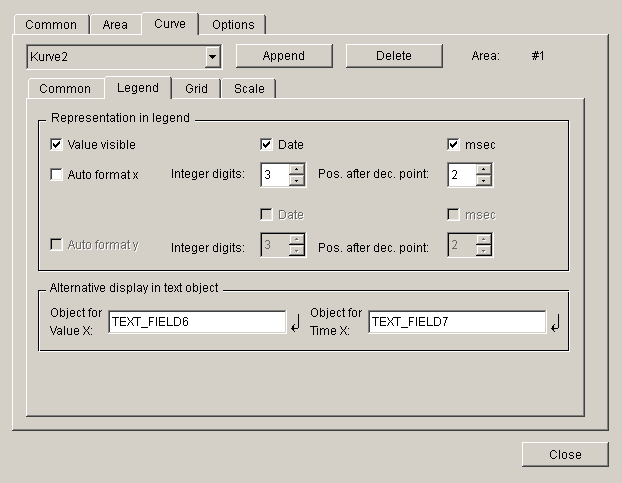
- Click on the Value visible option to display the current value of the data point element in the trend legend..
- Disable the Auto format x checkbox to define further details for the x axis in the legend (see above).
- Define the integer digits and the positions after decimal point the value can have to be displayed in the legend. Enter 3 and 3.
- Select Date and msec. This means that date and the milliseconds will be shown in the legend.
- The same applies to the Auto format y relating to the y axis if the curve type value over value was chosen.
Alternative display in text object
Provides the output of the current value and the current time / value of the curve value, e.g. in text fields outside of the trend. This option can be used instead of the legend. As the legend,Alternative display in objectalways displays the latest value.
Object for Value X
Enter here the name of the text object, in which the current value should be displayed.
Object for Value Y
Enter here the name of the text object, in which the current time / value should be displayed.
Grid tab
On the Grid tab the spacings and number of grid lines, which should be displayed above or below a specific reference point.
- Click on the Grid tab
Figure 8. Trend-Grid tab 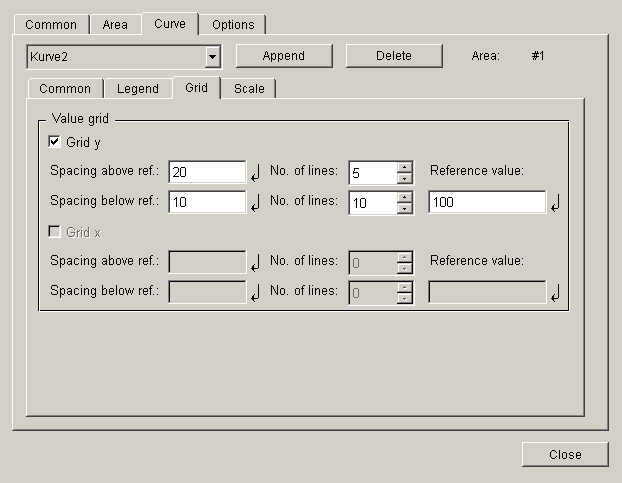
- Select Grid y.
- Enter the values to the fields as shown in the figure above.
Figure 9. Example of a trend with grid lines 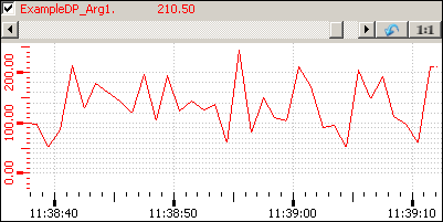
Reference value
With the aid of the reference value a line on the y axis between the above and below grid lines is defined. This means that if e.g. the reference point is 100 and 5 grid lines with a spacing of 20 were defined above the reference value, then horizontal grid lines are displayed at the values 120, 140, 160, 180 and 200 of the Y axis of the trend.
Spacing above ref.
Defines the spacing between the grid lines above the reference value.
Spacing below ref.
Defines the spacing between the grid lines below the reference value.
No. of lines
Defines the number of grid lines, which are displayed above/below the reference value in the spacings defined above.
The grid lines are connected to the X and Y axes. This means that the grid is not placed firmly on the trend window, but automatically adjusts to the zoom of the X-and Y-axis.
The Grid x is provided for the grid in the x-direction.
Curve Scale tab
On the Scale tab the representation of the scales within a trend is defined.
- Click on the Scale tab
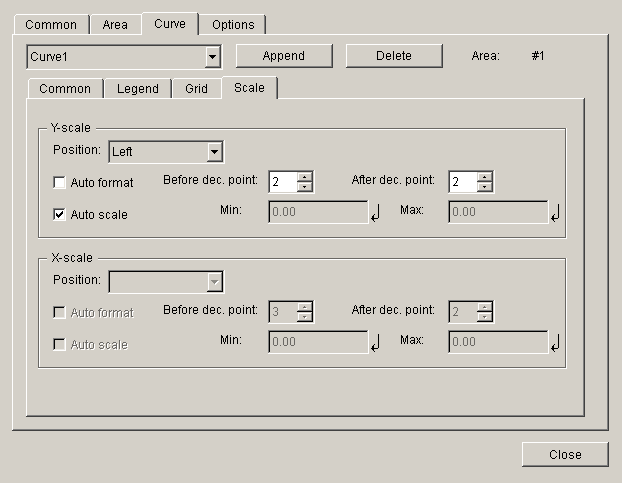
- Choose the position Left from the combo box. This means that the scale will be shown on the left side of the trend windows. The scale can also be shown either on the right side or not at all.
- Select the Auto format and Auto scale options. Auto format means that the values will be formatted automatically.
If the Auto format is not enabled for the Y-scale , it is only possible to edit position after decimal points and the format to be set has to be exponential in case of the trend type value-over-time, orientation horizontal and logarithmic. Note that the minimum and maximum values per curve have to bigger than 0 for a logarithmic trend.
Auto scale Min. Max .: here you can define the maximum and minimum values of your y-axis.
Common tab
This is where the general settings for your trend are made
- Click on the Common tab
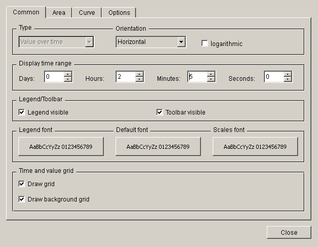
Orientation
Defines whether the curve is drawn form left to the right (Horizontal) or from the top to the bottom (Vertical).
Display time range
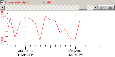
Select here the time range, which by default will be displayed on the Y axis after opening the trend. A maximum of 999 days can be displayed. Using the zoom (scroll wheel) the time range can be adjusted to own needs afterwards.
Note that if you do not want e.g. hours (days, minutes or seconds) to be displayed you have to enter a zero (not a blank) into the specific field.
Legend visible
Sets the legend defined in the Curve tab to visible or invisible.
Toolbar visible
Enables or disables the tools of the trend (zoom in X and Y direction, stop and start trend, 1:1 display, etc.).
Legend font, Default font, Scales font
Click on one of the buttons to define the font for the legend, common texts or the X and Y axes.
Time and value grid
Tick the Draw grid checkbox to display vertical grid lines in the trend (for horizontal grid lines see Grid tab of a curve). The grid lines are in the foreground of the curve, i.e. if a filling of the curve was selected (see Curve Common tab) the grid lines are shown in the foreground of the filling:
Tick the Draw background grid checkbox to display the grid lines in the background of the curve.
The grid lines are connected to the X and Y axes. This means that the grid is not placed firmly on the trend window, but automatically adjusts to the zoom of the X-and Y-axis.
Area tab
Here you can append additional trend areas and define the time scale and their formats.
- Click on the Area tab
Figure 12. Trend Area tab 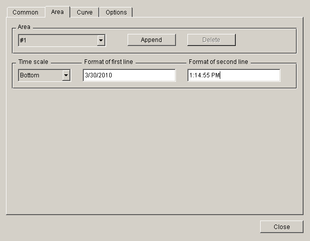
Area
You can select the areas (if more than one has been created) from the combo box.
Append
Opens a DP selector for the new area. Enter the name directly or select a data point using the DP selector button.
Delete
Use this button to delete the displayed area
Time scale
You can choose one of the three different options (None,BottomorTop) from the Time scale combo box. Bottom displays the time at the bottom of the diagram, the top option again allows you to display the time in the top of the diagram. If you do not want to display the time, choose the none option.
Format of first line / second line
The label of the time scale can be shown either in one line or on two lines. In these fields you can define the format of the labeling on each line separately.
Click in the text box to open the Time format selector.
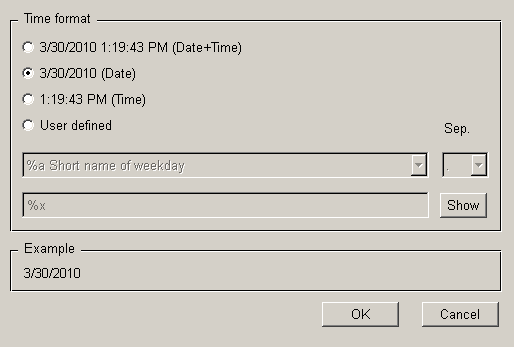
The time format selector allows you to choose different time formats: Date+Time, Date, Time or you can define the format yourself (user-defined).
If e.g. the Date format was selected for the first line and Time for the seconds line , the time scale is displayed in the trend window as follows:
Options tab
On the Options tab you can define settings for time leaps and zoom:
- Click on the Options tab
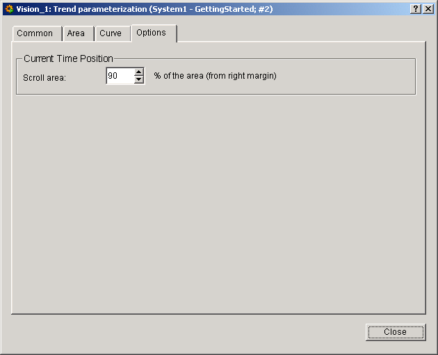
Time leap
In the "time leap" section you can specify the percentage of the curve that remains displayed when the curve start point is reset. This editor field is only available for the value-over-time format. The curve is always reset when its last point reaches the right-hand edge of the element. A leap of 99 percent, for example, results in the curve being constantly displayed. The size of the leap is selected by clicking on one of the spin button arrow heads.
- Set the Scroll area to 90.
- Click on Close.
Trend configuration is complete. Save your panel.
A double-click on the trend in the panel during engineering opens the Trend configuration panel.
Functionalities of the trend
Furthermore, the Trend widget in the GEDI provides the following features:
Ruler
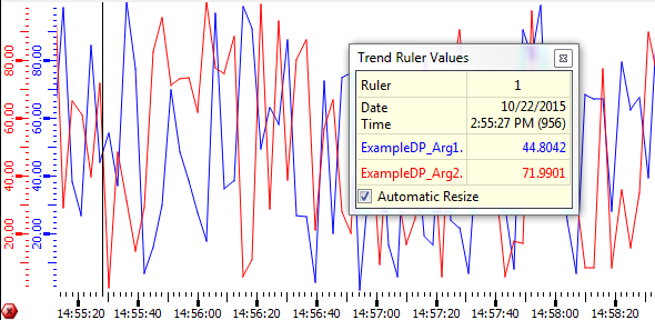
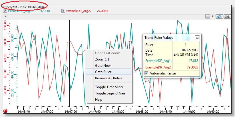
A fixed ruler you can open and close using the left mouse button. If the ruler is positioned, the automatic refresh to now-time is deactivated. The view will be frozen at the time the ruler has been set. The trend run will not be stopped, just the view will be frozen - thus zooming and other functions are allowed. If the ruler will be deactivated, the current view persists. If the update of the trend view is stopped, an icon is shown in the bottom left corner of the trend (see figure below).
In addition, a tool window with the trend ruler values pops-up. The tool window informs about the date and time of the position of the ruler as well as about the current curve values. The tool window can be moved and closed.
The tool window can be customized by adjusting the corresponding panel located under "/panels/trendRulerPanel.pnl". For more information see Trend Ruler Window Customization.
Press the left mouse button + Shift key to set a differential ruler in addition to the already set ruler (see figure above). Now the tool window shows the following data:
- Start date and time of the historical first ruler
- End date and time of the historical second ruler
- Difference between start and end
- Curve values of the ruler position and the differential ruler position
- Value difference between the curve values of both rulers
Use the "legendShowsTimeLabel" attribute to show the date and time of the ruler or the current date with now-time in the legend, when the ruler is not present in the current trend view.
Use the middle mouse-button + Ctrl key to move the ruler to another position. The ruler can be moved in the trend as long as the middle mouse-button is pressed.
The ruler can be deactivated by a mouse-click on any other position in the trend. Thereby the view will not jump to now-time, but still the view of the now deactivated ruler is shown. Use the context menu option to switch to now-time.
You can navigate the ruler using the cursor keys. To do that the ruler must be activated inside the trend (using a mouse click). Now the cursor keys can be used. Using SHIFT + Cursor Key allows to use the differential ruler and Ctrl + Cursor Key allows an increased navigation speed of the ruler.
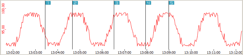
The "maxRulerCount" attribute allows you to use several rulers in a trend area. The rulers are distinguished by numbers. The values of the additional rulers will be added to the "trend ruler values" window.
The differential ruler can be displayed with the left mouse button and the shift key as usual. The difference is calculated between the first ruler and the differential ruler.
The middle mouse button can not be used in case of several rulers.
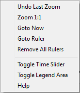
The rulers can be removed altogether with the "remove all rulers" entry in the context menu or individually by a left mouse click on the particular ruler. If you press the left mouse button, you can draw the ruler to another position. Note that by using the option "Remove All Rulers, both vertical and horizontal reference lines are removed.
Value-Axis Rulers
you can also set rulers for the value axis by clicking directly on the value axis or Shift + Click on the trend curve add a new value axis ruler. If the mouse cursor is pointed on an intersection between a value axis ruler and a curve, the next curve value to this intersection point is displayed. Clicking directly on the ruler will remove the value axis ruler. The color of the ruler matches the curve color for which the ruler has been set. The line type value axis ruler is always displayed as dotted line.
Scales
The trend has two scales - the vertical value scale of each curve and a shared horizontal time scale. The value scales are shown in the corresponding colors of the curves. Red tick marks show the beginning of a month on the time scale. Gray tick marks indicate that the whole text cannot be shown on the time scale (the text is too long/big).
Both scales can be moved by a mouse-click - hold left mouse-button pressed and move, then release. you can achieve the same effect by holding the scrolling wheel + Shift key pressed.
When scrolling the trend, the database request will be delayed by 0.5 seconds. If you continue scrolling during this timeout, the timer will be restarted. The request will be done, when no scrolling process will be performed for 0.5 seconds.
To zoom/move the time scales of several trend areas (see Area tab) collective, the function "visibleTimeRange" can be used.
To display the time scales of the trend areas shifted in time while being able to zoom/move the time scales of several trend areas. The following script can be used in the TrendScroll event:
int lastArea = -1;
main(time start, time span, int area)
{
  if ( area == lastArea )
  {
    lastArea = -1;
    return;
  }

/*Defines that as soon as the time scale of a trend area is zoomed/moved,
    the shown time difference between the two available trend areas is 7200 seconds (2h)*/

  int diff = area == 0 ? -7200 : +7200;

/*Determines the current trend area and thus the trend area whose time range will be moved by 2h*/
  int other = area == 0 ? 1 : 0;


/*The following is shown in the log viewer:
    start time, time span of the visible time range in seconds, trend area number,
     start time + difference of 2h and start time + difference of2h + time span.*/
  DebugN(start, (float)span, area, diff,(int)start + diff, (int)start + diff + (int)span );


/*The visible time range of the time scale of the current trend area is set
    - beginning with start time + difference of 2h and ending with start time + difference of 2h + time span.*/

  setValue("", "visibleTimeRange", other, (int)start + diff, (int)start + diff + (int)span);

  lastArea = other;
  time end;
  getValue("", "visibleTimeRange", other, start, end);
  DebugN(start, end);
}
Legend
The trend legend shows the names of the data point elements in the corresponding colors of the curves. Additionally, the current value/time (when the ruler is deactivated) or the ruler value/time of each curve is shown. Use the "Toggle Date-Time and Value Display" option from the legend context menu to hide the date and time display.
The shown curves can be hidden/shown in any combinations. Therefore, tick the specific checkbox of a curve in the legend or remove the tick from a combobox, respectively.
Zoom
You can zoom in a defined trend range using the mouse. Press the left mouse button, select the area you want to zoom and drag the appearing rectangle bigger or smaller in order to activate the zooming functionality. If the mouse pointer is only moved within the horizontal and vertical border, you can only zoom in one direction.
You can also zoom with the scrolling wheel whereby all curves are zoomed in both directions within the trend plotting area (value+time or x+y in case of x/y trend). On the time scale, only time will be zoomed (the time format conforms to zoom level with the precision of milliseconds). On the value scale, only the specific curve in value direction will be zoomed.
Further Functions
- Using Ctrl (key down) and left mouse button, you can drag trend curves within the trend (panning).
- If the invalid bit is set for a data point, the trend curve is shown with a pink marker and dotted line. Filled curves are shown using cross-hatch. How an invalid range will be shown will be specified by the config entries trendInvalidColor, trendInvalidLineType and trendInvalidFillType. See chapter User interface.
- Using the center button of the mouse and the CTRL key, you can select a specific time and the value including the time will be shown in the legend. The specific time and the value will also be shown in graphics objects if these are used for the alternative display of values.
- If the DIST managers in a distributed system are disconnected, in the trend legend will show the "disconnect" icon
 next to the data point name. Additionally the curve changes to dotted purple and the time of the disconnect is stamped by a purple dot.
 - When using the AutoScale function, no scaling will be performed while the Trend is stopped or when values only change outside of the visible range. If the ruler is moved from the view of past values to the current time, no automatic scaling will be performed.
If you open a trend for a value that is not archived and scroll the curve so that you cannot see the curve anymore, the values that were shown before are not shown anymore.
Translation of the right click menu of the trend
To translate the right click menu of the trend, translate the files of the UI. For more information see chapter Translation of UI Entries.
Trend Ruler Window Customization
The trend ruler windows is a customizable panel ("trendRulerPanel.pnl") which is located in the /panels directory of your WinCC OA Installation. The panel provides a predefined implementation of how to display values and react to specific events. This code needs to be adjusted or extended to match the required behavior of your project.
Using the $DP "$floating" it can be defined if the panel is opened as free floating element (=TRUE; default, including a window title bar) or as a ruler popup. This can also specified dynamically by using the "floatingRulerWindow" property of the trend. With a floating panel, the last position is saved and used as the position when the panel is opened again.
The public function "rulerChanged" of the panel can be used to react to changes (add, remove, move, etc) to the ruler and to implement the logic of the panel. Within the function the displayed content of the panel can be updated accordingly.
public rulerChanged(shape theTrend, int area) synchronized(table)The function rulerChanged is automatically triggered every 500ms, even if there were no changes to the ruler.
Note that following information is required to display the panel:
- Date / Time-stamp
- Value of the intersection point (The function "RulerValue" must be available!)
- Color and/or marker of the curve
- Event(area) description text (Must be implemented by the user!)
- Alarm description
Only one trend ruler panel (trendRulerPanel.pnl) can be defined for your project but to have different display options additional custom panels can be loaded using the addSymbol() function from within the trendRulerPanel.pnl.
Trend Ruler Icon
For displaying an icon for the ruler the trend uses the "trendRuler_X.png" pictures inside of the /pictures directory, where X represents the corresponding ruler (starting with 1).
Please note that the usage of multiple rulers must be activated using the trend property "maxRulerCount".
Event Curve
The event curve can be used to display specific events or time spans that should be clearly visible inside of the trend curves. The event curve displays the time stamp or time frame in which a specific event was triggered (e.g. changes to values, time or state). For the point in time a horizontal (or vertical for the Vertical Trend) line is displayed within the trend.
The curve type can either be set using the trend configuration panels or by using the trend property "curveType".
When using the event curve following notes should be considered:
- The event line of an event curve is drawn as a percentage of the total plot area where "min" and "max" define the starting and end percentage of the line., e.g. min = 10, max = 40 will result in an event line starting at 10% and end at 40% of the available plot area, starting from the bottom plot border.
- Multiple events can be stacked and displayed accordingly. This allows an easier distinction between overlapping time ranges.
- To display a background color for an event range the curve filling must be set, e.g. "fill to bottom" or "fill to refValue".
-
The filling of an event curve is displayed between the "on" and "off" state of a curve. The "off" value was previously defined as "0.0". This was changed to use the curve defined "ref.value" property instead. In the Trend configuration panel in the GEDI this is referred to as "fill ref.value". The default value remains "0.0", but this can be changed in the Trend configuration panel. The value is only used when the selected fill type is not "none".
CAUTION:In case another ref.value than "0.0" was previously defined, the event curve display will now look different.Basically the events should follow the order "on","off","on", etc. but it is possible to follow up on an "on" trigger with another "on" trigger. In this case the event must have a different state to mark, e.g. an invalid visualization.
An "off" trigger followed by another "off" trigger is displayed as a single line event.
An "on" event without closing "off" event is continuously drawn until the next "off" trigger occurs.
- It is recommended to disable the Y-axis of an event curve as it is not used anyway.
Event Curve using string DPEs / JSON
The event curve can also be used to display string DPEs. In this case the displayed values is determined with following behavior:
- If the string of the DPE contains a JSON format then the "value" key of the string is displayed (see JSON format below)
- If the string does not contain JSON than the value is determined as with a CTRL string: A string that contains either "0", "FALSE" or "false" is considered as FALSE, everything else is considered as TRUE.
JSON Structure
The curveValue can now also be a string attribute in JSON format. Following keys are used by the event curve:
- "value" - any datatype; A value > 0 is considered as TRUE and marks an "on" event (see description above)
- "text" - string; Text that should be displayed on the event line
-
"alignment" - string; The alignment relative to the event line for text and icon. Following alignment flags are available:
AlignLeft- Align to the left of the line-
AlignHCenter- Align to the horizontal center of the line -
AlignRight- Align to the right of the line -
AlignTop- Align to the top of the line -
AlignVCenter- Align to the vertical center of the line -
AlignBottom- Align to the bottom of the line
Horizontal and vertical flags can be combined using the | character, e.g. "AlignTop|AlignLeft".
When using a vertical trend the flags remain the same used differently, e.g. "AlignTop" is used to create an alignment to the right side or "AlignVCenter" is used to create an alignment to the horizontal center of the line.
This behavior is used to keep the compatibility of the DPE in both orientations.
-
"icon" - string; File name of the icon that should be displayed. The path must be relative to the /pictures directory.
Example
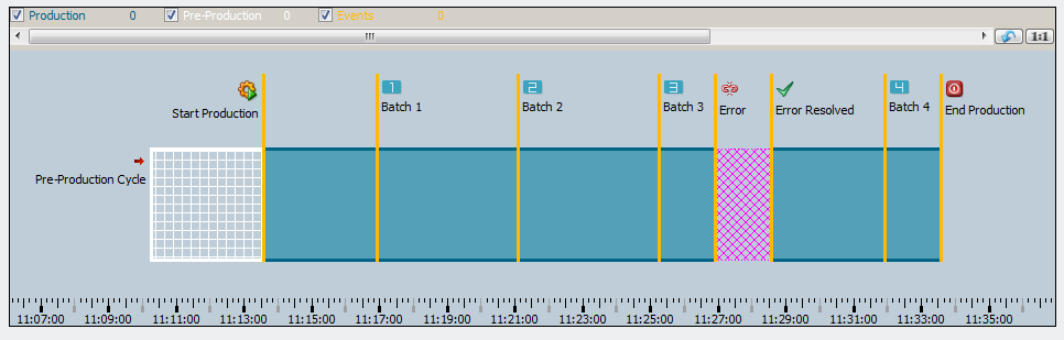
Following example code (Trend - Initialize script) fills an empty trend with multiple event curves to give a simple demonstration of a production line, see figure Trend - Event Curve Example.
Please note that for this example all default curves of the trend must be manually removed to get a similar visual representation.
// [myTrend] [1] - [Initialize]
  main()
{
  //Variable Definitions and Declarations
  time t = getCurrentTime();
  const bit64 INVALID = "1000001100000000000000000000000000000000000100000000000100100001";
  //Trend Visible Area Configuration
  this.scrollPercent(5);
  this.visibleTimeRange(0,t-1650,t+200);

  //Dynamically added the Event Curves ProductionLine, PreProduction, ProductionEvents
  this.addCurve(0,"ProductionLine");
  this.addCurve(0,"PreProduction");
  this.addCurve(0,"ProductionEvents");
  this.curveType("ProductionLine",4);
  this.curveType("PreProduction",4);
  this.curveType("ProductionEvents",4);

  this.curveLegendName("ProductionLine", "Production");
  this.curveLegendName("PreProduction", "Pre-Production");
  this.curveLegendName("ProductionEvents", "Events");

  //Display Height/Area of the Event Curves
  this.curveMin("ProductionLine",15.0);
  this.curveMax("ProductionLine",60.0);
  this.curveMin("PreProduction",15.0);
  this.curveMax("PreProduction",60.0);
  this.curveMin("ProductionEvents",15.0);
  this.curveMax("ProductionEvents",90.0);

  //Design Settings: Colors, Line Types, Fillings, etc.
  this.backCol("SiemensStone35");
  this.curveFillType("ProductionLine", "[solid]");
  this.curveFillType("PreProduction", "[hatch,[cross,10,horizontal]]");
  this.curveFillType("ProductionEvents", "[solid]");
  this.curveLineType("ProductionLine", "[solid,oneColor,JoinMiter,CapButt,3]");
  this.curveLineType("PreProduction", "[solid,oneColor,JoinMiter,CapButt,3]");
  this.curveLineType("ProductionEvents", "[solid,oneColor,JoinMiter,CapButt,3]");
  this.curveColor("ProductionLine","SiemensNaturalBlueDark");
  this.curveColor("PreProduction","SiemensSnow");
  this.curveColor("ProductionEvents","SiemensNaturalYellowLight");
  this.curveFillColor("ProductionLine", "SiemensNaturalBlueLight");
  this.curveFillColor("PreProduction", "SiemensSnow");
  this.curveFillColor("ProductionEvents", "SiemensNaturalYellowLight");

  //mandatory for displaying the Event Curves!
  this.curveFilled("ProductionLine",1);
  this.curveFilled("PreProduction",1);
  this.curveFilled("ProductionEvents",1);

  //Events in displayed order
  //Pre-Production
  this.curveValue("PreProduction", "{\"value\":1, \"text\":\"Pre-Production Cycle\",\"icon\":\"scriptWriteOnly\",
                    \"alignment\":\"AlignLeft\"}", t-1400,0);
  this.curveValue("PreProduction", "{\"value\":0}", t-1200,0);

  //End of Pre-Production and Begin of "Production"
  this.curveValue("ProductionEvents", "{\"value\":0, \"text\":\"Start Production\",\"icon\":\"vision\",
                    \"alignment\":\"AlignLeft\"}", t-1200, 0);
  this.curveValue("ProductionLine", "{\"value\":1}", t - 1200, 0);

  //Batch - Events 1-3
  this.curveValue("ProductionEvents", "{\"value\":0, \"text\":\"Batch 1\", \"icon\":\"trendRuler_1\"}",t-1000, 0);
  this.curveValue("ProductionEvents", "{\"value\":0, \"text\":\"Batch 2\", \"icon\":\"trendRuler_2\"}",t-750, 0);
  this.curveValue("ProductionEvents", "{\"value\":0, \"text\":\"Batch 3\", \"icon\":\"trendRuler_3\"}",t-500, 0);

  //Error Event
  this.curveValue("ProductionEvents", "{\"value\":0, \"text\":\"Error\", \"icon\":\"disconnected\"}",t-400, 0);
  this.curveValue("ProductionLine", 1.0, t - 400, INVALID);

//Sets the current value invalid. Design can be changed by using the Config Entry "trendStatusPattern"
  this.curveValue("ProductionEvents", "{\"value\":0, \"text\":\"Error Resolved\",\"icon\":\"apply_16\"}", t-300, 0);

  //Batch - Event 4
  this.curveValue("ProductionEvents", "{\"value\":0, \"text\":\"Batch 4\", \"icon\":\"trendRuler_4\"}",t-100, 0);
  this.curveValue("ProductionLine", "{\"value\":1}", t-300, 0);

  //End of Production Cycle
  this.curveValue("ProductionLine", "{\"value\":0}", t, 0);
  this.curveValue("ProductionEvents", "{\"value\":0, \"text\":\"End Production\",\"icon\":\"exit\"}", t, 0);
}
Viewport / Preselection Trend
For selecting and zooming into a specific time range of the trend curve a new viewport feature is available. To open the viewport the function "areaViewportTimeRange" can be used.
When using the viewport widget following notes and restrictions must be considered:
- The order of linked areas cannot be changed for the viewport widget.
- For displaying the ruler pop-up panel inside of the main area instead of inside of the viewport area the pop-up panel must be customized. The function call "setPosition(area);" must be changed to "setPosition(<main display area>);".
- The viewport area as well as the main trend area must be linked using the function "linkAreas". It is to consider that first the main trend area ID and afterwards the viewport area ID must be used: "linkAreas(<Main Area ID>, <Viewport Area ID>);"
- The design of the viewport widget can be changed using CSS. The available classes and examples can be found here, respectively here.
- Consider that extensive zooming into the trend may cause the viewport sliders to disappear as they selected time range cannot be displayed within the available amount of pixels.
- The Scrolling Mode of the ViewPort Widget can be defined with the property "areaViewportPageScrollMode".
- By using the property "areaMargins" the margin of the View Port can be changed to use a e.g. a different width compared to the trend area.
Additional Notes
Trend Grid
The Grid of the trend area can be customized to match your design requirements by using following functions:
Overlay Text
The property "areaPlotOverlayText" allows to place a custom test and content over an area of the trend. HTML can be used to place fully designed icons and captions for the area.
Configuration - Interaction Possibilities
To configure the allowed interactions with the trend elements the properties "areaInteractionFlags","areaInteractionFlags","areaPlotInteractionFlags" are available. They can be used to define wether panning, zooming or the context menu are available.
Restrictions - Displayed Area Range
To restrict the maximum displayed time span of an area the property "areaMaximumTimeSpan" can be used.
Trend display with gaps
When using RDB archiving a display gap in a trend can occur between the historical data and the current data. This gap can occur when data (couple of seconds ago) is being stored only in the local buffer of the RDB manager at the moment and is not being flushed to the Oracle database.
The trend shows values until the last data flush from WinCC OA buffer to Oracle. Current new data is received directly from the Event Manager and must not be read from the database.
The flush interval for RDB archiving can be configured. Consider that a shorter flush interval provides the advantage that the gap might be shorter but it increases the load of the RDB manager and the network traffic. The configuration for the flush interval is the maximum time the data will remain in the buffer before it is flushed.
A buffer is flushed when the defined block size or the timeout for the flush interval is reached. The block size is configured in the RDB configuration panel by using the parameter " Entries/Block". In the RDB configuration the flush interval is defined by using the parameter "Flush interval". We recommend to use a flush interval >= 1000 msec.
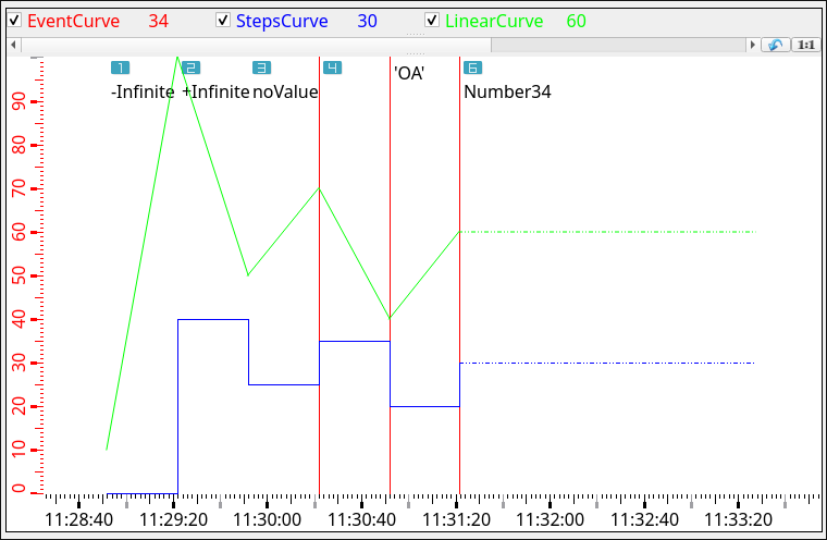
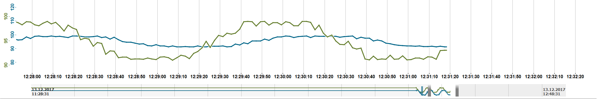
Infinite Values
inf, -inf or nan)
Event curve with infinite values and two further curves
main()
{
  time t = getCurrentTime();
  int count = 10;
  int timeStep = 30;
  bit64 status = 15;

  TREND1.curveType("#1_1", 4); // 4 = Event
  TREND1.curveLegendName("#1_1", "EventCurve");

  TREND1.addCurve(0, "#1_2");
  TREND1.curveColor("#1_2", "blue");
  TREND1.curveType("#1_2", 1); // 1 = Steps
  TREND1.curveLegendName("#1_2", "StepsCurve");
  TREND1.linkCurves("#1_2", "#1_1"); // all curves should have the same scale

  TREND1.addCurve(0, "#1_3");
  TREND1.curveColor("#1_3", "green");
  TREND1.curveType("#1_3", 2); // 2 = Linear
  TREND1.curveLegendName("#1_3", "LinearCurve");
  TREND1.linkCurves("#1_3", "#1_1"); // all curves should have the same scale

  t -= (long)(count * timeStep);

  TREND1.curveValue("#1_1", "{\"icon\": \"trendRuler_1.png\", \"text\": \"-Infinite\", \"value\": \"-inf\"}", t, status);
  TREND1.curveValue("#1_2", 5, t, status);
  TREND1.curveValue("#1_3", 10, t, status);
  t += timeStep;

  TREND1.curveValue("#1_1", "{\"icon\": \"trendRuler_2.png\", \"text\": \"+Infinite\", \"value\": \"inf\"}", t, status);
  TREND1.curveValue("#1_2", 40, t, status);
  TREND1.curveValue("#1_3", 80, t, status);
  t += timeStep;

  TREND1.curveValue("#1_1", "{\"icon\": \"trendRuler_3.png\", \"text\": \"noValue\", \"value\": \"NaN\"}", t, status);
  TREND1.curveValue("#1_2", 25, t, status);
  TREND1.curveValue("#1_3", 50, t, status);
  t += timeStep;

  TREND1.curveValue("#1_1", "{\"icon\": \"trendRuler_4.png\", \"value\": 12}", t, status);
  TREND1.curveValue("#1_2", 35, t, status);
  TREND1.curveValue("#1_3", 70, t, status);
  t += timeStep;

  TREND1.curveValue("#1_1", "{\"text\": \"'OA'\", \"value\": \"OA\"}", t, status);
  TREND1.curveValue("#1_2", 20, t, status);
  TREND1.curveValue("#1_3", 40, t, status);
  t += timeStep;

  TREND1.curveValue("#1_1", "{\"icon\": \"trendRuler_6.png\", \"text\": \"Number34\", \"value\": 34}", t, status);
  TREND1.curveValue("#1_2", 30, t, status);
  TREND1.curveValue("#1_3", 60, t, status);
  t += timeStep;
}