Layout management
Layouts change the size and position of objects according to parameters previously defined in the GEDI.
A layout arranges objects on panels which size can be altered in the best possible way and uses the available space optimally. Therefore, layouts are mainly used for child panels, configuration dialogues etc, but not for process images.
The layout changes the size and position of objects according to the given parameters which are defined in the GEDI. If a layout is defined in a panel, ALL of the panel’s objects must be managed by the layout. The size or position of an object that isn’t placed within a layout won’t be altered.
Layout types
There are four different layout types:
- vertical box (VBox)
- horizontal box (HBox)
- Grid
- Flow
Each layout generates a fixed gap between (spacing) and around (margin) the elements. Spacing and margin are both attributes of a layout group and can be modified in the GEDI. If they are not specified explicitly, their value is set by default according to the used style of the system. This means that a panel may look different on several systems with different styles during runtime. Therefore, a panel will always be integrated in the surrounding system in a perfect way. (spacing == -1 means that the spacing will be defined by the superior layout or style.)
The area of each layout is displayed by a red frame in the GEDI. In VISION the frame is invisible.
-dbg LAYOUT (see also General debug flags) it
is possible to display layout frame and spacers in the UI during runtime.Objects
Objects (e.g. shapes, panel references or shape groups) can be placed within a layout. The layout distributes the available space to the elements. With the attributes of each element some limiting factors like the minimum/maximum size or size policy can be defined for the layout.
In order to enable specific spaces between objects, there is the new “spacer” object. The attributes minimum size, maximum size and sizePolicy are also available for this object. The spacer is only displayed in the GEDI and is invisible in VISION, since it is only used for the behavior of the space.
The size of child panels that contain a layout can now be modified by the user. Moreover, panel references and object groups can be placed in layouts. These groups will be seen as units and depending on the settings, their size and position will be modified as a whole in size and position.
Hierarchy of layouts
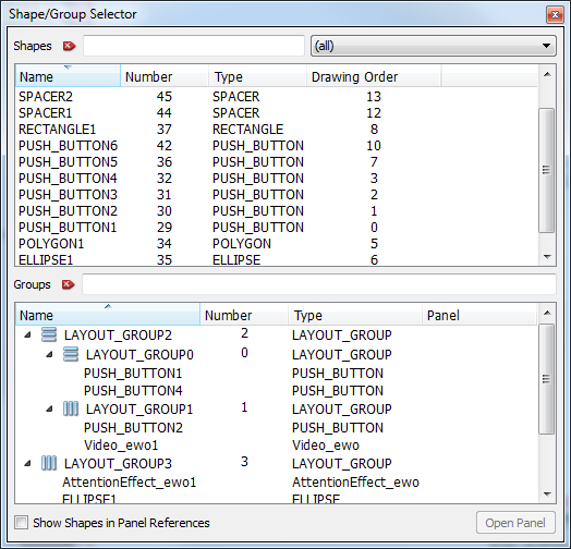
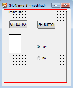
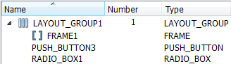
Just as a shape group, the layout groups also have a name which can be seen in the select shape/group dialog. Furthermore, the hierarchy of layouts (objects in layout, layout in layout) can be checked there.
In this dialog, a layout can be selected by clicking on it.
Activate layouts
In order to activate layouts in a panel, the layout type for the panel must be specified with the new panel attribute “layoutType” or one of the layout type buttons. As long as there is no layout defined for a panel in the GEDI (layoutType == None) the objects which are grouped in layouts won’t be modified but will remain on their place. In this state the size and position of an object can be altered as usual. The position of an object will be used for defining its order in the layout.
This size will be used as “sizeHint”. As soon as the panel layout is enabled, size and position of all objects that are within the layout will be changed according to their attributes and sizeHints.
Working with layouts
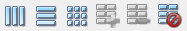
A layout can be created or edited by using the toolbar elements in the GEDI.
 forms a horizontal layout
around the selected objects or the whole panel.
forms a horizontal layout
around the selected objects or the whole panel.
 forms a vertical layout
around the selected objects or the whole panel.
forms a vertical layout
around the selected objects or the whole panel.
 forms a grid layout around the selected objects or all
objects inside of the panel.
forms a grid layout around the selected objects or all
objects inside of the panel.
 forms a flow layout
around the selected objects or all objects inside of the panel.
forms a flow layout
around the selected objects or all objects inside of the panel.
 adds a selected object to
the selected layout.
adds a selected object to
the selected layout.
 removes a selected object
from the selected layout.
removes a selected object
from the selected layout.
 breaks the selected
layout.
breaks the selected
layout.
The layout is only aid for size modification. If you want to select a layout group, a click on a shape within this group will only select the shape itself. In order to select the layout group use the Select Shape dialog or press the SHIFT button and click on any object within the group. Then you can modify the attributes of the layout group.
Select all won't select all of the shapes within the layout but all of the layout groups. Otherwise a following copy/paste action would not copy the layout groups.
Creating LAYOUTS
The following examples show how layouts can be created.
- Select the objects that the layout shall contain (CTRL+ left mouse click on the objects).
- Optional: Select the frame (or the rectangle) that shall be the layout container.
- Choose the layout type by using one of the new icons in the toolbar (Layout
vertically or Layout
horizontally).
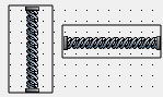
For this example, a vertical layout is selected. After clicking on the button a red frame
indicates the layout area.
Figure 4. Vertical layout in the GEDI 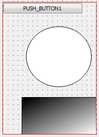
- Now define a second layout which contains 2 other objects. This time click on
the button for a
horizontal layout.
Figure 5. Vertical and horizontal layout 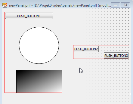
If you want to add an object to an existing layout, select the layout group (SHIFT + left mouse click on any object within the layout) and then the object which shall be added (CTRL + left mouse click). Click on the
button to add the
object to the layout.If you want to remove an object from an existing layout, select the object and click on the
button. The object is removed from the layout but still exists in the
panel. -
Since there is no layout defined for the panel, the objects won't be aligned automatically. Therefore you have to set the layout type for the whole panel. There are two different ways to do this:
-
Click on the panel background and select either the
, , or the button to
specify the layout type for the panel. - Select either HBox, VBox, Grid or Flow in the layout type attribute in the attribute editor.
-
- The layout for the panel is enabled and the whole panel is bordered with a red frame. The objects will change size and position according to the specified type.
Primitive Text IN LAYOUTS
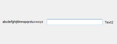
Displaying primitive texts in layouts is managed by additional attributes (see primitive text attributes). In the following example two primitive texts are used in a horizontal layout. "Text1" is changed to "abcdefghijklmnopqrstuvwxyz" at runtime.
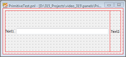
In the first figure the attribute fit size is set to TRUE. Therefore the changed text is fully displayed.
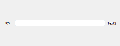
In the following figure the attribute fit size is set to FALSE and ellipsis mode is set to "ElideLeft". Therefore, a part of the text on the left side is replaced by dots.
LAYOUTS WITHIN LAYOUTS
This example shows how to use spacers and a layout within a layout.
- At first, set the layout type of the panel to NONE.
- Place new objects within the panel, select them and place a layout around them. In this example, a horizontal layout is placed around an ellipse and a rectangle.
- Insert a horizontal spacer between the ellipse and the rectangle. Set the "Horizontal Size Policy" attribute of the spacer to "Fixed".
- Add the spacer to the layout.
Figure 11. Add new objects + layout 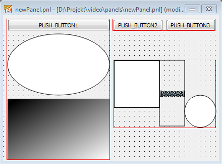
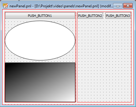
- Select the layout that contains the two push buttons (SHIFT + click on one of the buttons) and select the other layout by CTRL + SHIFT + one of the objects (e.g. the rectangle).
- Click on the button
to place a layout around the selected layouts.
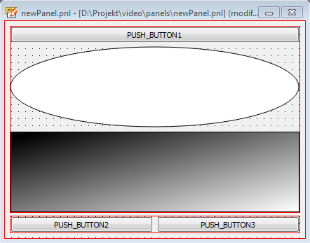
- If you set the layout type for the panel to HBox, the panel will look like this
Figure 12. Layout within layout - horizontal panel layout type 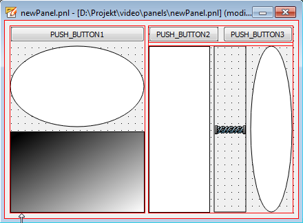
FRAME AS GROUPING LAYOUT
A frame can contain a layout. The same principle is valid for the rectangle.
- Draw a frame and place objects within it.
- Optional: Mark the frame (or rectangle) that should serve as the layout container.
- Click on the or the
button.
A layout that is defined in a frame or a rectangle will be displayed with a unique symbol in the select shape/group dialog.
Panel References as layout elements
Panel references can be used as objects inside of the layout managements. The panel reference itself can also contain one or more layouts. The layout settings inside of the reference will only be applied if the layout groups inside of the reference have been enabled. Either via GEDI or via layoutEnabled property of the panel reference.
Grid Allocation Behavior
The grid layout automatically calculates and creates the required number of columns and rows to contain the objects placed inside in the same relative position. For this following algorithm is applied:
If the horizontal or vertical edges of two ore more objects are within a range of 15 pixels the layout assumes, that these edges should be contained inside the same row respectively column. If the difference between the edges of the objects exceeds the 15 pixel range a new row respectively column is created. These empty cells are only kept if any other object spans over the corresponding row or column. Otherwise the cells are removed and the free space is redistributed to the remaining rows or columns. The same applies to completely empty rows or columns. They are also removed and redistributed.
Flow layout
The Flow layout is similar to the HBox layout. However, objects which do not fit into the available horizontal space will be put into the next line. This means that the minimum height depends on the available width.
Layout - Properties
For each object which is within a layout there are some properties that define how the objects are modified.
sizePolicy
The size policy defines how the object shall expand in the horizontal (Horizontal Size Policy Property) or vertical direction (Vertical Size Policy Property). The following values can be set for this attributes:
| Policy | Value | Description |
|---|---|---|
| Fixed | 0 | The sizeHint is: the only acceptable alternative so the object can never grow or shrink (e.g. the vertical direction of a push button) |
| Minimum | GrowFlag | The sizeHint is minimal, and sufficient. The object can be expanded, but there is no advantage to it being larger (e.g. the horizontal direction of a push button). It cannot be smaller than the size provided by sizeHint |
| Maximum | ShrinkFlag | The sizeHint is a maximum. The object can be shrunk any amount without detriment if other objects need the space. It cannot be larger than the size provided by sizeHint |
| Preferred | GrowFlag | ShrinkFlag | The sizeHint is best, but the object can be shrunk and still be useful. The object can be expanded, but there is no advantage to it being larger than sizeHint. |
| Expanding | GrowFlag | ShrinkFlag | ExpandFlag | The sizeHint is a sensible size, but the object can be shrunk and still be useful. The object can make use of extra space, so it should get as much space as possible |
| MinimumExpanding | GrowFlag | ExpandFlag | The sizeHint is minimal, and sufficient. The object can make use of extra space, so it should get as much space as possible. |
| Ignored | ShrinkFlag | GrowFlag | IgnoreFlag | The sizeHint() is ignored. The object will get as much space as possible. |
Layout Alignment
Defines how the object shall be aligned. Possible values are:
- AlignNone
- AlignLeft
- AlignRight
- AlignHCenter
- AlignTop
- AlignBottom
- AlignVCenter
- AlignTop | AlignLeft
- AlignTop | AlignHCenter
- AlignTop | AlignRight
- AlignVCenter | AlignLeft
- AlignVCenter | AlignHCenter
- AlignVCenter | AlignRight
- AlignBottom | AlignLeft
- AlignBottom | AlignHCenter
- AlignBottom | AlignRight
The alignment can either be set via GEDI or dynamically via CTRL- myObject.layoutAlignment(string alignment)
Maximum Size, Minimum Size
Defines the maximum and minimum size of an object.
The minimum and maximum size can either be set via GEDI or dynamically via CTRL - myObject.minimumSize(int x, int y) / myObject.maximumSize(int x, int y)
Primitive text attributes
- Fit size: If this attribute is set to TRUE the minimum size in the layout automatically modified to show the entire text without scaling. If FALSE is used the text may be cut off depending on the set minimum size.
- Ellipsis Mode: This attribute is only displayed if "Fit size" is set to FALSE. If the text is long, depending on the defined mode (ElideRight, ElideLeft, ElideMiddle) a part of the text is replaced by "...".
- transformable: If the "Fit size" attribute is set to FALSE and "Transformable" is set to TRUE, the text object in the layout is cut off and scaled.
Visibility
The object property "visible" not only determines if an object is displayed during run-time. When used in combination with active layout management the property also defines if the space of the object is allocated or not. The space of invisible objects is handled as free space for the layout size calculation. Toggling the property causes a recalculation of the layout object sizes and therefore corresponding adjustments of the UI objects.
The "visible" property can be either set via GEDI or dynamically via CTRL - myObject.visible(bool visibility)