WinCC OA EWOs
This chapter describes the different WinCC OA EWOs.
BackgroundCover.ewo
This is an easy to use "External Widget Object" that can be placed on top of other widgets (for example, buttons, check boxes, tabs) in order to cover them if necessary. You can find the EWO in wincc_oa_path//bin/widgets/.
Scheduler.ewo
The Scheduler.ewo is located in wincc_oa_path//bin/widgets/. It is required for the functionality of WinCC OA scheduler and is provided by the WinCC OA installation.
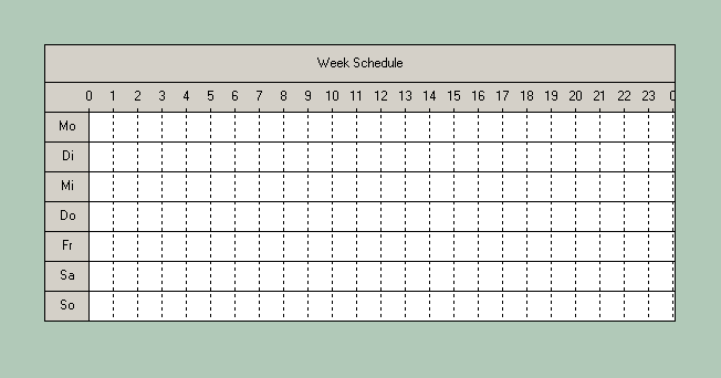
The scheduler ewo contains the following special properties:
-
backgroundOrigin: This property holds the origin of the object's background. The origin is either WidgetOrigin (the default), ParentOrigin, WindowOrigin or AncestorOrigin. This only makes a difference if the object has a background pixmap where case positioning matters.
-
header: the header of the object (in the figure above "Week schedule").
-
inhibitOverlap: If this property has been set to TRUE it will prevent two overlapping time bars being created.
-
numDays: number of the days shown in the schedule.
-
readOnly: TRUE or FALSE. By default, FALSE meaning that time bars can be drawn at runtime.
-
snapMinutes: Specifies a raster that allows a user to only draw or drag a bar within the set period (raster).
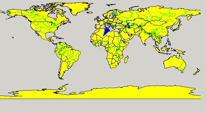
GIS Viewer EWO
The WinCC OA GIS Viewer EWO allows displaying and managing ESRI shapes files. You can display maps and add shapes to your maps.
The viewer was tailor-made to fit in with WinCC OA. Therefore, the GIS viewer provides various functions like:
-
Loading WinCC OA colorDB files. Therefore, the viewer understands WinCC OA colors including blinking colors,
-
A shape layer can be tied to WinCC OA _SumAlertPanel data point. Therefore, a shape will blink in case of an alarm of this data point,
-
The viewer understands the function dpQueryConnectSingle() and can perform a dpQueryconnect query and feed the results directly into the viewer.
The WinCC OA GIS Viewer does not come with any maps. ETM does not provide, or can not assist you, in getting ESRI shapes files. You may find free maps on the Internet or may have to purchase a map containing the appropriate information.
See the chapter Introduction to GIS_Viewer for an introduction to the GIS viewer. You will find a list of all available GIS viewer functions at the end of the chapter Introduction to the GIS Viewer.
AttentionEffect.ewo
The AttentionEffect.ewo offers four different effects (animations) to draw the attention of a user at a given point in a panel.
The AttentionEffect.ewo you can find in your WinCC OA installation directory under /bin/widgets/.
With the extended attribute color1 the color (with/without "alpha"-transparency) of the effect can be set.
With the extended attribute effectType the effect type can be selected.
For an AttentionEffect.ewo three types of events can be defined: clicked(), doubleClicked(), rightMousePressed().
There are four effect types available, which are displayed in an endless loop in the panel:
- WaterDrop
-
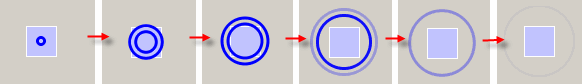
- Sphere
-
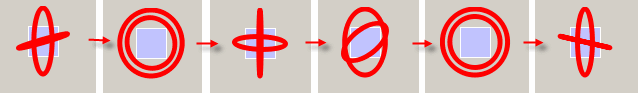
- FlashLight
-
- RotatingRect
-
Under certain circumstances performance problems can occur if the AttentionEffectEWO is used. In this case, use the following config entries in the [attentionEffectEWO] section of the config file.
[attentionEffectEWO]
updateIntervalWaterDrop = 100
updateIntervalSphere = 150
updateIntervalFlashLight = 200
updateIntervalRotatingRect = 100
The values are specified in milliseconds. The minimum value is 40 milliseconds. 40 is also the default value. All values that are smaller than 40 milliseconds are automatically set to the default value of 40 milliseconds.
If not all of these config entries are set, the default value (40 milliseconds) is used for the missing entry. If the config entries are not specified or the section (attentionEffectEWO) is missing, the default value (40 milliseconds) is used.
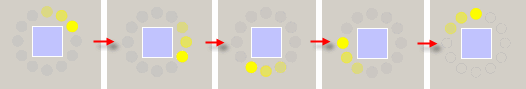
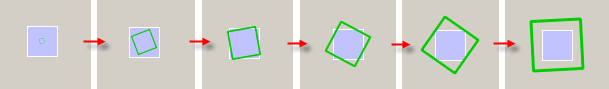
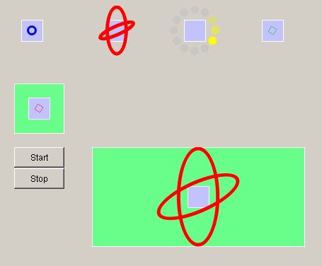
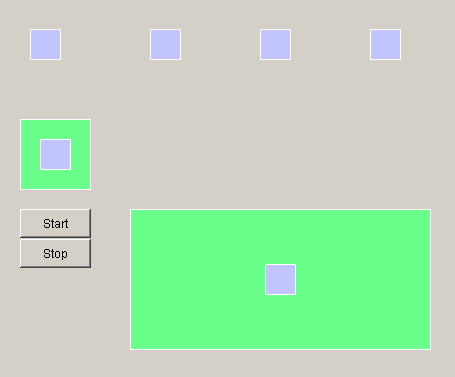
When the AttentionEffect.ewo is added to a panel this is transparent. In the running panel the animation is not started until the start() command is called (see below). Therefore, add the object which should draw the attention of a user in the back of the EWO. In the figures above such an object is the rectangle.
Starting and stopping animations
In a running panel the animation is not started until the "start" command is called.
Example of a code for a Clicked event of a button to start all effects of a panel
main()
{
  dyn_string shapes = getShapes(myModuleName(), myPanelName(), "shapeType", "AttentionEffect_ewo");

  for (int i = 1; i <= dynlen(shapes); i++)
  {
    shape s = getShape(shapes[i]);
    s.start();
  }
}
An effect can be stopped with the stop() command.
Example of a code for a Clicked event of a button to stop all effects of a panel
main()
{
  dyn_string shapes = getShapes(myModuleName(), myPanelName(), "shapeType", "AttentionEffect_ewo");

  for (int i = 1; i <= dynlen(shapes); i++)
  {
    shape s = getShape(shapes[i]);
    s.stop();
  }
}
PictureFlow.ewo
The PictureFlow EWO provides the animated display of pictures and panels (strictly speaking the pictures of the panels). The pictures and panels are arranged in form of slides in the PictureFlow. The main slide is always in the middle. With a mouse click on a slide on the left hand side or on the right hand side of the main slide, the slides flow in the appropriate direction, and the next or previous slide becomes the main slide. A direct "jumping" to the e.g. third-next slide is not supported, i.e. the slide group on the right must be clicked three times to bring the third-next slide to front.
The PictureFlow.ewo you can find in your WinCC OA installation directory under /bin/widgets/.
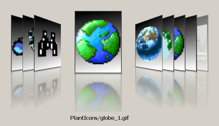
The following example demonstrates the use of the available CTRL functions for the PictureFlow EWO. If you copy this script to the Initialize event of your PictureFlow EWO, and add a primitive text with the name "panelFileName" below the EWO, you will get the same PictureFlow as shown in the figure above.
dyn_string names;

main()
{
  //Defines the size of a slide in pixel
  this.slideSize = makeDynInt(150, 200);

  for (int i = 0; i < 1; i++)
  {

    /*Adds a new slide with a picture to the PictureFlow. The path to the picture is
    required, starting at the /pictures directory*/
    this.addSlide("PlantIcons/binocular_2.gif");

    /*Appends the path to the dynamic field names for later display in the "panelFileName" text field.*/
    dynAppend(names, "PlantIcons/binocular_2.gif");
    this.addSlide("PlantIcons/binocular_3.gif");
    dynAppend(names, "PlantIcons/binocular_3.gif");
    this.addSlide("PlantIcons/binocular_4.gif");
    dynAppend(names, "PlantIcons/binocular_4.gif");
    this.addSlide("PlantIcons/globe_1.gif");

    dynAppend(names, "PlantIcons/globe_1.gif");
    this.addSlide("PlantIcons/globe_2.gif");

    dynAppend(names, "PlantIcons/globe_2.gif");
    this.addSlide("PlantIcons/globe_3.gif");

    dynAppend(names, "PlantIcons/globe_3.gif");
    this.addSlide("PlantIcons/globe_4.gif");

    dynAppend(names, "PlantIcons/globe_4.gif");
  }

  //An empty slide without picture is added.
  anytype any;
  this.addSlide(any);
  dynAppend(names, "-empty-");

  /*Function call of addPanels() for integration of panel pictures from the /panels and /panels/examples directories */
  addPanels("");
  addPanels("examples");

  /*Defines the index of the slide (beginning with 0) which will be shown as main slide (i.e. in the middle) when the PictureFlow EWO is opened */
  this.centerIndex = 3;

  //Passes the stored path information to the text field
  panelFileName.text = names[1];
}

addPanels(string dir)
{
  anytype pixmap;

  //Determines the absolute path to the panel directories specified in main()
  string path = getPath(PANELS_REL_PATH, dir, getActiveLang(), SEARCH_PATH_LEN);

  //Stores the panel names
  dyn_string files = getFileNames(path);


  /*The picture of each panel is stored in the cache and added to separate slides of the PictureFlow EWO*/
  for (int i = 1; i <= dynlen(files); i++)
  {
    string cached = getPath(PICTURES_REL_PATH, "panel-cache/" + dir + "/" + files[i] + ".png");

    if ( cached == "" )
    {
      DebugN(i, dir + "/" + files[i], getPanelPreview(pixmap, dir + "/" + files[i], 0.5));
      mkdir(getPath(PICTURES_REL_PATH, "panel-cache/") + dir);
      imageToFile(pixmap, "panel-cache/" + dir + "/" + files[i] + ".png");
    }
    else
    pixmap = QVarPicture("panel-cache/" + dir + "/" + files[i] + ".png");

    dynAppend(names, dir + "/" + files[i]);
    this.addSlide(pixmap);
  }
}
CONTROL Functions
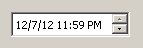
DateTimeEdit.ewo
The DateTimeEdit.ewo provides a widget for editing dates and times.
The DateTimeEdit.ewo allows the user to edit dates by using the keyboard or the arrow keys to increase and decrease date and time values. The arrow keys can be used to move from section to section.
You can find the DateTimeEdit.ewo in your WinCC OA installation directory under /bin/widgets/.
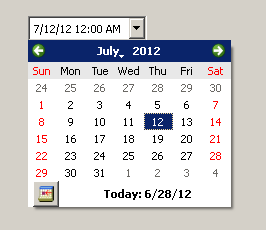
Using the calenderPopup property of the DateTimeEdit.ewo it is possible to enable or disable the calender popup, which can be used to select a specific date (see figure "DateTimeEdit.ewo + calender popup").
The values of the DateTimeEdit.ewo (date and time) are internally stored as "time" data type.
The DateTimeEdit.ewo provides special properties that are described in the following:
-
date: Returns the selected date. The time value equals 0.
-
time: Returns the selected time. The date value equals the 1.1..1970. Caution: This property can only be used with getValue().
-
dateTime: Returns date and time.
-
displayFormat: Allows to define the output format of date and time.
-
todayDisplayFormat: Allows to define the output format of the "Today" value inside the calender popup.
-
calenderPopup: Allows to display the calender popup. A value of "true" means, that the popup will be displayed whereas a value of "false" indicates that the popup will not be used.
Please note that the calender popup is only displayed if a valid date format is stated which allows the selection of day/month/year.
Additionally for displaying the "Go to Today" button the calenderPopup must be explicitly set to "true" after changing the display format to a valid date format. Otherwise this button is not available.
In the following the format expressions for the DateTimeEdit.ewo are described.
| Expression | Output |
|---|---|
| d | the day as number without a leading zero (1 to 31) |
| dd | the day as number with a leading zero (01 to 31) |
| ddd | the abbreviated localized day name (e.g. 'Mon' to 'Sun'). |
| dddd | the long localized day name (e.g. 'Monday' to 'Sunday'). |
| M | the month as number without a leading zero (1-12) |
| MM | the month as number with a leading zero (01-12) |
| MMM | the abbreviated localized month name (e.g. 'Jan' to 'Dec'). |
| MMMM | the long localized month name (e.g. 'January' to 'December'). |
| yy | the year as two digit number (00-99) |
| yyyy | the year as four digit number |
| Expression | Output |
|---|---|
| h | the hour without a leading zero (0 to 23 or 1 to 12 if AM/PM display) |
| hh | the hour with a leading zero (00 to 23 or 01 to 12 if AM/PM display) |
| m | the minute without a leading zero (0 to 59) |
| mm | the minute with a leading zero (00 to 59) |
| s | the second without a leading zero (0 to 59) |
| ss | the second with a leading zero (00 to 59) |
| z | the milliseconds without leading zeroes (0 to 999) |
| zzz | the milliseconds with leading zeroes (000 to 999) |
| AP | use AM/PM display. AP will be replaced by either "AM" or "PM". |
| ap | use am/pm display. ap will be replaced by either "am" or "pm". |
| Format | Result |
|---|---|
| dd.MM.yyyy | 21.05.2001 |
| ddd MMMM d yy | Tue May 21 01 |
| hh:mm:ss.zzz | 14:13:09.042 |
| h:m:s ap | 2:13:9 pm |
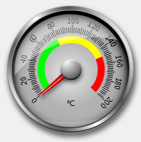
DialGauge EWO
The DialGauge EWO can be used for the display of measured data. The EWO consists of a scale, needle, casing, glass lid and a text to indicate the unit.
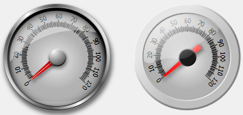
You can find the DialGauge.ewo in your WinCC OA installation directory under /bin/widgets/.
The following properties are available for the graphical adaptation of the EWO.
| Property | Description |
|---|---|
| backgroundBrush |
Defines the fill-pattern for the background. The default value is "Outline". Possible values are:
For further details about the different fill-patterns please refer to Fill-pattern string. |
| markingStyle |
You can add colored markings per script which are displayed along the scale (see also "addMarking"). The markingStyle property defines how this markings are displayed.
|
| maxAngle | Position of the maximum value of the value range. The angle is specified in degree in reference to 12 o'clock. This means that -90° corresponds to 9 o'clock, 0° to 12 o'clock and +90° to 3 o'clock. |
| Maximum | You can specify the value range which shall be displayed on the EWO. This property defines the upper limit of the value range. |
| minAngle | Position of the minimum value of the value range. |
| Minimum | Lower limit of the value range. |
| needleBrush |
Defines the fill-pattern for the needle. The default value is "Outline". Possible values are:
For further details about the different fill-patterns please refer to Fill-pattern string. |
| needleCenterShift | Allows to shift the center of the scale (=pivot point of the needle) in x and y direction. |
| needleColor | Defines the color of the needle. |
| scaleRadiusDelta | Allows to change the radius of the scale (minimize or maximize). |
| showCasing | Defines whether the casing shall be shown or not. |
| showGlass | Defines whether the glass lid shall be shown or not. |
| showNeedleKnob | Allows to hide the display of the knob in the center above the needle |
| showTickLabels | Allows to hide the display of the numeric text display at the large tick marks |
| Skin |
There are 2 different skins available for changing the apperance of the EWO:
|
| tickStyle |
Defines the style of the ticks inside of the gauge. Following styles are available:
|
| unit | Specifies the unit of the scale. |
| unitPosition | Allows to change the position of the specified unit. The position [0/0] is exactly the center of the EWO. |
The following example defines the unit, its position, three different markings and their marking style.
main()
{
  this.unit("°C");
  this.unitPosition(0,25);
  this.minimum(0);
  this.maximum(200);
  this.markingStyle("InsideScale");
  this.addMarking(0,80,"green");
  this.addMarking(80,150,"yellow");
  this.addMarking(150,200,"red");
}
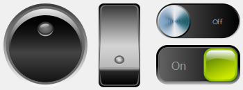
ToggleSwitch EWO
The ToggleSwitch EWO is an On/Off switch. It is toggled per click and triggers the "toggled" script.
You can find the ToggleSwitch.ewo in your WinCC OA installation directory under /bin/widgets/.
The following properties are available for the graphical adaptation of the EWO.
| Property | Description |
|---|---|
| autoExclusive | If auto-exclusivity is enabled, buttons that belong to the same parent widget behave as if they were part of the same exclusive button group. This means that only one button can be checked (switched on) at a time. If another button is also checked at the same time, it is automatically unchecked. |
| backgroundBrushOff |
Defines the fill-pattern for the background of the button if it is switched off. The default value is "Outline". Possible values are:
For further details about the different fill-patterns please refer to Fill-pattern string. |
| backgroundBrushOn |
Defines the fill-pattern for the background of the button if it is switched on. The default value is "Outline". Possible values are:
For further details about the different fill-patterns please refer to Fill-pattern string. |
| checked | Changes and indicates the current state (off or on). |
| skin |
There are different skins available for changing the appearance of the widget:
|
| textOff | Text which is shown on the EWO if it is turned off. |
| textOn | Text which is shown on the EWO if it is turned on. |
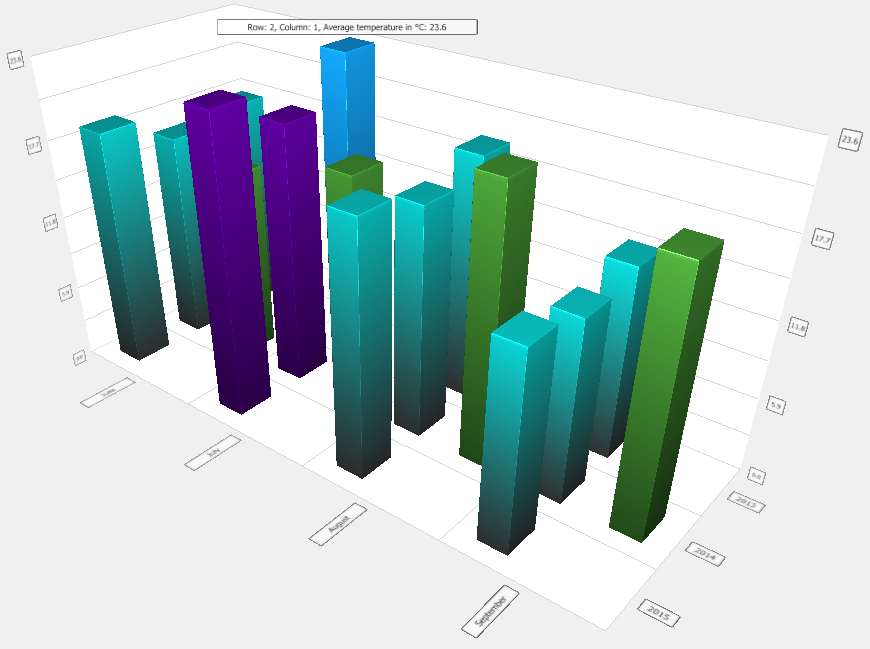
BarChart3D EWO
Data is defined in series. A series is a logical related data set. The data set is displayed in rows and columns.
| Property | Description |
|---|---|
| barSpacing | Defines the empty space between bars, in X and Z dimensions. It is preset to (1.0, 1.0) by default. |
| barThickness | Bar thickness ratio between X and Z dimensions. 1.0 means bars are as wide as they are deep, 0.5 makes them twice as deep as they are wide. It is preset to 1.0 by default. |
| xRotation | X-rotation angle of the camera around the target point in degrees. |
| yRotation | Y-rotation angle of the camera around the target point in degrees. |
| zoomLevel | The camera zoom level in percentage. 100.0 means there is no zoom in or out set in the camera. |
| rowLabes | Defines the labels for the row |
| columnLabels | Defines the labels for the columns |
| valueLabels | Automatically calculated. Read only property. |
| valueLabelFormat |
Defines the label format to be used for the labels on this axis. Supported specifiers are: d, i, o, x, X, f, F, e, E, g, G, c See sprintf() for additional details. |
| valueAxisSegmentCount |
Indicates how many labels are drawn. The number of grid lines to be drawn is calculated with the following formula: segments * subsegments + 1 The preset default is 5, and it can not be below 1. |
| valueAxisSubSegmentCount | Defines the number of subsegments inside each segment on the axis. Grid lines are drawn between each subsegment, in addition to each segment. The preset default is 1, and it can not be below 1. |
| rowTitle | Defines the row title. This title is only displayed in the 2D slice mode. |
| columnTitle | Defines the column title. This title is only displayed in the 2D slice mode. |
| valueTitle | Defines the value title. This title is only displayed in the 2D slice mode. |
| barShadowQuality |
The following constants can be used:
Restriction:
Shadows are not supported under
Windows. |
| barSelectionMode |
The following selection modes are possible:
Note:
The modes can be combined inside the string with the | (pipe) character, e.g.
|
| slicingActive | This property contains whether 2D slicing view is currently active or not. |
| ambientLightStrength | Ambient light strength for the whole graph. Value must be between 0.0 and 1.0 |
| lightStrength | Specular light strength for the whole graph. Value must be 0.0 and 10.0 |
| highlightLightStrength | Specular light strength for highlighted objects. Value must be between 0.0 and 10.0 |
| lightColor | Color for the specular light. Affects both ambient and specular light. |
| colorStyle |
The style of the graph colors:
|
| baseColor | Defines the color of the first series when colorStyle is "ColorStyleUniform" |
| baseGradient | Defines the gradient of the first series when colorStyle is not "ColorStyleUniform" |
main()
{
  dyn_float A_temp2015, A_temp2014, B_temp2014;
  dpGet("CityA.y15", A_temp2015, "CityA.y14", A_temp2014);
  //get temperature values used for series 0
  dpGet("CityB.y14", B_temp2014);
  //get temperature values used for series 1

  this.addSeriesRow(0, A_temp2015);
  //define series and rows
  this.addSeriesRow(0, A_temp2014);
  this.addSeriesRow(0, makeDynFloat(17.4, 23.6, 19.1, 14.9));
  //define values for row manually

  this.addSeriesRow(1, makeDynFloat());
  //define second series, insert blank row
  this.addSeriesRow(1, B_temp2014);

  this.rowTitle("Year");
  this.columnTitle("Month");
  this.valueTitle("Average temperature in °C");

  this.columnLabels(makeDynString("June","July","August", "September"));
  this.rowLabels(makeDynString("2015","2014","2013"));
  this.valueLabelFormat("%.1f");
  this.setSeriesBarLabelFormat(0, "Row: @rowIdx, Column: @colIdx, @valueTitle: %.1f");
  //define label format


  //define number of segments, sub segments and bar style
  this.valueAxisSegmentCount(4);
  this.valueAxisSubSegmentCount(2);
  this.barSpacing(makeDynFloat(1.5, 1.0));
  this.barThickness(1.5);
  this.lightStrength(8.0);
  this.highlightLightStrength(10.0);
  this.colorStyle("ColorStyleObjectGradient");
  this.baseGradient("[gradient,[linear,pad,0.0,0.0,1.0,1.0,0.0,{50,50,50}, 1.0,{10,200,200}]]");
  this.barSelectionMode("SelectionSlice|SelectionItemAndColumn");
}
Notes and restrictions
Chart EWO
The Chart EWO has been added to display process data. Multiple types of charts are available:
Donut/Donut bars, Radar chart, Bars/Stacked bars/Percent stacked bars, Bubbles and Polar.
The chart types can be changed dynamically with just changing an attribute. Below you find a description of the EWO specific properties. Additionally available functions can be found in the chapter Chart.ewo Functions.
| Property | Description |
|---|---|
| angularGridStep | Steps between each line of the grid used within the plot area. By default a 15 degree distance is used between each grid line. If the value range of the axis[0] is changed the grid steps are automatically calculated if this property is not set. The property is only used if a value >= 1 is set, otherwise the steps are automatically calculated. |
| plotColor | The color that should be used for the plot area in combination with the plotFillType. The color is not used if the plotFillType is a gradient or picture. |
| plotFillType | Fill type for the plot area. |
The following Event scripts are available for the EWO:
| Event | Specific Behavior |
|---|---|
| currentRootChanged() | |
| itemDoubleClicked(int series, int idx) |
TreeMap navigation: By default the user can double-click on an item in the TreeMap and if it has children, the clicked item will become the new root. This behavior can be changed to trigger this event with navigateOnClick. |
| itemRightPressed(int series, int idx) |
TreeMap navigation: By default a right-click will navigate the hierarchy upwards one step. This behavior can be changed to trigger this event with navigateOnClick. |
| itemSelected(int series, int idx) |
PDF Viewer EWO
The PDF Viewer EWO allows you to view PDF files in an EWO.

EWO Methods
| Method | Description |
|---|---|
| goToNamedDestination() | Jumps to the stated position |
| load() | Loads a PDF |
EWO Properties
The following properties are available for the EWO.
| Property | Description | Default |
|---|---|---|
| zoomFactor | Specifies the zoom factor. 1.0 == 100%. The zoom factor is only used when the zoomMode is "CustomZoom": See below. | 1 |
| zoomMode |
Specifies the zoom mode. You can use one of the following modes:
|
"FitToWidth" |
| currentPage |
The attribute returns the number of the current page, 1..n. |
- |
| pageCount |
The attribute returns the number of pages. |
- |
| namedDestinations | Returns a dyn_string containing the names of all named destinations in the current PDF document. Empty if no PDF document is loaded or no named destination is available. | - |
| showControls | This attribute shows or hides the navigation area. The default is TRUE to show the controls. | TRUE |
Notes and Restrictions
DoubleSpinbox EWO
The DoubleSpinbox EWO is an enhanced version of the already existing Spin button and provides additional options for customizing the object.
EWO Events
Following Events are available for the EWO:
| Event | EWO Specific Behavior |
|---|---|
| initialized() | - |
| acknowledge() | - |
| keyboardFocusIn() | - |
| keyboardFocusOut() | - |
| langChanged() | - |
| mouseOver(bool enter) | - |
| changed(double dValue, bool bFinished) | The event is triggered while changing the value either via the buttons or keyboard input. The event is triggered for each change and the passed dValue is updated accordingly while the bFinished is only changed to true if the mouse has been released, the keyboard focus has changed to a different object or the changes have been finished by using the enter key. The up and down key of the keyboard can also be used to increase/decrease the value. In this case releasing the corresponding key returns a true for bFinished. Also the mouse wheel can be used to change values. Note: If the value is set using CTRL then the event is not triggered! |
| doubleClicked(mapping event) | - |
| rightMousePressed(mappig event) | - |
EWO Properties
Following properties are available for the EWO.
| Property | Description | Default |
|---|---|---|
| accelerated | Allows to define if changing the value with the buttons should be accelerated if the buttons are constantly pushed. | true |
| alignments | Alignment of the objects. Possible values: left, right or center | left |
| backGroundBrush | Filling type of the background | solid |
| backgroundColor | Background color of the whole widget | "_Windows" |
| borderStyle | Border style of the widget: styled, flat or no border (=none) | Styled |
| buttonDownIcon | Custom icon | "" |
| buttonPos | Position of the increase/decrease buttons: "right", "left", split to both sides (= "left/right") or split to above and below (= "up/down") | right |
| buttonSymbols | Symbols of the button: "plus/minus", "up/down" or "none" | "up/down" |
| buttonUpIcon | Custom icon | "" |
| contextMenuPolicy | Disable or change context menu at right mouse click. | - |
| correctionMode | The behavior of correcting invalid values: CorrectToPreviousValue (the value before start editing), CorrectToNearestValue (if the value is outside of minimum and maximum, which value should be used) | CorrectToPreviousValue |
| decimals | Number of decimal values after the comma. | 0 |
| focusLostCancels | Defines if losing the focus cancels the editing or applies the changes. Note: Changing the focus by using the tab or back tab keys will not cancel the editing and therefore the new value will be applied. | false |
| foregroundColor | Color of the foreground / text | "_WindowText" |
| hintValue | Additional double value to be displayed below the value. Cannot be changed using the buttons but only by directly writing this value. | 0 |
| hintValueVisible | Defines if the hintValue is displayed or hidden | false |
| icon | String icon to be displayed in front of the value. | "" |
| innerBorderColor | Color of the inner border. Can be used to display alerts. | "_Transparent" |
| inputFieldColor | Color of the input field | "_Window" |
| invertedAppearance | Defines if the buttons should be displayed with switched positions. | false |
| invertedControls | Defines if the controls should swap directions to inverted functionality. | false |
| maximum | Maximum value (double) | 100 |
| minimum | Minimum value (double) | 0 |
| prefix | Prefix text to be displayed within the spinfield before the value. | "" |
| rangeBackground | Background color of the range label | "blue" |
| rangeColor | Color of the text for the range label | "white" |
| rangeFont | Font of the range text | Standard Font minus 3pt |
| rangeMaximum | Range value to be displayed as corresponding maximum range value | 100 |
| rangeMinimum | Range value to be displayed as corresponding minimum range value | 0 |
| rangeVisible | Defines if the range values are displayed. They are always displayed two pixels above the EWO | false |
| showGroupSeparator | Defines if group separators are displayed or no separators, e.g. 1.000, 1.000.000, etc. | false |
| step | Defines the precision of one step when increasing/decreasing the value. | 1.0 |
| suffix | Suffix text to be displayed within the spinfield after the value. | "" |
| value | Current value as double; Read/Write | 0 |
| valueVisible | Defines if the value should be displayed. | true |
| wrapping | Defines if the value will jump over if the max/min value is reached and exceeded. E.g. after reaching maximum value to start again with the minimum value. | true |