Creation of the CSS file
For the implementation of individual style sheets, the creation of a *.css file is required.
Due the creation of a CSS file a sequence of style rules must be followed. A style rule is made up of two elements - a selector and a declaration.
The selector specifies which widgets are affected by the rule. The declaration specifies which properties should be set on the widget.
In the following you can find some examples with general rules for a CSS file and an example of a CSS file whose content has an effect onto a panel.
Example
QPushButton
{
  color: red
}
The push button (QPushButton) is an example for a selector and { color: red } is the declaration. The rule defines that all push buttons should use red as their foreground color.
Example
QLineEdit, QComboBox
{
  color: red; background-color: white
}
Several selectors can be specified for the same declaration, using commas (,) to separate the selectors.
Example
PanelQT#myPanel QMenu
{
  background-color: white
}
PanelQT[type="configuration"]
{
background-color: darkgray
}In order to define rules more precisely the descendant and ID selectors can be used. In this case popup menus (QMenu) only use red as background color if they are opened on a panel with the name "myPanel". The background color of panels with type "configuration" is set to darkgray.
shape.stylesheet("")It is possible to define several properties in one declaration. The properties are enclosed in braces ({}) and separated with semicolons.
You can find a list of the supported properties in the external documentation of the Qt toolkit: List of Properties.
All entries of the properties in a file are generally case insensitive. That means upper and lower case will not be noted. The only exceptions are class names, object names, and Qt property names, which are case sensitive.
In the following table are listed the most important selector variation are listed.
| Selector | Example | Description |
|---|---|---|
| Universal Selector | * | Matches all widgets. |
| Type Selector | QPushButton | Matches all instances of a widget type. |
| Property Selector | QPushButton[flat="false"] |
Matches instances of a widget that are not flat. This selector may be used to test dynamic properties. Instead of =, you can also use ~= to test whether a property of type QStringList contains a given QString. |
| Class Selector | .QPushButton |
Matches instances of a widget, but not of its subclasses. This is equivalent to *[class~="QPushButton"]. |
| ID Selector | QPushButton#okButton | Matches all widgets, whose object name is the same as the here specified. |
| Descendant Selector | QDialog QPushButton | Matches all instances of a widget that are descendants (children, grandchildren, etc.) of the first specified selector part of a selector. |
| Child Selector | QDialog > QPushButton | Matches all instances of a widget that are direct children of a the first specified selector. |
Widget[type = "BtnClose"]
{
  color: red
}type attribute with the QCheckBox or
QRadioButton, the parent class MultiLabeledParent
must be used, e.g.: MultiLabeledParent[type = "STYLE"] QCheckBox
{
color: red
}Example 2
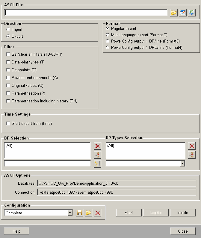
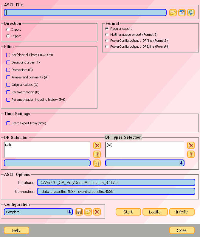
In the following you can see the view of the ASCIIMan.pnl panel either with implemented style sheet or without implemented style sheet. Below the both figures you gain an insight to the content of the CSS file, which is responsible for this view.


QComboBox, QSpinBox, QLineEdit
{
  border: 2px solid blue;
  border-radius: 7px;
  padding: 0 3px;
  background: lightblue;
  selection-background-color: darkgray;
}
QComboBox::drop-down
{
  border-radius: 7px;
  border-left-width: 1px;
  border-left-color: darkgray;
  border-left-style: solid;
}
QComboBox::down-arrow
{
  image: url(pictures:down.xpm);
}
QCheckBox::indicator
{
  border: 1px solid blue;
  border-radius: 3px;
}
QCheckBox::indicator:checked
{
  image: url(pictures:checked.png);
}
MultiLabeledParent { background: rgba(0, 0, 0, 0); }
QPushButton
{
  border: 2px solid rgb(255, 167, 43);
  background: rgb(255, 224, 137);
  border-radius: 7px;
  font-family: "New Century Schoolbook";
  font-size: 14px;
  font-style: bold;
}
PanelQT
{
  background-color: qlineargradient(x1: 0, y1: 0, x2: 1, y2: 1, stop: 0 #FFAFC0, stop: 1 #FFFFFF);
}
TrendPlot, TrendScaleQT, ClockQT
{
  background-color: qlineargradient(x1: 0, y1: 0, x2: 1, y2: 1, stop: 0 #03AFC0, stop: 1 #FF77FF);
}
Selection Operator - Attributes
For CSS multiple operators can be used to more distinctively select the required attributes. Following matching operators can be used within WinCC OA:
- "=" - Selects the type which exactly matches the stated value.
- "^=" - Selects the type which starts with the stated value.
- "$=" - Selects the type which ends with the stated value.
- "*=" - Selects the type which contains the stated value.
-
"~=" - Selects the type which contains the stated value but the value must be contained as a separate entry with spaces as separator, e.g. [type ~= "navigation"] - Type: "navigation area".
- "|=" - Selects all types which start with the stated value but the value must be contained as a whole and may only be followed by a hyphen ("-"), e.g. [type |= "top"] "top-area".
Additional information can be found here [W3C School].
Referencing Pictures in CSS Styles
Following information must be considered when using picture references within your style sheet:
- Images saved to WinCC OA's /pictures
folder can be directly addressed with the
pictures:prefix, e.g.:url(pictures:down_en.png); - The path to the picture can also be stated relative to the style sheet file,
e.g.:
url("pictures/down_en.png");This however is not recommended, as the files are addressed relative to the working directory.
- Folders can be accessed from any layer above the style sheet directory with a
relative path, e.g.:
url(../images/myImage.png);CAUTION:This form of addressing does not work for files outside of the project, sub-project or installation if the UI is running remotely. - Style sheets can be stated with a static path e.g. from a directory outside of the WinCC OA directories by using the -stylesheet parameter for the UI manager.
Using WinCC OA colors in CSS Styles
Colors defined in a WinCC OA color database can be used in CSS Styles. They are called by using the pseudo-function oa-color(). The colors will then be replaced with their corresponding RGBA values before the CSS is interpreted. This can be used for:
- the "stylesheet.css" file in the "config" folder
- specifying a stylesheet with the -stylesheet command line argument
- setting the stylesheet property of a panel or widget
Example
Setting the colors of a push button to colors defined in a color database:
QPushButton
{
  color:
  oa-color(_ETM);
  background:
  oa-color(STD_param_warning);
  border:
  2px solid oa-color(SiemensSand);
}
Trend Widget - CSS Examples
Following examples demonstrate how to change the style of specific trend elements by using style sheets:
Trend Legend Background
TrendLegend
{
  background: steelblue;
}

To set the legend background only for specific trends a type can be stated for the trend, e.g. "TrendQT[type="myTrend"] TrendLegend { background: red; }"
Trend Command Area Buttons
The Trend command area buttons "Reset Zoom" and "Undo Zoom" can be addressed using the names "zoomReset" or "zoomUndo", e.g.:
QPushButton#zoomReset
{
 qproperty-icon: url(pictures:arc.png)
}
QPushButton#zoomUndo
{
 qproperty-icon: url(pictures:checkbox.png)
}
Zoom Select / Rubberband- Selection
TrendPlot
{
  qproperty-rubberBandLineColor: red;
  qproperty-rubberBandFillColor: qlineargradient(x1:0,y1:0, x2:0, y2:1, stop:0 rgba(255, 255, 255, 80), stop:1 rgba(0, 255,
  0, 130));
}
The property "qproperty-rubberBandLineColor" is also used for a moving ruler.
Only colors can be used, brushes are not supported!
For the property "qproperty-rubberBandFillColor" the usage of brushes is possible, see Qt-Documentation for further information.


ViewPort Widget
The separate elements of the Viewport can be addressed using the corresponding Classes:
TrendAreaViewportHandle
{
  min-width: 10px;
  min-height: 10px;
  background-image: url(pictures:abottom.png);
  background-repeat: no-repeat;
  background-position: center;
   background-color: qlineargradient(x1:0, y1:0, x2:0, y2:1, stop:0 white, stop:0.4 gray, stop:1 green);
}
TrendAreaViewport > QWidget#viewport_leading
{
  background-color: rgba(12, 80, 200, 40)
}
TrendAreaViewport > QWidget#viewport_trailing
{
  background-color: rgba(12, 80, 200, 140)
}
TrendAreaViewport > QWidget#viewport_window
{
  background-color: rgba(255, 255, 20, 40)
}

Trend Markings
For setting the displayed markings of the trend time/value scales the property "qproperty-tickstyle" for the CSS classes "TrendTimeScale" or "TrendValueScale" can be used. Following styles are available: AllTicks, NoSmallTicks, OnlyMainTicks and NoTicks.
TrendValueScale
{
  qproperty-ticksStyle: "OnlyMainTicks";
}
Trend Ruler
Cannot be influenced using CSS and must be adjusted using the config entries trendRulerColor as well as trendRulerLineType inside of the [ui] section. Only a moving ruler can be styled using the CSS property "property-rubberBandLineColor", see Zoom Select / Rubberband- Selection.
Combobox Dropdown Menu
The dropdown menu of a combobox can be addressed using following syntax:
QComboBox QAbstractItemView
{
  margin: 5px;
}
QComboBox[type = "myType"] QAbstractItemView::item
{
  margin: 10px;
}
To address the items of a dropdown a style for the combobox itself must be defined, see example above.
Additional Notes
-
The attribute "font" is only changed by stylesheets if it is set to "defaultFont". The global stylesheet and an attribute/local stylesheet can be overwritten. The sequence of overwrites is:
- Global stylesheet
- Can be overwritten by the local stylesheet, if "defaultFont" is set in the global stylesheet.
- Can be overwritten by the "font" attribute, regardless of the value set in the global stylesheet.
Thus it is recommended to use the "font" attribute itself instead of the attribute/local stylesheet.
- For displaying rounded corners for the QTabBar object it is required to disable the property documentMode inside of a Control script, e.g. the Initialize script of the Tab-Widget:
<tabShape>.documentMode(false);- To set the font of the Clock via style sheet the .css properties qproperty-dateFont respectively qproperty-timeFont can be used. The font must be stated as font string, e.g.:
ClockQT
{
  qproperty-dateFont: "Noto Sans,-1,33,5,75,0,0,0,0,0";
  qproperty-timeFont:"Noto Sans,-1,33,5,75,0,0,0,0,0";
}- For setting the margin and padding of table cells the class TableQt::item can be used. Please note that any attribute must be set for the main TableQt class, otherwise the settings for the sub class "item" are not applied.
- For addressing a combo box within a table (see "cellWidgetRC") the QComboBox must be addressed as child class of the QTableView, e.g.
QTableView QComboBox
{
  color: red;
  border: 1px solid blue;
  border-radius: 9px;
  padding: 3px 18px 3px 3px;
}- To access custom style sheets inside of your /config folder for the Mobile UI Application as well as the Desktop UI they must be made available for the HTTP server by using the function httpConnect() (webclient_http.ctl), e.g.:
httpConnect("getTouchStyleSheet", "/config/touchscreen.css","text/plain");- To style a frame object using CSS the CSS class QGroupBox must be used. Hereby the name and type selectors can be used to directly address objects.
- The QMenu instances created via popupMenu() or popupMenuXY() have the "scripted" property set to "true". This allows you to distinguish between the UI generated popups from the C++ code and the customer created ones via scripting. In the stylesheet.css one can now use e.g.:
QMenu:enabled[scripted="true"]
{
  background: rgb(248,255,25);
  color: rgb(255,55,11);
  font-size: 18px;
}
Restrictions
Following restrictions must be considered when working with Stylesheets:
- Minimum and maximum settings inside of the stylesheet (e.g. min-width or min-height) are not supported as they interfere with the internal settings of a graphical object and therefor cause displaying errors.


