Properties of graphics objects (Standard tab)
The Standard tab shows all properties for the graphics object that is currently selected.
This section describes the properties common to all graphics objects:
- The object name.
- The serial number.
- The color formatting (background or fill color, foreground, border or text color, true color support)
- Text, font and line formatting (for labels, border lines).
-
Formatting of surfaces: definition of fill pattern (HatchStyle), Configuring the background with an image. Supported graphics formats are, for example, Bitmap (bmp), Pixmap Format (xpm), Graphics Interchange Format (gif) and Windows (Enhanced) Meta File (wmf, emf). See chapter Graphical design of panels.
-
Position of objects (Position, rotation angle)
- The object size. Note that when an object is already scaled or rotated, the result of applying a new size from the property editor might not be pixel-accurate. Selected objects can now be resized by holding the CTRL Key and cursor keys. Grid-Snap is used. As with move, SHIFT-key in addition ignores the grid-snap. For example, CTRL+SHIFT+cursor_right/down scales the objects by 1 Pixel to the right (makes the object larger). The cursor_left/up reduces the size.
- Layout management
- Shadows
- Enabling graphics objects and visibility (Enable, Visible, Layer)
- Drag and drop of objects
- Antialiasing
- Multiselection of primitive shapes at runtime
- Hotkey
- Tooltip
Specific attributes are described in the following sections.
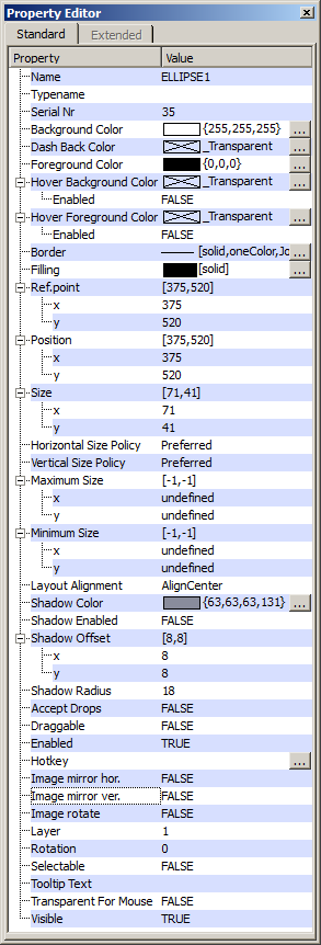
The first column contains the property names in alphabetical order. The second column contains the current settings. You can edit these settings by clicking the appropriate field in the second column. The response depends on the type of the property:
- Texts can be entered in the field directly.
- Selection lists provide different options. Select one of the options
- Pop-Up windows
The object name
After creating a graphic object, a default object name will be assigned to the object. "Border1", for example, means the first object of type "Border". Each object must have an unique name. Numbers and characters are allowed. Special characters are not allowed.
The Typename is a string which can be passed project-specific to a variable
using getValue("objectName",
"type",<variable>). It is possible to
use the Typename (as well as the object name) for a more detailed definition of
selectors in stylesheets. Special characters are not allowed.
Serial number
The serial number of an object.
Colors
- BackColor: Background or fill color.
- DashBackColor: Allows a two-colored display of a dotted line. If the color is transparent (default), the dotted line will be single-colored.
- ForeColor: Foreground, border or text color
- HoverBackColor: Defines the background or fill color for a graphic object when the cursor is moved over it. When the cursor is not over the object, the backColor and foreColor are shown. Default = Disabled. ... opens the Color Selector.
- HoverForeColor: Defines the foreground, border or text color of a graphic object when the cursor is moved over it. When the cursor is not over the object, the backColor and foreColor are shown. Default =Disabled....opens the Color Selector.
NOTE
If a shape has a solid filling, you can also click the filling even though the filling color would be transparent.
If both the fore and background colors for a shape are transparent, a pink border will be shown in the GEDI.
Blinking colors can contain transparent colors. This means that an object does not blink, for example, red-grey but red-background color. To use a transparent color, complete the following steps: Create the transparent color with the color selector (to create the color, use the project view and the color database, see chapter The project view). Choose the "Dynamic arbitrary" option. Select the transparent color and another color, for example, red. Set these two colors using the check boxes below the color selection window. Drag a color from the color list into the check box. Using the check boxes, you specify how long a color will be blinking.
Create a new data point of the type _AlertClass. This means that you create a new alert class. Add the alert class config to the new data point.
Choose the new color that has been created for this data point in the alert class config (click the color button and specify the color for the alert state).
Choose the new alert class for an alert handling of a data point.
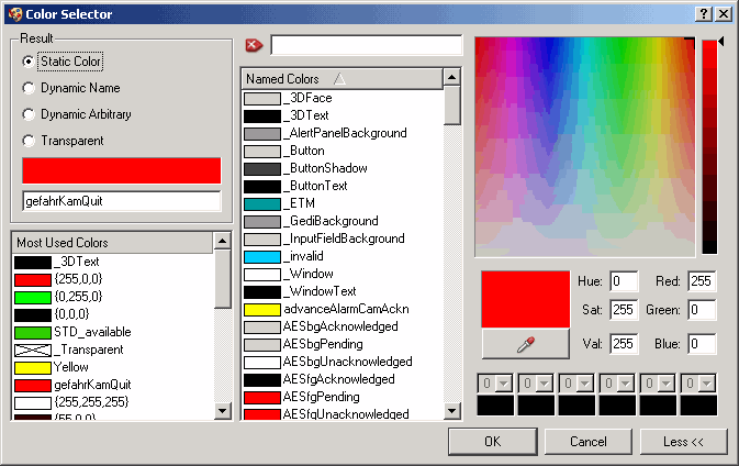
- The field shows the current color and the color code in RGB notation (Red, Green, Blue components with each between 0 and 255). Clicking the field opens the Color Selector that allows creating a color using 255 RGB colors. Clicking More colors shows also the "True Colors". You can select a color using the color "pipette". Click on the "pipette" button and then select the color. The selected color is shown automatically in the Color Selector. You can also change the colors of a WMF file at runtime. Choose the color of the WMF file that you want to change in the color selector and set the background color in the script.
NOTE
Under Windows the use of the color pipette can freeze the action. This happens if the Windows "grab function" is already blocked by another. Thus, the responsible process must be closed. This is a limitation of the operating system.
If you change the colors of a WMF file, you have to consider that the colors of only "real" (not converted WMF files or WMF files that use a bitmap pattern as color ) WMF files can be changed and that the display settings have to be same when changing the color as they were when creating the WMF file.
-
Static colors are colors that do not blink
-
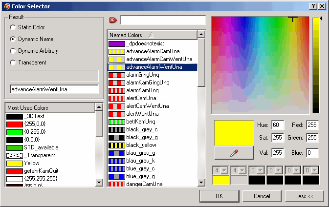
Dynamic colors (dynamic name) are colors that blink. Dynamic colors comprise the default blinking colors. Dynamic Arbitrary: Here you can specify your own dynamic colors. Use the check boxes below the color window and select the colors. Drag a color from the color list into the check box. The check boxes specify how long a color should blink. Transparent colors
For any personal color select "static color" or "Dynamic arbitrary" and then choose the color combination from the color table. The color table displays all 255 available RGB colors. To select a color, click on one of the color boxes or click on More>> to select an arbitrary color.
NOTE
Blinking colors can also contain transparent colors. This means that if a transparent color has been specified for an alert state, the background will be shown, for example, red/background. The transparent color can be specified using the color editor and by selecting the dynamic name option. To use a transparent color, complete the following steps:
Create the transparent color using the color editor. Choose the "Dynamic name" option.
Create a new data point of type _AlertClass. This means that you create a new alert class.
Choose the new color that was created, for this data point (click the Color button and specify the color for the alert state).
Choose the new alert class for an alert handling of a data point.
- The blink sequence (this means the blink duration)is visualized using color bars (check boxes below the color window).
A transparent color cannot be specified for Controls like Trend.
Font/Frame/Lines
For formatting fonts see Font selection in GEDI.
Via a right click on the row "font" of the property sheet and selection of the option "Set Default Font", the selected font can be reset to the GEDI default.
With the option "Apply To All Languages" the current Settings can be applied to all other project languages.
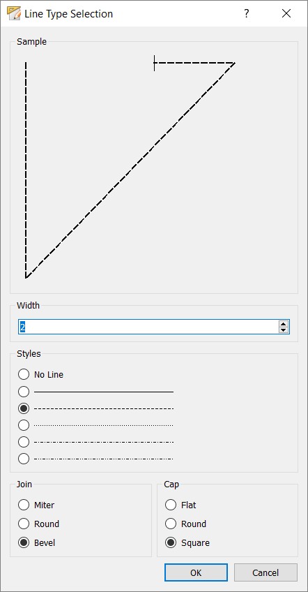
Lines
The following properties are available for formatting lines:
| Property | Meaning |
| PenCap | Flat, Square, Round curve end |
| PenJoin | Bevel, Miter, Round join |
| PenStyle | Line style (solid, dash, dash-dot, ...) |
| PenWidth | Line width (integer between 0 and 50) |
When the line type "no line" is selected, no outline is drawn, instead the filling is drawn over the entire area.
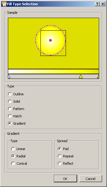
Fill type
The fill type of an object can be an image, a pattern or a color. It will be described in a fill-pattern string and can be set with the fill type selector.
Outline
Outline means that only the outline can be seen. To make only the outline visible, set BackColor to transparent and ForeColor to the outline color.
Solid
Solid means a completely filled area. Set BackColor to the desired color and HatchStyle to solid (Solid is the default value).
Pattern
Select an image as a pattern. You can also edit and save the image with Edit....
-
Size: Fit (the image is fitted within the object) or Tiled (the image is loaded once in the middle of the object).
-
Share Bitmap: The option Share bitmap references the pictures or bitmaps from the installation path <wincc_oa_path>/pictures to your project. So the pictures are not saved separately in a new directory for each of your panels. Without this option a picture picture.xpm will be saved in the project directory <proj_path>/images/panelname. By default, this option is set to "Yes"(if you have selected a picture from the .../pictures directory).
If the attribute "horizontal mirror image" has been set, an image will be mirrored horizontally and if the attribute "vertical mirror image" has been set, an image will be mirrored vertically.
Hatch
Hatch type specifies the type of the fill pattern. Select the hatch type here.
An image has priority and replaces the hatch style (fill pattern) and color. HatchStyle and color can be used together.
Gradient
The Gradient fill allows to add additional plasticity to graphic objects. It is also possible to compose multiple colors together to create a colorful graphic object.
-
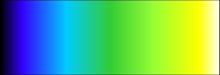
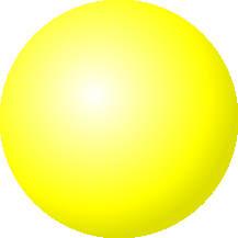
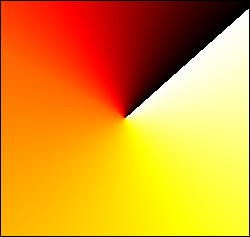
Type: Allows to select between the types linear, radial and conical (cf. figure below).
-
Spread
-
Pad => The gradient fill will be displayed on the whole area
-
Repeat => The gradient fill will be repeated multiple times over the whole area
-
Reflect => The gradient fill will be repeated in the inverted order
NOTE
To change the colors of the gradient fill use a double click with the left mouse key on the arrow you want to edit.
New colors can be added using a double click on an empty area beneath the color spectrum. (cf. figure: Add new color). A color selection dialog is automatically opened to select the wanted color.
Through changing the position of the points inside the gradient fill example, the position of the gradient can be additionally customized.
Using a double click with the right mouse key on a color arrow, the arrow can be removed.
Layout management
You can define the behavior of all graphical objects in case that a layout is enabled for a panel. Horizontal size policy and vertical size policy specifies how the object is changed in vertical and horizontal direction (see also sizePolicy in the layout management chapter).
The minimum and maximum size defines the limitations for resizing the object. Layout Alignment allows to specify how the object shall be aligned within the layout (in the center, on the top, bottom, left or right side).
There are also the properties Fit size and Ellipsis Mode for primitive texts (also described in the layout management chapter).
Position
The position of a graphics object in the panel is specified by the position coordinates. For a simple graphics object the reference point is the point set with the first mouse-click on the panel. For primitive text and all graphics objects the top left corner point is the reference point. The position data is specified in pixels, measured from the left edge (Left), the right edge (Right), the top edge (Top) and the bottom edge (Bottom) of the panel field. As a default the reference point's position changes during moving an object.
You can define the position of objects directly in the panel using the mouse, or in the Property Sheet by editing the entries Position X and Y.
Shadow
It is possible to display a shadow for each graphics object. The attribute Shadow Enabed will enable or disable the shadow. Shadow Color specifies the color of the shadow, Shadow Radius specifies the radius in pixels. Shadow Offsetx and y specifies the number of pixels that the shadow is offset on the x- and y-axis.
Enabled (Visibility of graphics objects)
Yes: The default value means that an object is enabled.
No: Disabled objects are visible in VISION but are not enabled. This means that the scripts will not be executed and the objects cannot be used at runtime. Disabled objects will be displayed grey.
Drag and drop of objects (Draggable and Accept Drops)
Allow the drag and drop of an object. For more information, see chapter Drag & Drop at runtime.
Layer
There is a default layer (layer 1) and seven other layers. You can, for example, assign the layer 2 to a graphic object by selecting the layer 2 from the field.
Antialiasing
Antialiasing is always enabled for SVG graphics. The antialiasing flag is only used for the following shapes:
- Arc
- Bordered
- Ellipse
- Filleable
- Line
- Pipe
- PrimitiveText (default = off)
- Rectangle (default = off)
- Trend
Border type
Type of the border (Normal, 3D, Sunken, Raised).
Different types of borders exist for graphics objects. E.g. Button, border, frame, text field, table, textEdit and clock can be displayed either normal or without border or with a 3D effect. Further border, framer and clock can be displayed with sunken or raised area. The default setting is normal.
-
Normal : display a border two dimensional
-
3D : display a border with raised edges
-
Sunken : displays a border with sunken area.
-
Raised : displays a border with raised area.
Rotation angle
The rotation angle specifies an angle. An angle of 90 degrees means anticlockwise rotation of 90 degrees. You can also rotate the object with the mouse. Select Layout -> Rotation mode and rotate the object.
When you rotate objects by entering the rotation angle directly in the attribute editor, truncation errors might arise (particularly in case of trigonometric functions). This means that the value will be decreased by one degree.
Selectable
Defines if a shape is selectable at runtime. See Multiselection at run time.
There is also a CTRL attribute "selected" that contains state of selection. It is only changeable if the shape is selectable. See Functions for all graphics objects (overview).
Visible
Objects can be shown or hidden in the panel. Hidden objects will not be shown at runtime.
Hotkey
You can use the Hotkey property to define key combinations (Ctrl, Alt, Shift + any key) that execute scripts of objects at runtime. Using the Clicked or Command event, you can program a script that is triggered by the Hotkey.
A hotkey can be programmed for all primitive objects, meaning, for example, rectangle, circle etc. as well as for push button and text field. See chapter Simple graphics objects for a list of simple graphics objects. Use the Clicked event for all graphics objects except for the text field. For the text field, use the Command event.
Note here that the objects in the panel can be run through at runtime in the sequence given in the Property Sheet (Tab Order) using the TAB key.
ToolTipText
Define a tooltip for your graphic object. A tooltip shows the defined text at runtime when the pointing device is moved over the object. You can modify the tooltip by using config entries (see Tables). By default, the tooltip disappears after 10 seconds. You can also deactivate the tooltip with the pointing device (left or right click), see also "toolTipText". You can use tooltips in references (no override).
NOTES
If a tooltip must be shown for a transparent frame inside the frame also, use the code this.fill="[solid]"; for the Initialize script of the frame.
The colors of the tooltip are defined via the system colors _ToolTip (background color) and _ToolTipText (text color) which can be changed accordingly.
Fit Size (only available for primitive text)
If Fit Size is true, the text width is calculated by the max. length of the selected textType and the max. width of the biggest character in the chosen font (also related to other languages). If Fit Size is false, the text width depends on the actual shown characters.
Ellipsis Mode
The ellipsis mode allows to automatically reduce the displayed text inside of a primitive text or button if no sufficient space is available. In this case the text in the defined position (left, middle or right; see options below) is replaced with "...".
Following options are available:
-
ElideNone
-
ElideLeft
-
ElideMiddle
-
ElideRight
NOTES
This attribute is only available for the primitive text and the button.
To use this setting for the primitive text, the fitSize attribute must be disabled (= FALSE).