Properties of complex graphics objects
Complex graphic objects comprise further properties. The "extended" properties of complex graphic objects such as textEdit and slider are described in continuation.
The chapter Complex graphics objects describes the complex graphic objects.
-
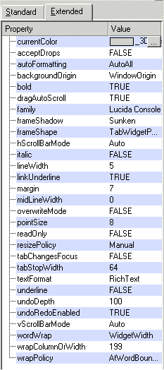
CurrentColor: The current color (textEdit).
-
AutoFormatting: Specifies the format of an object (for example, textEdit):
-
-
"AutoNone": Do not perform any automatic formatting.
-
"AutoBulletList ": Only automatically format bulletted lists.
-
"AutoAll ": Apply all available auto-formatting.
-
In CTRL, set the property with "autoFormatting".
-
AllColumnsShowFocus: Specifies whether items (tree) should show keyboard focus using all columns.
-
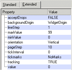
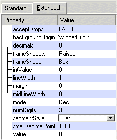
BackgroundOrigin:Specifies the origin of a widget's background. This attribute only makes a difference if the widget has a background pixmap in which case positioning matters. The possible backgrounds are:
-
-
"WidgetOrigin"
-
"ParentOrigin"
-
"WindowOrigin"
-
"AncestorOrigin"
-
In CTRL, set the property via "backgroundOrigin".
-
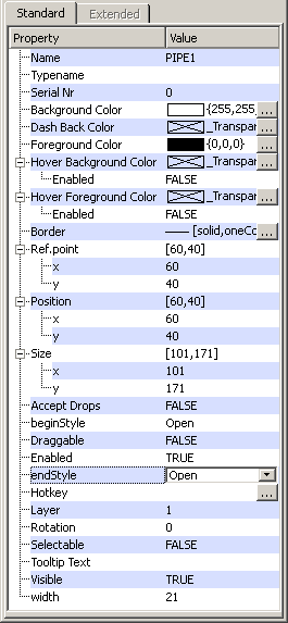
beginStyle/endStyle:Specifies thepipe connection of a pipe: open, closed or connector.
-
defaultRenameAction: The attribute "defaultRenameAction" specifies what action to perform when the editor loses focus during renaming of elements (of a tree widget):
-
-
"Accept " = an item is renamed although enter is not pressed
-
"Reject" = an item is not renamed unless you press enter.
-
In CTRL use "defaultRenameAction".
-
Defaultbutton. In a ChildPanel you can define which button shall be activated when you press the Enter/Return Key, regardless of which object currently has the keyboard focus. If you, for example, have three buttons and set the Defaultbutton attribute to TRUE for one of the buttons, the script of this button is executed when you press enter/return key. If the Defaultbutton attribute was enabled for several buttons, the code of the button that was initialized last, is executed.
-
decimals: Sets the number of decimal places of an LCD number. In CTRL set the number using "decimals".
-
intValue: Sets the value (integer) of an LCD number. In CTRL set the value using "intValue".
-
mode: Sets the mode for a LCD number. The mode:
-
-
"Hex" - Hexadecimal
-
"Dec" - Decimal
-
"Oct" - Octal
-
"Bin" - Binary
In CTRL set the mode using "mode".
-
-
numDigits: Sets the number of digits that will be displayed (in a LCD number). In CTRL, set the number of digits using "numDigits".
-
segmentStyle: Sets the segment style of an LCD number. The segment style:
-
-
Outline: Raised segments are filled with the background color (default).
-
Filled: Raised segments are filled with the foreground color.
-
Flat: Flat segments are filled with the foreground color.
-
-
smallDecimalPoint: If "smallDecimalPoint" is TRUE, the decimal point will be drawn between two digit positions. Otherwise it occupies a digit position of its own, that is, it is drawn in a digit position. In CTRL, set the property using "smallDecimalPoint".
-
step: Increment of a spin button. Integers between 1 and 1000 are allowed. In CTRL set the increment using "sbStep".
-
value: Sets the current value of an LCD number or of a spin button. In CTRL set the value for an LCD number using"value". (the value of a spin button cannot be set using the attribute "value" in CTRL).
-
lineStep: Specifies the current line step of a slider (the space between the steps). In CTRL, set the space using the attribute "lineStep".
-
maxValue: The maximum value of a slider. In CTRL set the value using "maxValue".
-
minValue:The minimum value of a slider. In CTRL set the value using "minValue".
-
Orientation: Specifies the orientation of a slider or a thumb wheel ("Horizontal" or "Vertical"). In CTRL set this property via "orientation".
-
pageStep: Specifies how many steps the slider moves when you click it. In CTRL set the number of steps via "pageStep".
-
tickInterval: Sets the interval between the tick marks. In CTRL set the interval using"tickInterval".
-
tickmarks: The attribute "tickmarks" specifies where the tickmarks are to be drawn relative to the slider's groove.
-
-
-
"NoMarks" - do not draw any tickmarks.
-
"Both" - draw tickmarks on both sides of the groove.
-
"Above" - draw tickmarks above the (horizontal) slider
-
"Below" - draw tickmarks below the (horizontal) slider.
-
"Left"- draw tickmarks to the left of the (vertical) slider.
-
"Right" - draw tickmarks to the right of the (vertical) slider
-
-
-
tracking:The attribute "tracking" specifies whether the slider tracking has been enabled. If tracking has been enabled (the default), the slider emits the valueChanged() signal whenever the slider is being dragged. If tracking has been disabled, the slider emits the valueChanged() signal when the user releases the mouse button (in other words, the attribute specifies how often the "change" script will be called, only when you release the mouse button or when the slider is being dragged). In CTRL, set the tracking using"tracking".
-
value:Sets the current value of a slider. In CTRL set the current value using "value".
-
vertical: A check box or combo box can be shown horizontally (FALSE) or vertically (TRUE).
-
BoldBold: Specifies if the current format is bold or not. In CTRL, set this property with "bold".
-
DragAutoScroll:This attribute specifies if autoscrolling in drag move events has been enabled. This attribute makes a difference when an object contains so much text that the scroll bars become visible and you want to move a selected text with drag&drop. In this case, this attribute specifies whether the content should scroll (when you reach the margin) or not.Set this property in CTRL with"dragAutoScroll".
-
Family: Specifies the font family of the current font. In CTRL, you can query the current font family with the attribute"family".
-
FrameShadow:The attribute "frameShadow" specifies the frame effect (3D effect) of a textEdit, progress bar, tree widget or a thumb wheel. Possible effects are"Plain", "Raised" or "Sunken". In CTRL, use the attribute"frameShadow".
-
FrameShape:The attribute "frameShape" sets the style of a textEdit frame, a thumb wheel, a tree widget or a progress bar. Possible shapes are:
-
-
-
"NoFrame " //no frame
-
"Box " // rectangular box
-
"Panel" // rectangular panel
-
"WinPanel" // rectangular panel (Windows)
-
"HLine " // horizontal line
-
"VLine " // vertical line
-
"StyledPanel " // rectangular panel depending on the GUI style
-
"LineEditPanel " //is used to draw a frame suitable for line edits. The look depends upon the current GUI style.
-
"TabWidgetPanel " //is used to draw a frame suitable for tab widgets. The look depends upon the current GUI style.
-
"MShape " //internal mask.Note that "MShape" should not be used!
-
-
In CTRL set the attribute via "frameShape".
-
freezeOnStop(bool)
If activated (= TRUE) the trend will trigger the freeze mode instead of the normal stop mode in case a ruler is set. During the freeze mode the trend stops displaying newly received values but the values are still received and collected. It is recommended to set the property inside of the "Initialize" script of the trend to prevent displaying errors if the property is set afterwards.
-
HScrollBarMode:The attribute "hScrollBarMode" sets the horizontal scroll bar mode of a textEdit, tree widget or a table. In CTRL, set the attribute with"hScrollBarMode".
-
itemMargin: The width of the element margin (dpTree).
-
Italic:The attribute "italic" sets the font (for example, of a textEdit) to italic. In CTRL, set the attribute with"italic".
-
isToggle: If the attribute isToggle of a button has been set to TRUE, the button remains pressed although you have released it.
-
LineWidth:The attribute "lineWidth" sets the width of a textEdit, a progress bar, a tree widget or a thumb wheel (frame) line. In CTRL, set the attribute via"lineWidth".
-
LinkUnderline:The attribute "linkUnderline" underlines a link (the format of the text has to be rich text, see the CTRL attribute "linkUnderline").
-
Margin:The attribute "margin" specifies the distance between the innermost pixel of a frame and the outermost pixel of the rectangle inside this frame(TextEdit, Thumb wheel, Progress bar,TreeWidget). In CTRL, set the attribute with "margin".
-
MidLineWidth:The attribute "midLineWidth" sets the width of the mid line (content) for a thumb wheel, a tree widget or a progress bar. See the CTRL attribute"midLineWidth" for a sample image.
-
resizeMode:This attribute specifies whether all, none or the only the last column of a tree widget should be resized.The resize mode:
-
-
-
"NoColumn" = The columns do not get resized.
-
"AllColumns" = Allcolumns will be resized equally to fit the width of the tree view.
-
"LastColumn" = The last column will be resized to fit the width of the list view.
-
-
-
rootIsDecorated:The attribute "rootIsDecorated" specifies whether the tree view shows open and close signs on root items. In CTRL, use"rootIsDecorated".
-
SelectionMode:The attribute "selectionMode" specifies how a tree view reacts to selection by a user:
-
-
-
"Single"= When you select an item, any item already selected becomes unselected. You can unselect the selected item by clicking on the empty space within the tree view.
-
"Multi"= When you select an item in the usual way, the selection status of that item is toggled and the other items are left alone. Also, multiple items can be selected by dragging the mouse with the left mouse button pressed.
-
"Extended"= When you select an item in the usual way, the selection is cleared and the new item selected. However, if you press the Ctrl key when clicking on an item, the clicked item gets toggled and all other items are left untouched. If you press the Shift key while clicking on an item, all items between the current item and the clicked item get selected or unselected, depending on their present state. Also, multiple items can be selected by dragging the mouse over them.
-
"NoSelection" - Items cannot be selected.
-
-
-
showSortIndicator:By using "showSortIndicator", you can sort columns of a tree widget by clicking on the column headers:
-
TRUE = Sort columns by clicking on the column headers (displays an arrow to indicate the sort order of the content).
-
FALSE = Sort columns by clicking on the column headers (no arrow is displayed).
-
showToolTips: Specifies whether the tree view should show tooltips for truncated column texts:
-
-
-
TRUE= shows tooltips for truncated column texts.
-
FALSE = does not show tooltips for truncated column texts.
-
-
-
treeStepSize:Specifies the number of pixels a child is offset from its parent(tree). In CTRL set the number of pixels using "treeStepSize".
-
OverwriteMode:Sets the overwrite mode of a textEdit. In CTRL, set the mode with"overwriteMode".
-
PointSize:The attribute "pointSize" sets the font size of a textEdit text. In CTRL, set the size with"pointSize".
-
ReadOnly:The attribute "readOnly" sets a textEdit document to read only. In CTRL, set the document to read only using"readOnly".
-
TabChangesFocus: If the attribute "tabChangesFocus" has been set to TRUE, it will not be possible to input tabulators. In CTRL, you can set the attribute with "tabChangesFocus".
-
TabStopWidth:The attribute "tabStopWidth" sets the tab stop width of a textEdit. In CTRL, set the width with"tabStopWidth".
-
TextFormat: Sets the text format of a textEdit.The text format can be either "PlainText" or "RichText". In CTRL, set the text format using"textFormat".
-
Underline: Underlines the current font (text). In CTRL set the format using "underline".
-
UndoDepth: This property holds the depth of the undo history. In CTRL, set the attribute with "undoDepth".
-
UndoRedoEnabled: Specifies whether undo or redo has been enabled. In CTRL, set this property with"undoRedoEnabled".
-
VScrollBarMode:The attribute "vScrollBarMode" sets the vertical scroll bar mode of a textEdit, a tree widget or a table. In CTRL set the scroll bar mode via"vScrollBarMode".
-
WordWrap:The attribute "wordWrap" specifies the different word wrap modes (of a textEdit):
-
-
"NoWrap" = Do not wrap the text.
-
"WidgetWidth" = Wrap the text at the current width of the widget (this is the default). Wrapping is at whitespace by default; this can be changed with "wrapPolicy".
-
"FixedPixelWidth" = Wrap the text at a fixed number of pixels from the widget's left side. The number of pixels is set with "wrapColumnOrWidth".
-
"FixedColumnWidth" = Wrap the text at a fixed number of character columns from the widget's left side. The number of characters is set with "wrapColumnOrWidth".
-
In CTRL, set the word wrap mode with "wordWrap".
-
The attribute "wrapColumnOrWidth" sets the number of characters for the wrap mode "FixedColumnWidth" and the number of pixels for the wrap mode "FixedPixelWidth" (see attribute wordWrap above). In CTRL set the number of characters or pixels via"wrapColumnOrWidth".
-
WrapPolicy:The attribute "wrapPolicy" specifies where text (of a textEdit) can be wrapped in word wrap mode. Word-wrap options:
-
-
Anywhere - Break anywhere, including within words.
-
AtWordBoundary - Break lines at word boundaries, for example, spaces or newlines.
-
AtWordOrDocumentBoundary - Break lines at whitespace, for example, spaces or newlines if possible. Break it anywhere otherwise.
-
In CTRL, set this property with "wrapPolicy".