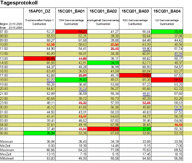
Example of a daily report for a weather station
The following example of a daily weather station report illustrates a selection of reports configured very simply with different value formatting. The maxima and minima of each column are highlighted by a red or green background, respectively while various values are marked as invalid or as correction values according to their status.
For daily report the 2 o'clock value is not written (empty row). When switching daylight saving on, the value is written twice when switching daylight saving off (two rows for 2 o'clock).
When you create a report worksheet it is saved in a template file (.xlt): Example in figure.
The report containing (actual) sets of values from the WinCC OA archive and analysis results can be viewed in a report file (.xls) such as that shown in figure.
The Excel window
The title bar of the Excel window displays the file name "Operating_report_20001022.xls" (see Report file names).
The menu bar contains the familiar Excel menus (see Excel Online Help) plus the WinCC OA Report menus (see Layout and navigation of WinCC OA Excel Report - Online Help).
The Excel worksheet
The worksheet with the name "Sheet1" displays the formatted table with the query and analysis result.
The header section of the worksheet shows the report name and the column titles.
The data area of the report contains n values; in this example it is a daily report containing 24 hourly values in 24 rows. The number of values is actually determined when selecting the report type by the settings in thePeriodandIntervalfields under "Time range" inReport/Configuration/Report types. The screenshot "Configuring a report type" shows the time range setting for the weather station report in figure.
Column A displays 24 time points ( = period) with the [Day, Hour] (= interval)
Column B shows the 24 hours starting at 7.00 o'clock.
Columns C to G display the values for each time point in the data area.
Column C for example displays the data point with the DP name "15AP01_DZ" and the DP comment "Dry weather pump1".
"SumNumber" is a DP function that is calculated at the same time as the history values are archived. (See PARA module/Data point configs/_dp_fct).
The footer area of the table displays in column A the result functions (result query) that are applied to each of the sets of values for linking and analysis. (see Control keys.)
Column B shows the same functions but in a different format.
Columns C to G display in the footer area the respective results for each column (that is, for each data point).
Further layout examples of report worksheets
The following list provides some examples for extra features that can be added to a worksheet (for more details, refer to the Water supply example of use):
-
A logo in the far right of the header above the last column,
-
Additional calculation columns using Excel functions (across the row), such as sums, differences, mean values
-
a bar chart positioned in the table footer (as in the Water supply report),
-
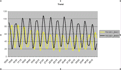
a trend or line chart located in a separate chart sheet (as in Figure 20).
The Figure below shows a simple line chart (trend) based on the table above.
The chart elements are:
-
x-axis units with category label
-
y-axis units
-
Legend (labelling of value sets), for example, data point name from the column titles
Headings can be added if required:
-
Chart title, for example, Trend
-
Axis title (x)
-
Axis title (y)
You can see other layout options for trend diagrams (line charts) and other chart types in Water supply example of use and in the Report design section.