Water supply system example
Interpreting the report
The water balance-sheet in the figure shows the water levels of the two reservoirs, with two water supply rates displayed on one side, and the water consumption per unit of time for the four town areas displayed on the other.
Worksheet
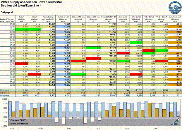
The Daily report worksheet displays values read from the WinCC OA archive for a certain period (in the example from 07.01.2001, 7:00 hours to 08.01.2001, 6:00 hours), plus columns containing values calculated from these.
Bar chart
The Bar chart illustrates very clearly the difference between the incoming water supply rate and water consumption rate (mean values) per unit of time. The total water intake per unit of time is shown as light-blue bars. The total water consumption in all four town areas per unit of time is shown as orange bars. Negative (that is, above average) consumption figures between 13:00 and 19:00 are shown as white bars that also appear below the zero-level or base line of the chart.
The following explanation of the chart elements draws on Excel terminology used in the Excel dialog boxes and the Excel Help.
-
The x-axis is the time axis and is labelled with the time values in steps of 4 hours. There is no title for labeling the x-axis (category axis).
-
The y-axis in the chart is the scale axis for the water quantities, in the example in m³/h. The y-axis (scale axis) is labelled in steps of 5000 (to three decimal places). There is no title for labeling the y-axis.
-
The units for the x and y-axis respectively are found automatically from the worksheet by Excel.
-
The hour values (x values) are linked to the first column of the report worksheet.
-
The water quantities (y values) are generated automatically by Excel from the spreadsheet values.
-
The set of values and the time units (x-axis label) each depend on the data range and cell area selected when creating the chart.
-
The legend defines how each set of y values (set of water quantity values) is assigned to each category on the x-axis (time units). The legend is positioned in the lower-left of the chart with a graphical sample a legend label.
-
A has been inserted in the bottom-right of the chart. You can design the charts in a large variety of ways using the Excel drawing functions.