Frequency distribution
The frequency distribution trend (<proj_path>/panels/vision/frequency_distribution.pnl) displays the averaged distribution of the frequency of data point element values over a period of time.
Figure: Frequency Distribution of a Value over one Day with 10 Classes evenly distributed over the Value Range
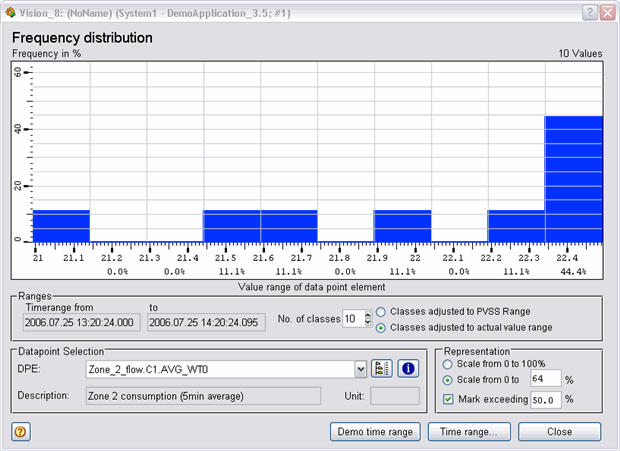
The value range (WinCC OA value range or actual range between two limits) is displayed along the horizontal axis. In the diagram, this range would be from 0 to 10 m³/h.
The horizontal axis is divided into classes. In this case, the WinCC OA value range is therefore divided into 10 equal-width value classes. The first class corresponds to 0 to 1 m³/h, the second 1 to 2 m³/h and so on. The number of classes can be selected to suit the occasion.
The vertical axis, as a proportion of the overall time, indicates the frequency with which the values lie within a class. This information is also displayed as a figure below each class. For instance the measured values are in the range from 4 to 5 m³/h for 18.5 % of the time period considered. The sum of all averaged frequencies therefore always equals 100%.
In addition, any bars that lie above a particular frequency value can be displayed in a different color (Mark exceeding nn%).
The frequency distribution trend actually calculates the true, time-weighted distributions but does not work for cyclic values with equidistant time periods.
The frequency distribution trend is implemented with the bar-trend widget (see also Bar trend) and several calculations in a Control script (see also Control fundamentals).
The Weather Station process display represents an example of this trend and opens by clicking on the "Frequency distribution" button.