Navigation facilities
A wide range of navigation options can be implemented with WinCC OA which provides all the usual tools necessary for contemporary user-interface design.
The DemoApplication only utilizes some of the possible options and by no means covers the full spectrum of available navigation features.
Starting from the central operation panel, this section illustrates different navigation options from a user viewpoint and also describes the steps necessary to implement them.
Start cascade
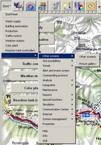
All major process displays, overviews and analysis panels can be accessed by means of a button that opens a tree-like branching structure, the cascade. The cascade button is located at the top left of the central operation panel. The cascade is identical to the cascade in the panel topology.
Implementation:
Creating a primitive symbol in WinCC OA, inserting it in a process display and configuring it is a simple matter with the graphics editor GEDI (see also Complex graphics objects and Cascade functions in Control).
The cascade is based on and uses the functions of the panel topology
(PT_cascase0_1.pnl). Open the panel
naviPanel_user.pnlin<project_path>/with
the graphics editor and click on the Start button. The
panels/para/PanelTopology/templatesPT_cascase0_1.pnlpanel appears as source in the property
sheet.
The "start panel" can be selected, customized and is the starting point for the panel topology. The panel topology is essentially an Explorer-like tree structure, grows out from this panel and can contain as many nodes and sub-nodes as necessary. These are linked to panels, for instance, main panels are placed on nodes while detailed views are placed on their associated child nodes. For more information about the panel topology, see chapter panel topology.
Figure: Start Cascade for opening a Panel
Buttons in the operational panel - Direct selection
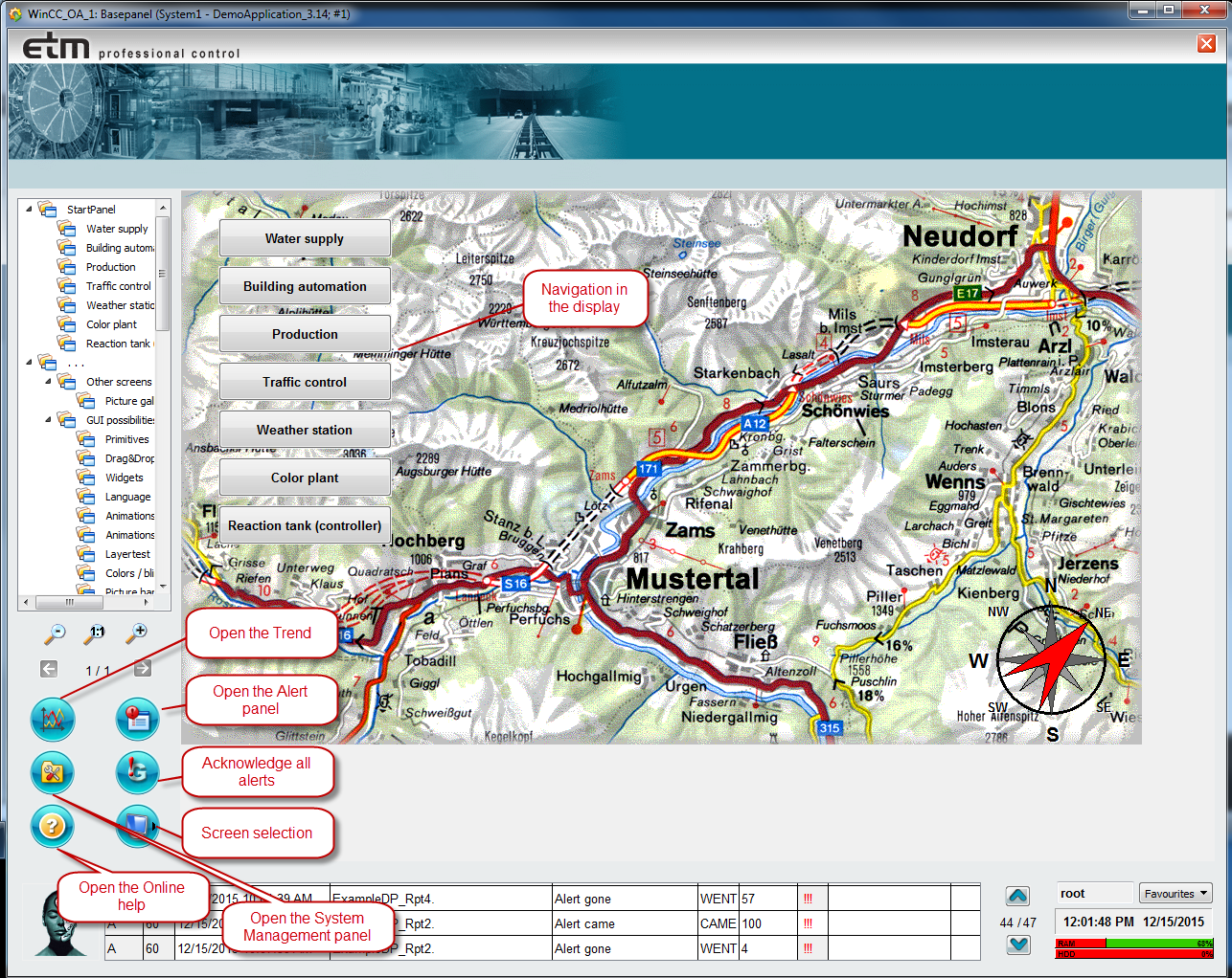
In the central operation panel, in the left half of the operating block, there are five buttons containing icons that represent the different industry scenarios, see Navigation facilities. Display a scenario in the main area of the central operation panel by clicking on the button for the desired scenario.
Implementation:
basepanel_user.pnl in the
<proj_path>/panels directory in the graphics editor (GEDI).
                    Then select the push buttons (not standard symbols), point at the
                        "Standard" tab and select "Clicked".
The buttons for standard symbols that are based on the panel topology have a more complex structure. They are reference objects, that is, standardized elements with explicit parameters, see also Properties of references and over configuration. In this case, a configuration dialog opens by right-clicking a button for its context menu and selecting "Properties". In this panel you can configure this button to show the process display and configure the associated icons and group alert data points. Implementation includes incorporation of the ApplicationProperties data point. For more information about setting properties, see the section Properties Panel.
Buttons in the process displays
A new process display can also be opened from within a current process display. See
the example in the geographical overview panel
(<proj_path>/panels/mainpanels/geographical_overview.pnl).
Implementation:
The necessary parameter settings again can be viewed directly in the panel with the help of the graphics editor or can be looked up in the Online Help under the section Simple configuration for the GEDI.
Panel topology
Panel topology allows navigating between the plant images of the DemoApplication. You can navigate left, right, up and down through the Panel topology.
The "start panel" can be selected, customized and is the starting point for the panel topology. The panel topology is essentially an Explorer-like tree structure, grows out from this panel and can contain as many nodes and sub-nodes as necessary. These are linked to panels. For instance, main panels are placed on nodes while detailed views are placed on their associated child nodes. With just a few clicks you can integrate a panel topology into a project and configure it. The independent panels that exist outside the topology are linked to a similar structure of intermediate nodes (this sub-tree is supplied as part of WinCC OA and can be edited by the user or extra nodes added to it).
In the DemoApplication it is also possible to execute a script Evalscript functionName() in the $parameter field of the parameter panel (in the panel topology). EVALSCRIPT functionName() evaluates a dollar parameter before the panel is opened. Furthermore, it is possible to execute a script instead of opening a panel. EXECSCRIPT functionName() is added to the Panel(inc.rel.path) field in the node configuration panel of the panel topology. However, the script can only be added if the node is added to the "..." branch of the main panel (in the panel topology).
Panel list
There is yet another option for showing process displays that is provided more for
maintenance purposes than for general navigation. Right-clicking on the Layer button
(to the right of the panel ring) opens a list of all process displays held in the
directory <proj_path>/panels/mainpanels. A selected panel
then opens in the main area of the central operation panel.
Implementation:
The list can be found and displayed directly from the panel currently running. WinCC OA provides many functions for file and directory access (see also File functions) in such a way that implementing this reporting facility is a relatively simple matter. The list itself displays as popup menu (see also the popupMenu()Control function) whose options and sub-structures can be defined at runtime. For details refer to the corresponding Event script in the graphics editor.
Navigator - "Birds Eye View" window
The "Navigator" function for zooming and panning in VISION is also available in the DemoApplication and can be opened with this button in the operating block. This "Birds Eye View" window can be attached to any module in order to enable navigation within this module. This function allows separate zooming of canvas modules.
Implementation:
The navigator consists of a panel
(panels/vision/navigator.pnl), with embedded zoom
functions and an ActiveX object. For detailed information, see the section
Zooming/Panning in the chapter Fundamentals VISION in the WinCC OA online
help.
Navigation around the object
Nearly all dynamic symbols (see also Properties of references and over-configuration) can have child panels for operation, additional information and trends or possess context menus for configuration. These you can open directly by left-clicking or right-clicking (context menus) on the object reference.
Implementation:
This area includes a wide range of options for interface design. The different scenarios contain examples for using this type of navigation elements. The sections Simple Configuration and Panel functions explain how panel handling is implemented in WinCC OA and the complex user-interface design process.