Configuration of a Symbol
The "Reference Definition" panel is automatically opened every time a symbol is added to a panel. It allows the configuration of a symbol.
On the tabs of the panel you can select how a state change should be shown. The panel contains the following tabs: mandatory, representation, optional and rule.
By using the panel, you specify:
-
a master data point: mandatory definition of the master data point element whose state value is displayed via the symbol; - see mandatory tab
-
definition of the symboldisplay: Background colors, images, rotations, forms, etc. - see representation tab
-
detailed configuration of a symbol (specified via $-Parameters); - see optional tab
-
rules on visibility, activity and highlighting of a symbol; - see rule tab
Mandatory Tab
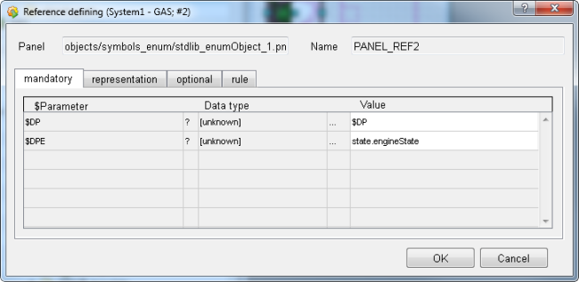
$DP
It is important that this value remains unchanged -> Value = $DP. The necessary data point is specified by the user of the library.
Do not assign a value to the $ parameter $DP. The required value must be specified by the user of the library.
$DPE
Click on the cell with the three dots "..." (see the figure above) in order to specify a data point element whose state should be represented via the symbol in the connected panel. The data type of the element must correspond to the data type of the symbol, i.e. in the case of the symbol template_enum_l, the datapoint element must be of integer data type. Enum data type is a list of integer values.
Representation Tab
On the representation tab, you can specify the color, the images and the rotation of a symbol. The "representation" tab contains the following settings: "Number of States", "Image", "Form", "Rotation" and "Definition of values"
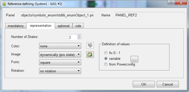
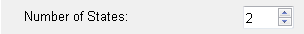
Number of States
Specifies the number of states and therefore also the color states that a symbol can display (1-50).Note, however, that the colors or the images for the state MUST be specified via the further options - see below.
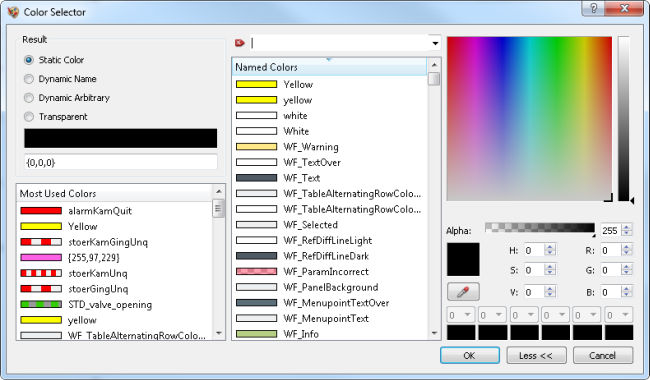
Color
Defines the colors in which the background of a symbol should be displayed. By default the display "dynamically (pro state)" is selected.
The following displays are possible:
none - the symbol is not displayed in any color. This option can only be selected if several images are selected (no static image).
static - the background color of the symbol is displayed statically. This
means that it is not dependent on the value or state and always remains the same.
This option can only be selected if several images are selected (no static image).
Click on the  button in order
to select a color via the color selector.
button in order
to select a color via the color selector.
In order to achieve special effects, slightly transparent images can be used in combination with the background color display.
dynamically (pro state) - the background of the symbol is displayed per state
in a selected color. Click on the button in order to open the "Definition" panel for the color selection.
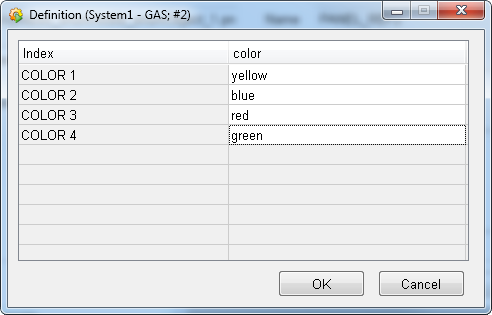
For every state value (COLOR x) of the "Index" column, a color must be given in the "Color" column. Click on the corresponding cell in the "Color" column in order to open the color selector and determine a color.
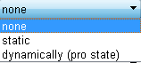
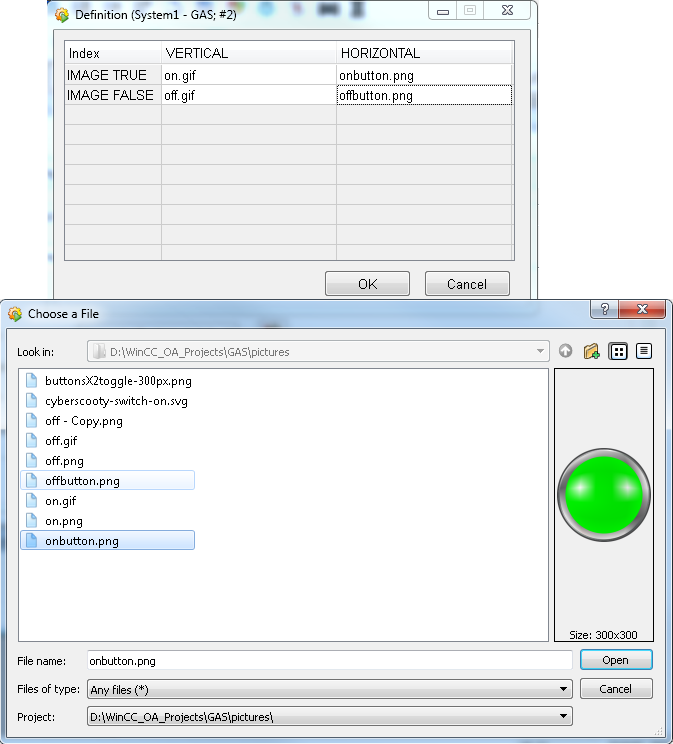
Image
Allows displaying an image in the symbol. Note that the selected images must be saved in the project directory \pictures. By default, "static" display is selected.
The following displays are possible:
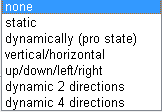
none - no image is displayed. This option can only be selected if several colors are have been selected (no static colors).
static - the selected image is displayed statically. That means that this is
not dependent on the value or state and always remains the same. This option can
only be selected if several colors have been selected (no static colors). Click on
the  button in order to open
the "Choose a file" window and select an image.
button in order to open
the "Choose a file" window and select an image.
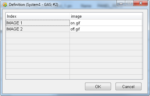
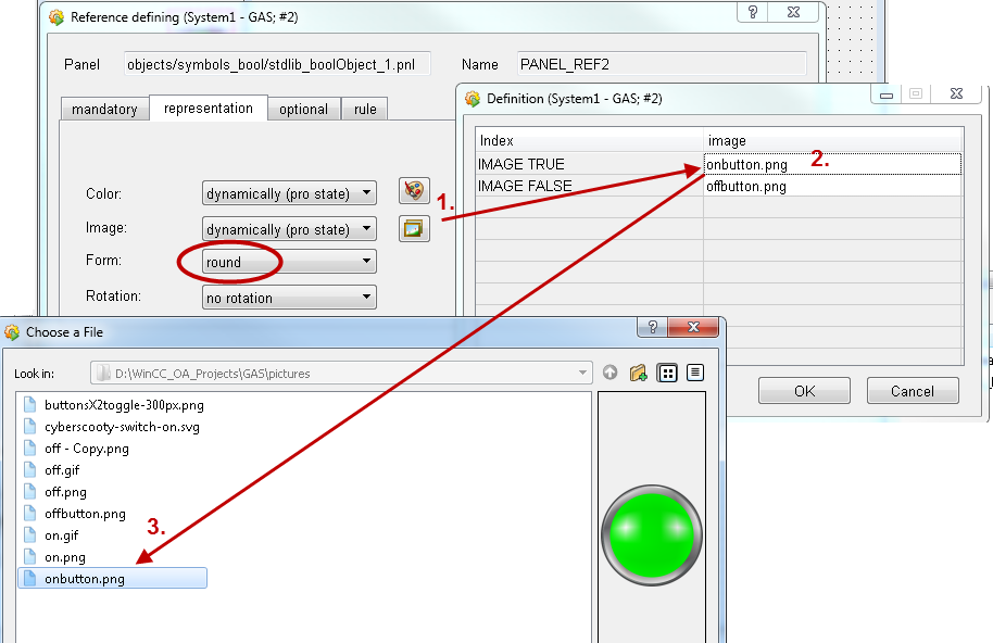
dynamically (pro state) - a selected image is displayed per status value.
Click on the button in order
to open the "Definition" panel for choosing the image. For every state value (IMAGE
x) of the "Index" column, an image must be selected in the "Image" column. Click on
the corresponding cell in the "Image" column in order to open the "Choose a file"
window and select a color for a status value.
In the images below two images were selected for the two selected states.
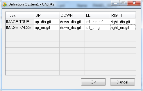
horizontal/vertical - depending on the direction in which the symbol will
later be shown ($-Parameter $_DIRECTION_2), different images can be selected. Click
on the button in order to open
the "Definition" panel for choosing the images. For every position (IMAGE
vertical/horizontal) of the "Index" column, an image must be selected in the "Image"
column. Click on the corresponding cell in the "Image" column in order to open the
"Choose a file" window and select an image for a position. If this display is
selected, the definition of the rotation is not possible (see "Rotation" below) -
"no rotation" will automatically be selected.
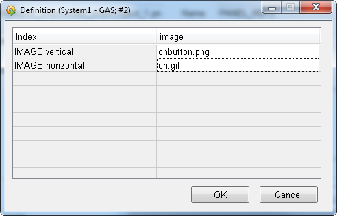
When the symbol is later used by a library user, the position can be changed via the reference panel.
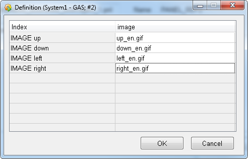
up/down/left/right - depending on the direction in which the symbol will later
be shown ($-Parameter $_DIRECTION_4), a different image can be selected
respectively. Click on the
button in order to open the "Definition" panel for choosing the image. For every
direction (IMAGE up/down/left/right) of the "Index" column, an image must be given
in the "Image" column. Click on the corresponding cell in the "Image" column in
order to open the "Choose a file" window and select an image for a direction. If
this display is selected, the definition of the rotation is no possible (see
"Rotation" below) - "no rotation" will automatically be selected.
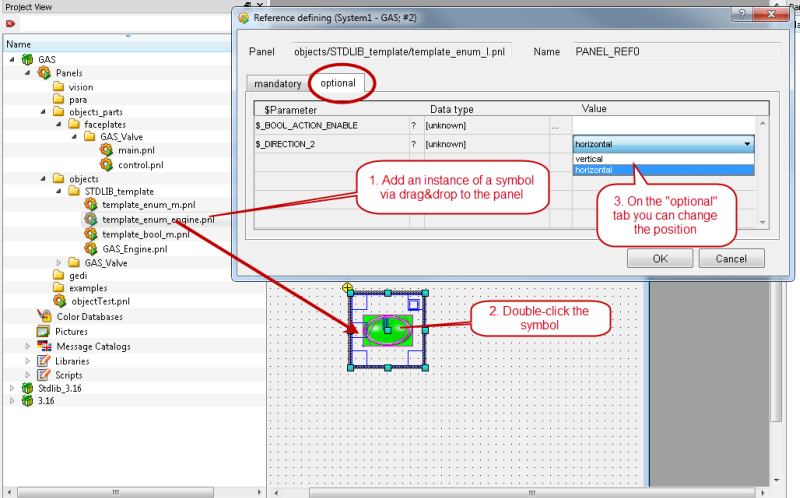
In the reference definition after adding a symbol to a panel, you can select the direction on the "Optional" tab. See figure "Graphics editor GEDI - an instance of a symbol is added to a panel and the position is changed via the reference panel" above.
dynamic 2 directions - this option combines the options "dynamic (pro state)"
and "horizontal/vertical". After clicking on the button, an image for horizontal position and
an image for vertical position must be given for every status value. If this display
is selected, the definition of the rotation is not possible (see "Rotation" below) -
"no rotation" will automatically be selected.
In the reference definition after adding a symbol to a panel, you can select the position on the "Optional" tab. See figure "Graphics editor GEDI - an instance of a symbol is added to a panel and the position is changed via the reference panel" above.
dynamic 4 directions - this option combines the options "dynamic (pro state)
and "up/down/left/right". After clicking on the button, an image must be selected for each of
the four directions respectively. If this display is selected, the definition of the
rotation is not possible (see "Rotation" below) - "no rotation" is automatically
selected.
In the reference definition after adding a symbol to a panel, you can select the direction on the "Optional" tab. See figure "Graphics editor GEDI - an instance of a symbol is added to a panel and the position is changed via the reference panel" above.
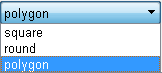
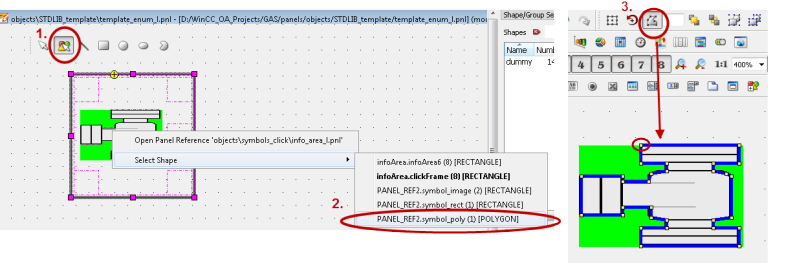
Form
Defines the background for the image that is displayed. The specification of the form is meaningful when the image has other form than rectangular. The following forms can be selected: rectangular (default), round and polygon.
The figure below shows how to select the representation form "round" for a round image that is used for a symbol.
The figure below shows how to edit a polygon image for a symbol in GEDI.
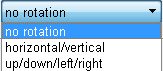
Rotation
Defines the possible rotations of the symbol. The following selection possibilities are available:
no rotation - the symbol cannot be rotated. This choice is also made if the options "dynamic 2 directions" and "dynamic 4 directions" are chosen under Image, as the selected image defines the rotation.
horizontal/vertical - the symbol can be displayed in either horizontal or vertical position ($-Parameter $_DIRECTION_2 of the later used symbol). NOTE that the horizontal/vertical rotation can only be used for the Image types "static" and "dynamically (pro state).
up/down/left/right - the symbol can be rotated in four directions - up, down, left and right ($-Parameter $_Direction_4 of the later used symbol). NOTE that the up/down/left/right rotation can only be used for the Image types "static" and "dynamically (pro state).
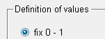
Definition of Values
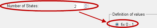
Only adjustable for the symbols of type "Enum". Specifies in which way the status values are defined. This specification is only available for symbols of type "Enum". By default, a fixed definition is set. The following definitions can be selected:
fix 0 - <NumberOfStates-1> - the state values are determined based on
the information of the corresponding state value number
This means that the "Number of States" changes the "Definition of Values".
variable - a row of values can be specified that correspond to a certain state . After selecting this definition, click on the button with the three dots "..." in order to specify the values for every state. Separate the values via a comma.
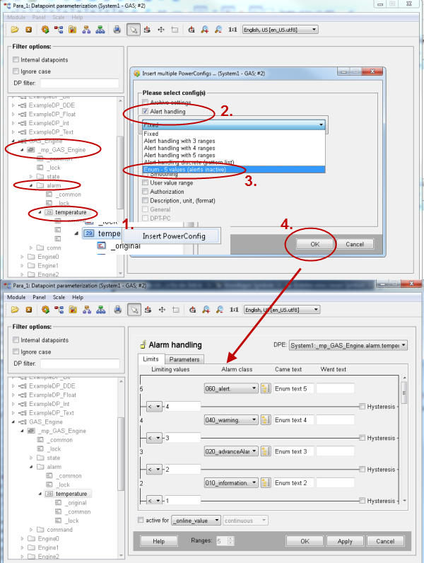
from PowerConfig - the definition of the values is defined by a WinCC OA enum-alert handling PowerConfig added to the master data point. Add an alert handling to the master data point of the data point type you are using. Select the option "Enum - 5 values (alerts inactive). The four statuses are then used for the representation of the symbol.
Figure: Add an enum alert handling to a master data point
For information on PowerConfigs, see WinCC OA online help PowerConfigs, basics.
Optional Tab
$-Parameters for the advanced definition of the reference. This information is optional. If a value for an optional $-Parameter is not entered (empty), then its default value is used. A table with all optional $-Parameters and their meaning can be found under $-Parameters.
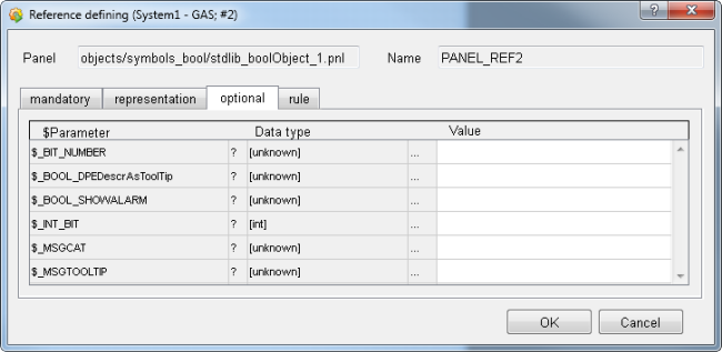
Here the direct links to the relevant sections of the $ parameter description for a boolean reference - see figure below.
Figure: "Optional" tab of a boolean Reference
Rule Tab
$-Parameters are used for the advanced definition of a symbol. The rules can optionally be set if the default value does not meet the requirements. The rules are specified by using a rule and a DPE together. In other words the rule and a DPE build a pair.
Figure: "rule" tab of a boolean Reference
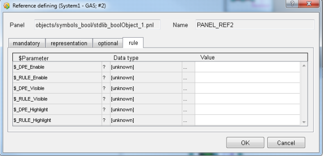
The same rules are also available for enum references.
In the table below you can find the rules and the corresponding DPEs.
| DPE&Rule | DPE | Rule |
|
$_DPE_Enable The elementary symbol is set active (TRUE) or inactive (FALSE) based on this data point element. Click on the column with the three dots "..." in order to open the data point selector for selecting the data point element (whose value determines the activity of the elementary symbol). |
$_RULE_Enable Here, define a rule for when an elementary symbol of the data point element should be set active. Enter the rule directly or use the Rule Editor, which is opened by clicking on the cell with the three dots "...". The rule is compared with the value of the data point $_DPE_Enable during runtime and sets the elementary symbol inactive/active accordingly. |
|
|
$_DPE_Visible Specifies the data point elements that are responsible for setting the elementary symbol visible (TRUE) or invisible (FALSE). Click on the column with the three dots "..." in order to open the data point selector for choosing the data point element. |
$_RULE_Visible Here, define a rule for when the elementary symbol of the data point element should be visible. Enter the rule directly or use the Rule Editor, which is opened by clicking on the cell with the three dots "...". The rule is compared with the value of the data point $_DPE_Visible during runtime and sets the elementary symbol visible/invisible accordingly. |
|
|
$_DPE_Highlight Specifies the data point elements that are responsible for setting the elementary symbol as highlighted (TRUE) or not highlighted (FALSE). Click on the column with the three dots "..." in order to open the data point selector for choosing the data point element. |
$_RULE_Highlight Define a rule for when the elementary symbol of the data point element should be highlighted. Enter the rule directly or use the Rule Editor, which is opened by clicking on the cell with the three dots "...". The rule is compared with the value of the data point $_DPE_Highlight during runtime and highlights the elementary symbol accordingly. |
In a rule definition, the following expressions can be used as operators:
-
! = Negation
-
, = OR-combination
-
& = AND-combination
-
< = less than
-
> = greater than
-
<= = less than or equal to
-
>= = greater than or equal to
-
b<bit_number>= bit from a bit number (e.g. b3).
Example:
Rule = !(1,4,5),(27,>45&!99)
is transformed to:
if (!(x==1 || x==4 || x==5) || (x==27 || x>45 && x!=99)) {
return TRUE;
}