"cellWidgetRC"
Adds a widget (a push button or a combo box) to a table.
Synopsis
setValue(string shape, "cellWidgetRC", int row,string column, string
                    widgetType, anytype param | mapping param);
getValue(string shape, "cellWidgetRC", int row,string column, string
                    widgetType,anytype param | mapping param);
shape.cellWidgetRC(int row, string column, string widgetType, anytype param |
                    mapping param);
Parameters
| Parameter | Description |
|---|---|
| shape | Name of the object |
| row | The row |
| column | The column |
| widgetType |
The widget type can be one of the following available options:
|
| param |
Either the name of the button, the entries of the combo box or the minimum and maximum value of the progress bar (see the example further on). The list of combo labels must be preceeded by a boolean variable (TRUE/FALSE) that specifies if the selected entry in the combo box is editable or not. The parameter can also be stated as a mapping, see mapping description below. Caution: The entries of a editable combo box must not be changed via the clicked event of the table. This may result in error messages. |
Description
Adds a widget (push button, combo box or progress bar) to a table. If a cell should show a bool variable, it is shown as a check box.
If a permanently visible combo box is used the "Clicked" event is triggered when an entry within the combo box is selected (if editable) or when the value in the line edit inside of the combo box was finished (e.g. by pressing Enter or changing the focus).
param - mapping
The param parameter can also be stated as mapping with following key:
- editable / bool (default: false): Defines if the combo box is editable
- items / dyn_string: The items to be displayed
- permanent / bool (default: false): Defines if the combo box is always visible or only if the cell is edited.
If the values of a cell are changed (via script, e.g. cellValueRC, etc.) while a permanent combo box is used, the combo box tries to display the newly given value as currently selected value.
If a value is set to the combo box which is not yet available in the list of items for the combo box than the value is applied to the cell but the combo box is not showing the value (if the combo box cannot be edited).
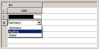
In the following example, two widgets (a button and a combo box) are added to a table. The combo box can be edited as the first passed parameter inside of the combo box entries is of value "true".
main()
{
  TABLE1.appendLine("#1", "PushButton");
  TABLE1.appendLine("#1", "Bar");
  TABLE1.appendLine("#1", "ComboBox");
  TABLE1.cellWidgetRC(0, "#1", "PushButton", "Geb.");
  TABLE1.columnEditable(0, true);
  TABLE1.cellWidgetRC(1, "#1", "Bar", makeDynAnytype(0,100));
  TABLE1.cellValueRC(1, "#1", 75);
  TABLE1.cellWidgetRC(2, "#1", "ComboBox", makeDynAnytype(true,"Germany", "Austria", "Swiss"));
}
When using the progress bar, the fill color is equal to the foreground color of the table. The fillType of the cell will be inherited to the progress bar.
Assignment
Table