
Creating Widgets for WinCC OA
This guide is the comprehensive entry point for creating custom WinCC OA dashboard widgets using standard web technologies.
What is a Widget?
-
A widget is a web component that displays data or reacts to user input.
-
It is built using HTML, CSS, and JavaScript (ES modules).
-
The widget is described by a JSON configuration file (
.widget.json) that defines:-
Its name
-
What settings it supports
-
Where its code is located
-
Basic Requirements
-
No backend logic inside the widget The widget should never query the OA server directly.
-
Transparent background Dashboard handles widget background colors.
-
Reusable structure One widget can be placed multiple times with different settings.
Widget File Structure
/data/
  ├─WebUI/
    ├─ my-widget/
    │   └─ my-widget.js (widget implementation)
    ├─ widgets-v2/
    │   └─my-widget.widget.json (widget description)
    └─ svg/
        └─ my-widget.svg (icon)
Tutorial: Creating a Temperature Widget
This tutorial walks you through creating a simple widget that displays a temperature value with a unit.
Step 1. Decide the Use-Case
Example use-case:
-
We want to show the Ambient temperature from selected Data Point.
-
The widget will display a number (
22) and a unit (°C).
Step 2. Create the Component File
Create /data/WebUI/temp-widget/temp-widget.js:
import { LitElement, html, css } from 'https://esm.run/lit@3';
import { customElement } from 'https://esm.run/lit/decorators.js';

export class TempWidget extends LitElement {
  static properties = {
    value: { type: Number },
    unit: { type: String },
    color: { type: String },
    icon: { type: String },
    name: { name: String }
  };

  constructor() {
    super();
    this.value = NaN;
    this.unit = '';
    this.color = '';
    this.icon = '';
    this.name = '';
  }

  static styles = css`
    :host {
      display: block;
      font-family: var(--theme-font-family, inherit);
      color: var(--theme-color-text, #161616);
    }

    .container {
      display: flex;
      align-items: center;
      gap: 0.5rem;
    }

    .label {
      font-weight: 500;
    }

    .value {
      font-size: 1.25rem;
      font-weight: bold;
    }
  `;

  render() {
    const contentStyles = {
      color: this.color ? this.color : '#161616'
    };
    return html`
      <div class="container" style=${styleMap(contentStyles)}>
        <ix-icon class="icon" size="16" name="${this.icon}"></ix-icon>
        <div class="label">${this.name}:</div>
        <div class="value">${isNaN(this.value) ? '--' : this.value.toFixed(1)} ${this.unit}</div>
      </div>
    `;
  }
}

customElements.define('temp-widget', TempWidget);
Step 3. Create the JSON File
/data/WebUI/widgets-v2/temp-widget.widget.json:
Notes:
-
Types: Pick only those base types you actually support (see reference). Including unnecessary types can mislead users and increase validation overhead.
-
widgetType: Still required for legacy reasons (value not used at runtime by the web component dashboard).
-
label/description: Can be inline language objects or catalog keys (preferred for reusable translations). See language catalog section for adding new keys.
-
jsonSchema: Describes data shape forwarded to the component. Avoid adding properties that the component never reads.
-
uiSchema: Use
WuiLayout(preferred) rather than generic JsonForms layout names likeVerticalLayoutunless specifically supported. (In this minimal example we keep a single content layout.) For richer examples see the schema reference file. -
Controls: Controls represent the basic building blocks for creating forms. See also the Control → Context → Attribute Reference for how controls map to contexts and widget attributes.
{
  "types": ["int", "float", "long", "ulong", "uint"],
  "widgetType": "label",
  "label": { "en.utf8": "Temperature Widget" },
  "description": { "en.utf8": "Displays temperature with unit" },
  "size": { "minRows": 2, "minCols": 4 },
  "defaultSettings": { "unit": "°C" },
  "svgFile": "data/WebUI/svg/temp-widget.svg",
  "componentSettings": {
    "scripts": ["/data/WebUI/temp-widget/temp-widget"],
    "tagname": "temp-widget",
    "jsonSchema": {
      "type": "object",
      "properties": {
        "datapoint": { "type": "string" },
        "value": { "type": "number" },
        "unit": { "type": "string" },
        "color": { "color": "string" },
        "icon": { "type": "string" },
        "name": { "type": "string" }
      }
    },
    "uiSchema": {
      "type": "object",
      "elements": [
        {
          "type": "WuiLayout",
          "label": "WUI_Settings.Area.Content",
          "options": {
            "collapsible": "open",
            "showFirstElementAsHeader": false,
            "noborder": true
          },
          "elements": [
            {
              "type": "DataPointControl",
              "scope": "#/properties/datapoint",
              "label": "WUI_Settings.Area.Datapoint"
            },
            {
              "type": "IconSelectorControl",
              "label": "WUI_Settings.GeneralLabels.Icon",
              "scope": "#/properties/icon"
            }
          ]
        }
      ]
    }
  }
}
Step 4. Add an Icon (Optional)
-
Save an SVG file in
/data/WebUI/svg/temp-widget.svg. -
Reference it in the
.widget.json.

Step 5. Test the Widget
-
Reload the WebUI.
-
Drag your widget from the palette.
-
Configure its settings (value, unit).
Troubleshooting:
-
Widget not appearing: Check that the
.widget.jsonfile name ends with.widget.jsonandtagnamematches the custom element definition. -
Script not loading: Ensure path correctness; if you omit a leading
/, the runtime may attempt internal resolution rules (see schema referencescripts). -
DataPoint value is
--: Confirm the selected datapoint produces numeric values compatible with the declaredtypeslist.
You just created your first widget!
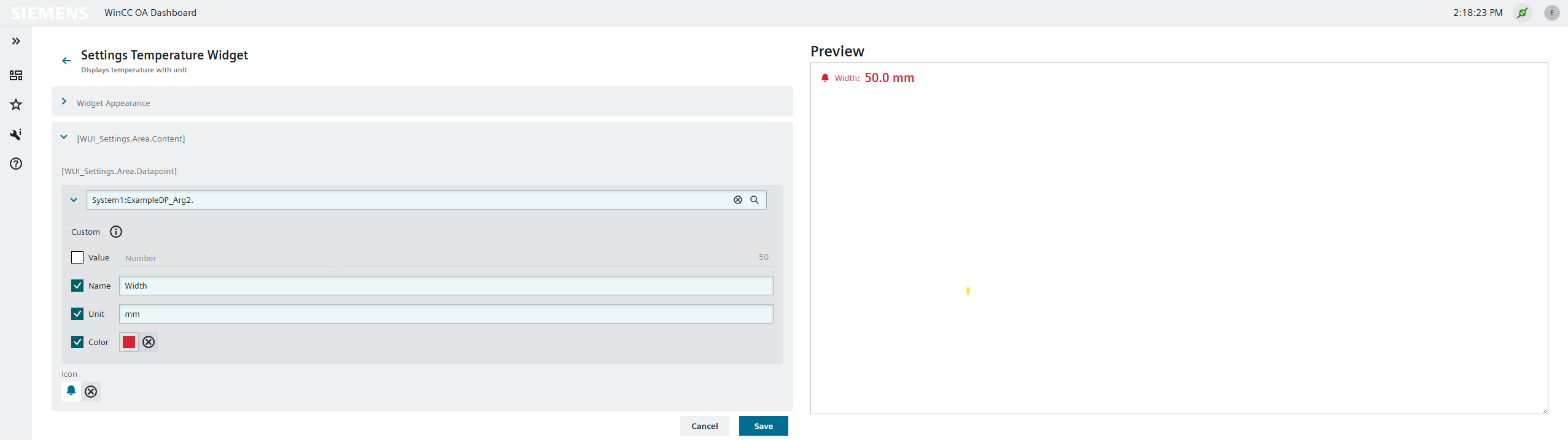
Step 6. Result Preview
Best Practices
When creating widgets for WinCC OA, follow these guidelines:
-
Keep the background transparent. The dashboard has an option to color the background of a widget based on user preferences.
-
Use IX color variables instead of fixed color codes wherever possible.
-
Use standard datapoint attributes. There are default attributes commonly used with data-points:
value,valueType,lastUpdate,name,format,unit,color,min,max,alertColor,alertRanges. When working with OA datapoints, use these attributes in the UI element. Additional attributes can be added, and not all attributes are required. -
No data retrieval in the widget. Within a UI element, data retrieval should not be done.
-
Match the tag name. The custom HTML tag defined in the widget source needs to match the
componentSettings>tagnamein the widget JSON. -
Use the correct file name. The widget JSON file must end with
.widget.json(e.g.,myWidget.widget.json). Validate the JSON structure before deployment. Place it in/data/WebUI/widgets-v2/. -
Script file references. JavaScript sources can go in any directory under
/data/. We recommend/data/WebUI/widgets-v2/<widget-name>. In the JSON schema, scripts are referenced viacomponentSettings>scripts— omit the.jsfile extension. -
Local dependencies in production. While it is possible to link libraries from public external sources (e.g., esm.run or esm.sh), we recommend linking to local files only in production.
-
Widgets are sized by the dashboard. Do not rely on screen sizes or view-height because the actual size of the widget is determined by the dashboard.