Popup Menu
The popup menu enables you to quickly add and configure popups displaying text, pictures and check boxes.
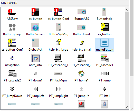
The "menuButton" is placed in a panel and opens the popup menu. It can be found in the catalog window, from where it is placed with drag&drop.
Popup Menu Configuration
The popup menu configuration is done mainly in the associated configuration panel. It opens automatically at first placement of the "menuButton" and then via double-clicking it in the GEDI.
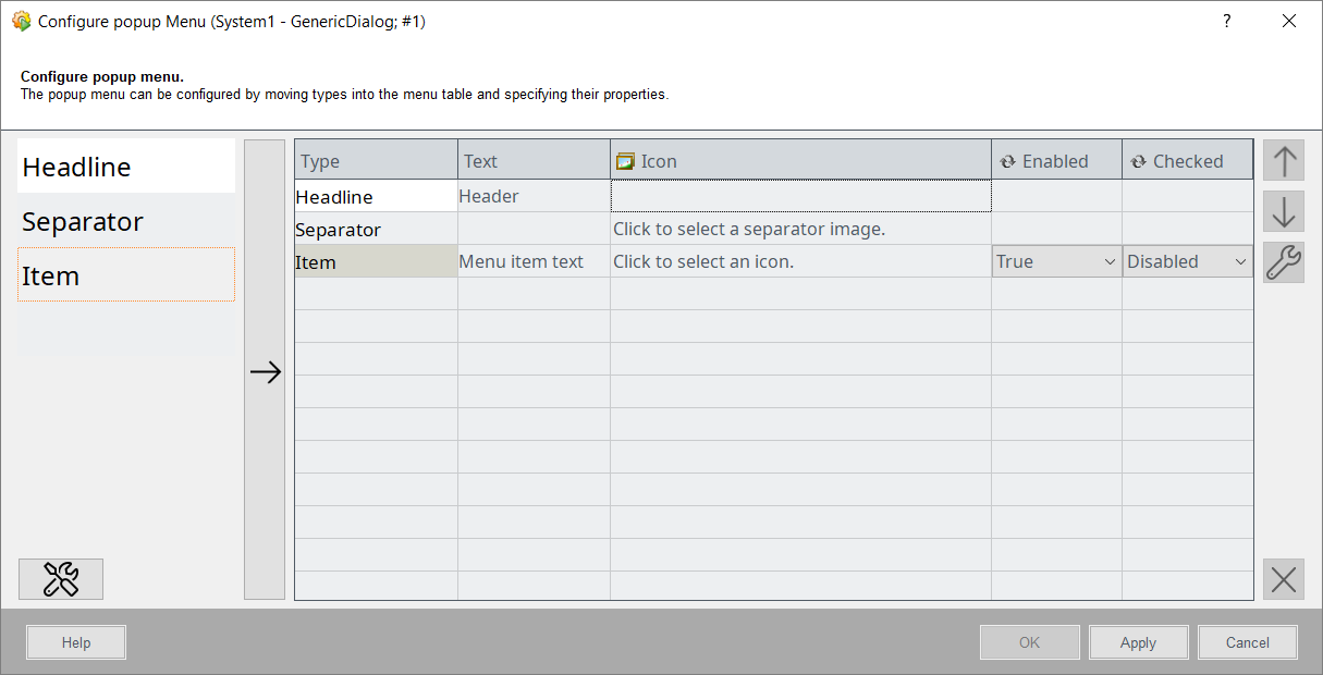
The various menu entries are added by either selecting the needed entry type and clicking "append" button, or appending it via drag&drop from the menu type list. The following menu entry types exist:
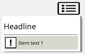
- Headline - The menu entry to display a text.
- Separator - The menu entry to display a line or an image.
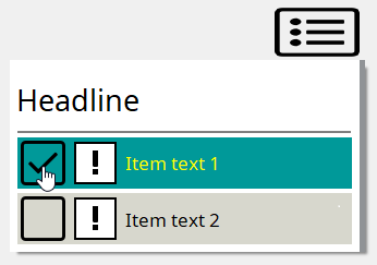
- Item - The clickable menu entry which can be a text or an image. It can also be a check box.
The menu entry will receive the appropriate default values as soon as it is placed in the configuration table. The following values can be given:
- Type - The value defining the entry type. This value is unchangeable, entries of a different type must be added separately.
- Text - The text displayed in the menu entry.
- Icon - The picture displayed by the menu entry. This is only usable for the Separator and Item entries.
- Enable - This property makes the menu entry clickable, which closes the menu. It is only available for the Item entries.
- Checked - This property adds a check box before the entry. The menu will not close when a box is checked or unchecked. This is only available for the Item entries.
The general style of the popup menu can be changed with the property button( ). This will open the
separate menu property configuration panel.
). This will open the
separate menu property configuration panel.
The order of items within the menu is set via the "up" and "down" buttons to the right. Selected Entries can be removed with the remove button below.
Menu Property Configuration
The menu property configuration panel is used to adjust the color options for the entire menu and the popup opening direction, relative to the "menuButton".
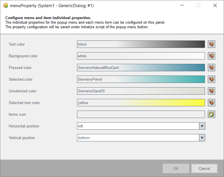
In addition to the default configuration for the whole menu, each menu entry can be
configured further. To do this, select the desired entry and open the specific
configuration menu with the edit button( ) below the "up" and "down" buttons.
Some properties are unique for certain menu entry types, such as the font format for Headline and Item entries or Icons for Separator and Item entries. Any changes made to the menu entry property will not be affected by changes made to the general configuration settings.
Popup Menu Properties and Events
Further adjustments for styling and placing can be made via the Property Editor in the GEDI.
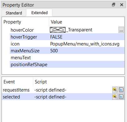
The extended properties can be either set directly in the GEDI or via control script.
To set a property via script, the property name is preceded by a "set" (e.g.:
this.setMenuText()). Available are:
- hoverColor - The background color, which appears when mouse is moved over the popup menu during runtime.
- hoverTrigger - When set to TRUE the popup menu will automatically be opened as soon as mouse is placed over it.
- icon - The icon used for the "menuButton", from which the popup menu is opened.
- maxMenuSize - The maximum size of the popup menu in pixel. If the number of menu entries would cause the menu size to exceed the specified maximum size, the popup menu will remain at the maximum size and gain a vertical scrollbar.
- menuText - If this is specified, the "menuButton" icon will be replaced with the given text.
- positionRefShape - If a shape name is set, the popup menu will be opened at the position of the specified shape.
All configurations made via the popup menu configuration panel are written into the popup menu events:
- Initialize - This event holds the popup menu styling properties.
- requestedItems - This event holds the configured popup menu entries and their values.
- selected - This event holds the actions triggered by clicking an Item entry.
While the events can be changed by the user inside the GEDI, any change will automatically be overwritten by changes made in the configuration panels.