Data mining Wizard - Correlation
In the "Correlation" panel you can:
-
detect correlations between data points
-
check the correlation coefficient to detect the highest correlation
-
view the data points with correlation in a trend to illustrate the correlation between data points
The different parts of the "Correlation" panel as well as how to use the Correlation panel are described in more detail in the following.
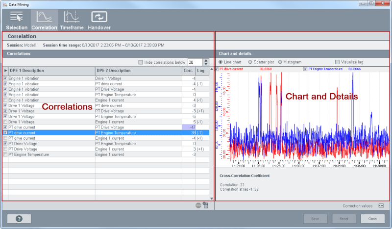
The "Correlation" panel consists of the following parts: Correlations and Details
Correlations
The "Correlations" table shows the data points that were selected in the session panel. All selected data points are compared with each other and their correlation coefficient is shown. The correlation coefficient is the degree of linear dependence between two variables. The higher the correlation coefficient, the higher the correlation is between the variables (data point values). See also cross correlation coefficient below.
 The first button stops the calculation and the
calculator symbol recalculates the correlation coefficient.
The first button stops the calculation and the
calculator symbol recalculates the correlation coefficient.
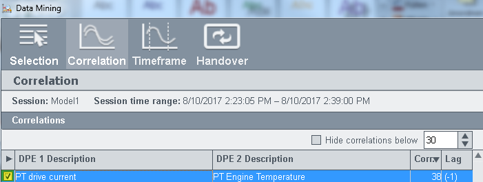
Enable the check box (see figure "Correlations - Check box") above to select the data points that should be passed on to the classification wizard. The data points are passed on via the Handover panel.
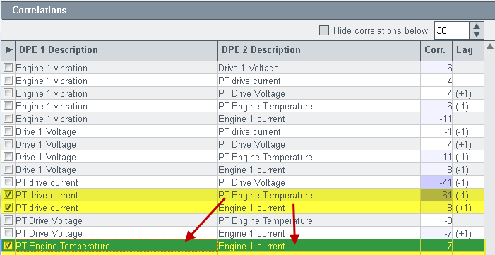
When you click on the "Save" button, further DPs that contain the same data points as the selection, are selected. In the figure below the two upper rows are selected: "PT drive current PT Engine Temperature" and "PT drive current Engine 1 current". After Saving the selection, also the row "PT Engine Temperature Engine 1 current" is selected.
Note that in case of high number of data point values (approx. over 500.000), the response time of the system is slower. Thus, the time required for a calculation is longer.
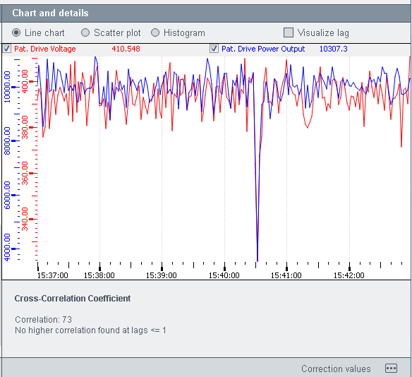
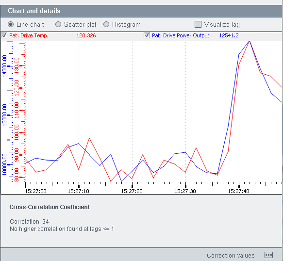
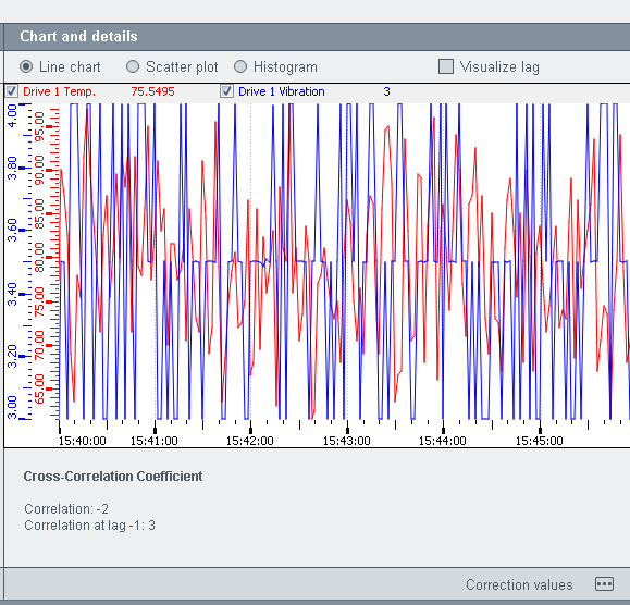
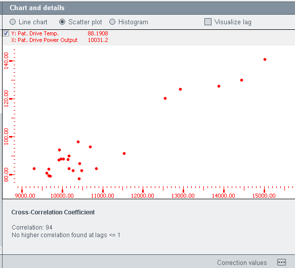
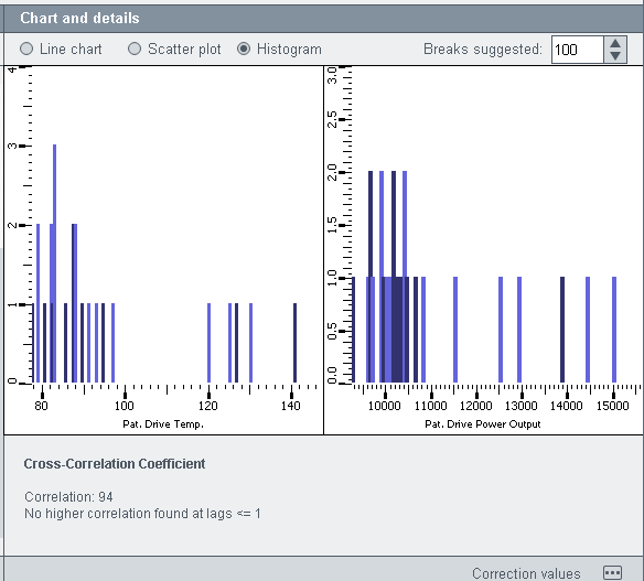
Chart and details
The Chart anddetails section provides a line chart, a scatter plot and a histogram. You can switch between the views via the radio buttons above the view (see figure below).
The cross correlation coefficient specifies the degree of linear dependence between two variables. If the correlation is strong positive correlation, it means that there is a correlation between the two variables that are being compared. A negative correlation tells you how perfect the linear dependence between two variables is but not how strong it is. If a correlation between two variables does not exist, the dependence is not linear but rather a parabola.
Scatter plots use horizontal and vertical axes to plot data points. Scatter plots, however, show how much one variable is affected by another. The relationship between two variables is called their correlation.
A histogram is a graphical representation of the distribution of numerical data. It is an estimate of the probability distribution of a continuous variable. To construct a histogram, the first step is to divide the entire range of values into a series of intervals and then count how many values fall into each interval. The intervals are usually specified as consecutive, non-overlapping intervals of a variable. The intervals must be adjacent, and are usually equal size. The histogram shows the value distribution of data points and time series. The Breaks suggested for the histogram suggest a single number that specifies the number of cells for the histogram. Note, however, that this number is a suggestion only and the number is set according to a formula (1, 2 or 5 times a power of 10).
The "visualize lag" check box shows the maximum delay between the values of two different data points.
Correction values
You can set a correction value for a data point value by using the button at the bottom of the panel. The correction values properties panel is opened. Select a data point and a time range. The values within the time range are shown (see figure below):
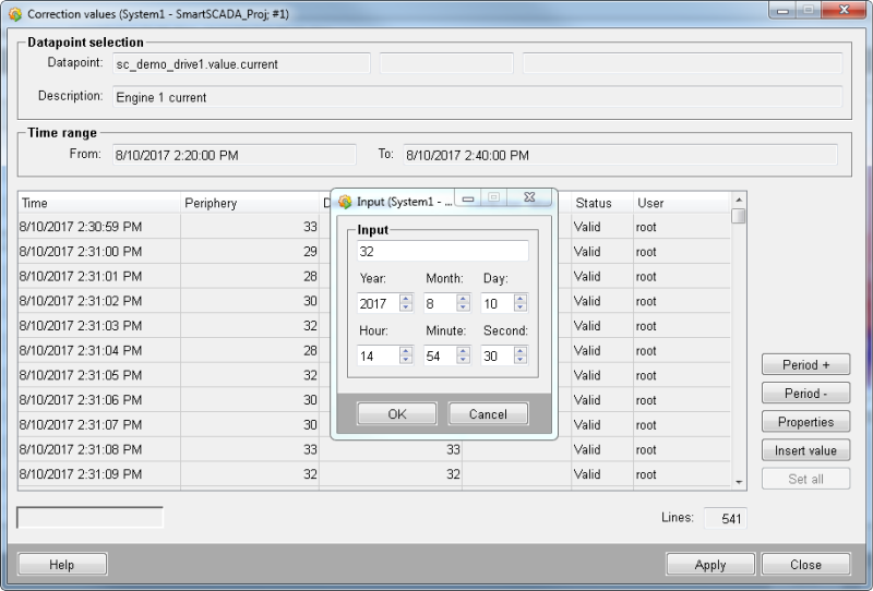
Select a value and click the "Insert value" button or setall values. Apply the changes.