Wizard Framework
Used for easy creation of wizards in a uniform layout style. The key elements "Navigation Bar" and "Bottom Bar" can be customized to fit the needs of the custom wizard.
Wizard Framework Overview
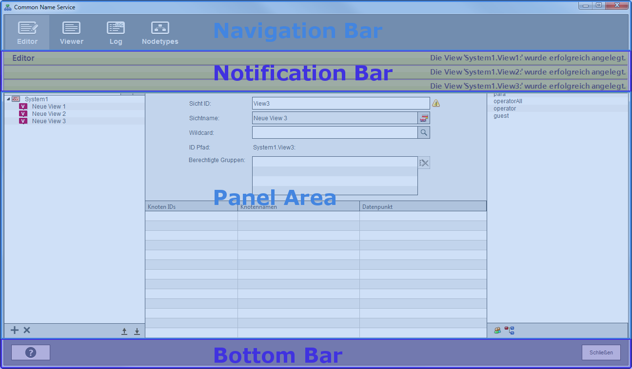
The Wizard Framework defines the look & feel of new wizards. The wizards consist of a defined number of elements. The following table gives a short description of the elements inside the framework.
| Element | Description |
|---|---|
| Navigation Bar | The "Navigation Bar" is displayed in the upper side of the wizard panel. The navigation elements inside the bar are used to navigate between the various panels inside of the wizard. |
| Notification Bar | The "Notification Bar" is used for displaying warnings and errors that might occur during the usage of the wizard. If no errors or warnings are currently active the notification bar remains hidden. |
| Panel Area | This area is reserved for the custom panels that are used inside the wizard. |
| Bottom Bar | The "Bottom Bar" is used to display the general buttons like "Close", "Apply" or "Reset". Depending on the configuration of the wizard these buttons can be available or remain hidden. |
Following screenshot displays the WinCC OA CNS Wizard that is based on the WinCC OA Wizard Framework. The elements described above are highlighted for a better understanding.
Wizard Configuration
For a faster configuration of new wizards respectively the quick adoption of existing wizard the WinCC OA Configuration panel can be used.