
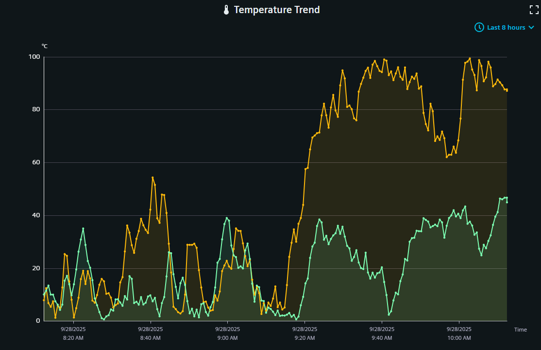
Line Chart Widget
The line chart shows one or multiple datapoint values in a graph.
Settings
The Line Chart Widget can have the custom appearance settings of custom title, colors and controls.
Time Range
N[unit]/[modifier]. For this, N specifies a
natural number, unit the chosen unit of time and the modifier specifies the start or
end of the unit or current time (if this is not provided otherwise). The available
units are:
- s - second
- m - minute
- h - hour
- d - day
- w - week
- M - month
- Q - quarter
- Y - year
- 1d/d - 1d/d - Yesterday (full day)
- 1d - Last 24 hours
- 2h - Last 2 hours
- 1w/w - 1w/w - Last week (Monday - Sunday)
Content
One or multiple series from datapoints can be picked from the project to be shown in the chart. The settings for each series are imported from the project, with a possibility to overwrite names and other settings in this content configuration. Each series can also receive a custom y axis, whose values are similarly imported from the project or set directly by overriding this information. The area visibility and line type can also be defined. As the Dashboard applies down sampling to reduce data volume and increase visualization, an additional confidence band can be shown.
Formatting
A legend for the datapoint series can be shown and it's alignment and position can be set. The legend can also be made scrollable to eable better handling of large legend entries. Grid lines can be set separately for each axis. The general y axis can be set with custom name, color, unit and limits.
Advanced
The time range selection can be made available at runtime. A zoom and tool tip can be applied.
Datatypes
| Datatype | Supported |
|---|---|
| bool | ✓ |
| float | ✓ |
| int | ✓ |
| long | ✓ |
| time | ✓ |
| uint | ✓ |
| ulong | ✓ |
Dashboard View Controls
Within the standard Dashboard view, the icon in the upper right corner shows the displayed time range and can be used to adjust it. See the time range settings above for details.