
Label Widget
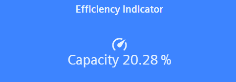
The label widget is used to display a simple text.
Settings
The Label Widget can have the custom appearance settings of custom title, colors and controls.
Content
The Label widget can display a single datapoint value, whose settings can be overwritten here.
Formatting
The font sizes for value and unit can be chosen from three available sizes. The icon selector will let the user add one of a selection of icons in 3 different sizes. The icon's position relative to the text can be set with the position arrows.
Supported Datatypes
| Datatype | Supported |
|---|---|
| bool | ✓ |
| char | ✓ |
| float | ✓ |
| int | ✓ |
| langString | ✓ |
| long | ✓ |
| string | ✓ |
| time | ✓ |
| uint | ✓ |
| ulong | ✓ |