
General Widget Settings
This section describes the settings which are the same for most widgets.
Widget Appearance Settings
These Settings apply to all Widgets without exception, and set general titles and colors.
Custom Titles
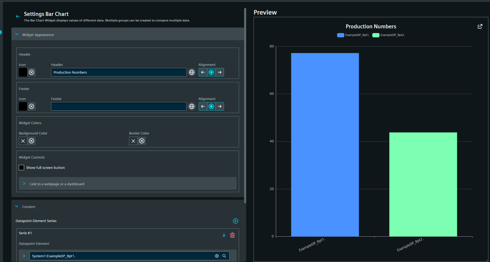
The title and subtitle displayed for the graph can either be set manually or taken from the datapoint. Via the drop-down list, any of the associated descriptions or names in WinCC OA can be chosen. The title is displayed above the graph and the subtitle below it. Both custom titles can be added in all available project languages. The alignment can be set to either of left, center or right via the corresponding alignment buttons. In addition, an icon can be set for each title. Icons are chosen from the Siemens Industrial Experience Design System (IX) catalog or from the project icons added in the data/WebUI/icons folder.
Custom Colors
The background and border color can either be chosen from the theme colors or the WinCC OA colors, or be freely chosen via a color-picker.
Custom Controls
The full-screen button can be added for all widgets, making them pop out to full screen mode.
A link to another dashboard or a webpage can be added. The link is indicated with a symbol in the upper right corner of the widget. The selected title for the link appears when the pointer hovers over the link symbol. The linked dashboard or page are opened either in the current view or in a new tab.
Content Settings
Most widgets require a connection to a datapoint element to function properly. The exceptions to this are the Alert View, iFrame, html, label and ULC UX widgets. Datapoints are added from a drop-down selection. Each datapoint produces a separate series of values, which is handled differently according to the widget type.