
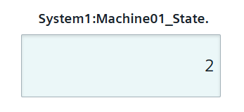
Input Widget
The Input widget is used to write data to a datapoint.
Settings
The Input Widget can have the custom appearance settings of custom title, colors and controls.
Content
The Input Widget is connected to a singular datapoint. The data entered in the input area is written to this datapoint.
Formatting
The input area of the widget will show the placeholder text set here in one of three available sizes.
The value set can be made mandatory.
- Color Selector from Browser
- Date picker
- Datetime picker
- Email address
- Month and year
- Number input
- Password input
- Search input
- Telephone number
- Text input (default)
- Time selector
- URL
- Week of year selector
Supported Datatypes
| Datatype | Supported |
|---|---|
| bool | ✓ |
| float | ✓ |
| int | ✓ |
| long | ✓ |
| string | ✓ |
| time | ✓ |
| uint | ✓ |
| ulong | ✓ |
Dashboard View Controls
Within the standard Dashboard View the desired value can be entered into the textbox area of the input widget. This value is set to the datapoint via a dpSet() after hitting enter. If this value can not be set for the datapoint an error message will be shown. If the value does not conform to the selected input type, the entry will not be accepted.