Creating your custom SVG Widget
It is possible to create your custom SVG Widget from an SVG file.
To do so, select an SVG file. An excellent resource for this is the Industry Graphic Library, included in the picture folder.
Once you have selected an SVG, save it in the data/WebUI/widgets folder. Furthermore, each widgets needs a JSON-file which
has the same name as the graphic. The viable widgets are read out automatically, so from this moment, you should see the SVG in the list
of available widgets within the Dashboard after refreshing your browser.
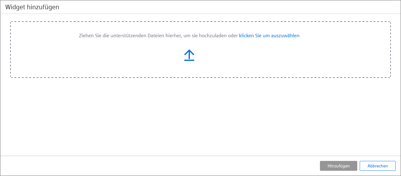
Another possibility to add custom widgets is the upload via the dashboard itself. Open the Edit menu and select a datapoint for which the new widget shall be added, which will open the widget selector. In this menu, the Add Widgets button can be found at the top right. This opens the dialogue to add the custom widget. These files must be packaged as zip archive. The following folder structure can be contained in the zip file:
- widgets (folder)
- widget JSON file (e.g.: label.json)
- widget SVG file (e.g.: label.svg)
- components (folder, optional but not optional when there is a
"moduleFederationSettings"property in the widget JSON)- <widgetname> (folder, e.g.: label)
- files for module federation
- <widgetname> (folder, e.g.: label)
- msg (folder, optional)
- <lang> (e.g.: de_AT.utf8)
- JSON or cat files
- <lang> (e.g.: de_AT.utf8)
The behavior for attempted uploads of files which would overwrite an already present widget can be set via the
etm.widget.upload request. The first parameter archive is the Base64-encoded ZIP archive containing
the files for upload. The second parameter is the optional overwrite. If this is set to "true", existing
files in the project directory are overwritten. If set as "false"(default), an error is returned when files exist that
would be overwritten and no files are uploaded.
There is currently no feedback when the JSON file is invalid. If the widget is not shown, check the validity of the JSON file.
Comments are not allowed in the JSON file and will invalidate it.
Widget definition files can also be added to sub-directories of
data/WebUI/widgets. These files include the relative path in the
widget name that is returned by the etm.widget.list request (e. g. for
the widget definition file data/WebUI/widget/sub1/gauge.json, the name
in the result of the list request will be "sub1/gauge"). Both JSON and
SVG files for a widget must be placed in the same directory.
When a list request is received and the last update of the cached widget information is older than 30 seconds, the cache is refreshed and
new or changed widgets will be included in the list. In addition, the optional parameter "forceUpdate" can be set to
"true" in the request parameters to force an immediate update of the cached widget information. This applies only to
the local project, and not to sub-projects or the product, for which the widget cache is initialized at server startup only.
The JSON file structure
The JSON file contains the description for how the new SVG Widget will work.
Types
This defines the data type the SVG can use. It can be one or more of "float", "uint",
"ulong", "long", "int", "bool" or "string". Also
the names of predefined data point structures or structure types are allowed.
WidgetType
The description of the widget type. For a new SVG widget, this has to stay "svg".
Label
The label displayed for the new widget, in the project languages.
Description
The description for the Widget, in the project languages.
Size
The minimal size a widget of this type occupies in the grid within a dashboard. It is indicated as "minRows" and
"minCols". The maximum is 25 rows by 25 columns.
Inputs
Each Widget can use one or more data points. These are referred to as inputs.
Name
The specific input name. This is used to address the input and can thus not contain any special characters or blanks.
Label
The widget-specific label for the widget rules in the project languages.
DPE
This parameter can be used to directly pre-fill a structure with specific data point elements. If no data point elements are specified,
the parameter contains an empty string "". In the Dashboard the available range for the defined data point elements
will be shown automatically.
Description
The description shown directly below the datapoint selector. It is also given in the project languages.
AllowRuleOverride
This parameter indicates if the set rules can be overwritten. When it is set to "false", you cannot modify or extend
the rules from within the dashboard.
Rules
The predefined rules, which describe how the widget behaves. If left empty, no predefined rules are available. This means all needed rules must be set manually via the dashboard.
The rules are defined via the logical "operator", the corresponding "value" and the resulting
"actions". Here, the value of the rule always refers to the value or status of the selected datapoint.
Actions themselves are controlled via the "selector", "property" and "value". The
"selector" specifies the part of the SVG which is changed. As selector you can use simple CSS classes (indicated
with a preceding dot), HTML IDs (indicated with a preceding hashtag) or entire Javascript selectors (e.g.: "#elementid >
path:nth-child(7)"). For support, a list of all selectors found in the SVG is shown when you click into the selector
field. The "property" correspondingly defines which property of this part will be adjusted. Possible properties are
dependent upon the respective element (e.g.: the "fill" property is used for elements of the types
"rect" or "polygon". To fill a "text" element, the attribute
"textContent" is used). When the properties field is clicked, a list of the 5 most used properties with their
description and default values is shown. The "value" determines what this change looks like. One rule can control
multiple actions, and will then contain separate areas for each action. For an example, see the section below.
SvgFile
The path and name for the used SVG file. The file is used as preview and base for the widget.
AllowStructureDrop
This parameter determines if the widget accepts the use of data point structures in addition to normal data points.
Creating your custom SVG Widget - Example
Multiple examples for the JSON file can be found with the existing widgets in the data/WebUI/widgets folder inside your
installation. Some widgets, such as the traffic lights are already implementations of an SVG widget. All other widgets also follow roughly the
same structure and can thus be used as inspiration.
Exemplary, one of the rules defined in the aforementioned traffic light is explained here:
{
  "operator": "is",
  "value": 2,
  "actions": [
    {
      "selector": ".red-active",
      "property": "opacity",
      "value": "0"
    },
    {
      "selector": ".yellow-active",
      "property": "opacity",
      "value": "0"
    },
    {
      "selector": ".green-active",
      "property": "opacity",
      "value": "1"
    }
  ]
}
This rule is used to activate the green element within the SVG when the corresponding data point has the value 2.
The logical operator "is", in combination with the value "2" defines that the following rule is executed when
the datapoint reaches the exact value of "2".
This rule has 3 associated "actions". Each action targets one of the round elements, which brighten the lights within the
traffic light widget. The first action targets the red element with the designation ".red-active" in the
"selector". The property manipulated is "opacity". It is set to "0" to remove all opacity.
This removes the object. Likewise, the opacity of the yellow element is also set to "0". The green element's opacity is set to
"1" to show it entirely.
Use of Variables
Both the rules as well as the actions can use already present configuration attributes of datapoints as variables. These attributes are listed in
the widget settings directly below the selected datapoint and when one of the "value" input-fields is clicked.
Example
{
    "operator": "between",
    "value": { "from": "{min}, "to": "{max}" },
    "actions": [
    {
      "selector": ".left-tank",
      "property": "fill",
      "value": "{alertrange_1_color}"
    }
  ]
},
In this example, the operator "between" is used to check if the datapoint value is between the "{min}" and
"{max}" - which is the specified PV Range configuration. If this is true, then the section ".left-tank" will
be highlighted in the defined alert color.
Usage of Functions
You can also use simple CSS functions inside of actions. This can be helpful to position or scale elements correctly inside the SVG.
Example:
{
  "operator": "always",
  "value": "",
  "actions": [
   {
     "property": "style",
     "selector": "#rect1",
     "value": "transform: translate(22.8px, 51.8px) scaley(clamp(0, calc(1 - ({value} - {min}) / ({max} - {min})), 1))"
    },
    {
      "property": "fill",
      "selector": "#rect2",
      "value": "url(#gradient1)"
    },
  ]
},
In this example, the operator "always" is used to execute the action with every change of the datapoint value. The element
with the HTML ID "#rect" is first moved ("translate") with the "transform" CSS
attribute, and then adjusted in height with "scaley". In the calculation after this, the normalized datapoint value is
interpolated in a value range between 0 and 1.
Important hereby is that these CSS functions only work in conjunction with the "style" property. While it is possible to
directly use the "transform" function of the SVG elements, this would not allow the use of CSS functions like
"calc", "max", or "clamp".
For example, reusing a defined color gradient in an SVG can be accomplished by using the "url()" function. This is shown
in the second action above.