
Advanced Configuration
This chapter explains how the various functionalities and features of the Trend can be further customized.
Trend Ruler Window Customization
The trend ruler window is a customizable panel ("trendRulerPanel.pnl") which is located in the /panels directory of your WinCC OA installation. The panel provides a predefined implementation of how to display values and react to specific events. This code needs to be adjusted or extended to match the required behavior of your project.
The font sizes of the popup panel text are hard coded inside of the panel and can only be changed there. By default, the font size 12 is used for text and 16 is used for values.
Using the $DP "$floating" defines if the panel is opened as free floating element (=TRUE; default, including a window title bar) or as a ruler popup. This can also be specified dynamically by using the "floatingRulerWindow" property of the trend. With a floating panel, the last position is saved and used when the panel is opened again.
The public function "rulerChanged" of the panel can be used to react to changes (add, remove, move, etc) to the ruler and to implement the logic of the panel. Within the function, the displayed content of the panel can be updated accordingly.
public rulerChanged(shape theTrend, int area) synchronized(table)Note that following information is required to display the panel:
- Date/Time-stamp
- Value of the intersection point (The function "RulerValue" must be available!)
- Color and/or marker of the curve
- Event(area) description text (Must be implemented by the user!)
- Alarm description
Only one trend ruler panel (trendRulerPanel.pnl) can be defined for your project, but for different display options additional custom panels can be loaded using the addSymbol() function from within the trendRulerPanel.pnl.
Trend Ruler Icon
To display an icon for the ruler, the trend uses the "trendRuler_X.png" pictures inside of the /pictures directory, where X represents the corresponding ruler (starting with 1).
Please note that the usage of multiple rulers must be activated using the trend property "maxRulerCount".
Event Curve
The event curve can be used to display specific events or time spans that should be clearly visible inside of the trend curves. The event curve displays the time stamp or time frame in which a specific event was triggered (e.g. changes to values, time or state). For the point in time a horizontal (or vertical for the Vertical Trend) line is displayed within the trend.
The curve type can either be set using the trend configuration panels or by using the trend property "curveType".
When using the event curve, the following notes should be considered:
- The event line of an event curve is drawn as a percentage of the total plot area, where "min" and "max" define the starting and end percentage of the line. For example, min = 10, max = 40 will result in an event line starting at 10% and end at 40% of the available plot area, starting from the bottom plot border.
- Multiple events can be stacked and displayed accordingly. This allows an easier distinction between overlapping time ranges.
- To display a background color for an event range the curve filling must be set, e.g. "fill to bottom" or "fill to refValue".
-
The filling of an event curve is displayed between the "on" and "off" state of a curve. The "off" value was previously defined as "0.0". This was changed to use the curve defined "ref.value" property instead. In the Trend configuration panel in the GEDI this is referred to as "fill ref.value". The default value remains "0.0", but this can be changed in the Trend configuration panel. The value is only used when the selected fill type is not "none".
CAUTION:In case another ref.value than "0.0" was previously defined, the event curve display will now look different.Basically the events should follow the order "on","off","on", etc. but it is possible to follow up on an "on" trigger with another "on" trigger. In this case the event must have a different state to mark, e.g. an invalid visualization.
An "off" trigger followed by another "off" trigger is displayed as a single line event.
An "on" event without closing "off" event is continuously drawn until the next "off" trigger occurs.
- It is recommended to disable the Y-axis of an event curve as it is not used anyway.
Translation of the right click menu of the trend
To translate the right click menu of the trend, translate the files of the UI. For more information see chapter Translation of UI Entries.
Event Curve using string DPEs/JSON
The event curve can also be used to display string DPEs. In this case, the displayed values are determined with following behavior:
- If the string of the DPE contains a JSON format then the "value" key of the string is displayed (see JSON format below)
- If the string does not contain JSON, the value is determined as with a CTRL string. A string that contains either "0", "FALSE" or "false" is considered as FALSE, everything else is considered as TRUE.
JSON Structure
The curveValue can now also be a string attribute in JSON format. The following keys are used by the event curve:
- "value" - any datatype; A value > 0 is considered as TRUE and marks an "on" event (see description above)
- "text" - string; Text that should be displayed on the event line
- "alignment" - string; The alignment relative to the event line for text and
icon. The following alignment flags are available:
AlignLeft- Align to the left of the line-
AlignHCenter- Align to the horizontal center of the line -
AlignRight- Align to the right of the line -
AlignTop- Align to the top of the line -
AlignVCenter- Align to the vertical center of the line -
AlignBottom- Align to the bottom of the line
Horizontal and vertical flags can be combined using the | character, e.g. "AlignTop|AlignLeft".
When using a vertical trend, the flags remain the same used differently, e.g. "AlignTop" is used to create an alignment to the right side or "AlignVCenter" is used to create an alignment to the horizontal center of the line.
This behavior is used to keep the compatibility of the DPE in both orientations.
- "icon" - string; File name of the icon that should be displayed. The path must be relative to the /pictures directory.
Example
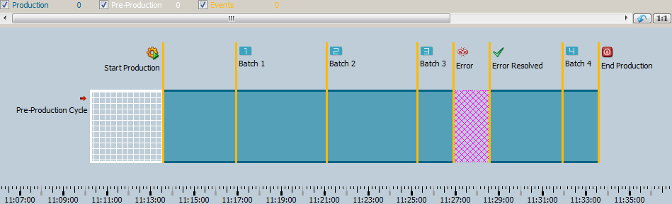
Following example code (Trend - Initialize script) fills an empty trend with multiple event curves to give a simple demonstration of a production line, see figure Trend - Event Curve Example.
// [myTrend] [1] - [Initialize]
  main()
{
  //Variable Definitions and Declarations
  time t = getCurrentTime();
  const bit64 INVALID = "1000001100000000000000000000000000000000000100000000000100100001";
  //Trend Visible Area Configuration
  this.scrollPercent(5);
  this.visibleTimeRange(0,t-1650,t+200);

  //Dynamically added the Event Curves ProductionLine, PreProduction, ProductionEvents
  this.addCurve(0,"ProductionLine");
  this.addCurve(0,"PreProduction");
  this.addCurve(0,"ProductionEvents");
  this.curveType("ProductionLine",4);
  this.curveType("PreProduction",4);
  this.curveType("ProductionEvents",4);

  this.curveLegendName("ProductionLine", "Production");
  this.curveLegendName("PreProduction", "Pre-Production");
  this.curveLegendName("ProductionEvents", "Events");

  //Display Height/Area of the Event Curves
  this.curveMin("ProductionLine",15.0);
  this.curveMax("ProductionLine",60.0);
  this.curveMin("PreProduction",15.0);
  this.curveMax("PreProduction",60.0);
  this.curveMin("ProductionEvents",15.0);
  this.curveMax("ProductionEvents",90.0);

  //Design Settings: Colors, Line Types, Fillings, etc.
  this.backCol("SiemensStone35");
  this.curveFillType("ProductionLine", "[solid]");
  this.curveFillType("PreProduction", "[hatch,[cross,10,horizontal]]");
  this.curveFillType("ProductionEvents", "[solid]");
  this.curveLineType("ProductionLine", "[solid,oneColor,JoinMiter,CapButt,3]");
  this.curveLineType("PreProduction", "[solid,oneColor,JoinMiter,CapButt,3]");
  this.curveLineType("ProductionEvents", "[solid,oneColor,JoinMiter,CapButt,3]");
  this.curveColor("ProductionLine","SiemensNaturalBlueDark");
  this.curveColor("PreProduction","SiemensSnow");
  this.curveColor("ProductionEvents","SiemensNaturalYellowLight");
  this.curveFillColor("ProductionLine", "SiemensNaturalBlueLight");
  this.curveFillColor("PreProduction", "SiemensSnow");
  this.curveFillColor("ProductionEvents", "SiemensNaturalYellowLight");

  //mandatory for displaying the Event Curves!
  this.curveFilled("ProductionLine",1);
  this.curveFilled("PreProduction",1);
  this.curveFilled("ProductionEvents",1);

  //Events in displayed order
  //Pre-Production
  this.curveValue("PreProduction", "{\"value\":1, \"text\":\"Pre-Production Cycle\",\"icon\":\"scriptWriteOnly\",
                    \"alignment\":\"AlignLeft\"}", t-1400,0);
  this.curveValue("PreProduction", "{\"value\":0}", t-1200,0);

  //End of Pre-Production and Begin of "Production"
  this.curveValue("ProductionEvents", "{\"value\":0, \"text\":\"Start Production\",\"icon\":\"vision\",
                    \"alignment\":\"AlignLeft\"}", t-1200, 0);
  this.curveValue("ProductionLine", "{\"value\":1}", t - 1200, 0);

  //Batch - Events 1-3
  this.curveValue("ProductionEvents", "{\"value\":0, \"text\":\"Batch 1\", \"icon\":\"trendRuler_1\"}",t-1000, 0);
  this.curveValue("ProductionEvents", "{\"value\":0, \"text\":\"Batch 2\", \"icon\":\"trendRuler_2\"}",t-750, 0);
  this.curveValue("ProductionEvents", "{\"value\":0, \"text\":\"Batch 3\", \"icon\":\"trendRuler_3\"}",t-500, 0);

  //Error Event
  this.curveValue("ProductionEvents", "{\"value\":0, \"text\":\"Error\", \"icon\":\"disconnected\"}",t-400, 0);
  this.curveValue("ProductionLine", 1.0, t - 400, INVALID);

//Sets the current value invalid. Design can be changed by using the Config Entry "trendStatusPattern"
  this.curveValue("ProductionEvents", "{\"value\":0, \"text\":\"Error Resolved\",\"icon\":\"apply_16\"}", t-300, 0);

  //Batch - Event 4
  this.curveValue("ProductionEvents", "{\"value\":0, \"text\":\"Batch 4\", \"icon\":\"trendRuler_4\"}",t-100, 0);
  this.curveValue("ProductionLine", "{\"value\":1}", t-300, 0);

  //End of Production Cycle
  this.curveValue("ProductionLine", "{\"value\":0}", t, 0);
  this.curveValue("ProductionEvents", "{\"value\":0, \"text\":\"End Production\",\"icon\":\"exit\"}", t, 0);
}
Viewport/Preselection Trend
For selecting and zooming into a specific time range of the trend curve, a new viewport feature is available. To open the viewport, the function "areaViewportTimeRange" can be used.
When using the viewport widget, the following notes and restrictions must be considered:
- The order of linked areas cannot be changed for the viewport widget.
- For displaying the ruler pop-up panel inside of the main area instead of inside of the viewport area, the pop-up panel must be customized. The function call "setPosition(area);" must be changed to "setPosition(<main display area>);".
- The viewport area as well as the main trend area must be linked using the function "linkAreas". Consider that first the main trend area ID and afterwards the viewport area ID must be used: "linkAreas(<Main Area ID>, <Viewport Area ID>);"
- The design of the viewport widget can be changed using CSS. The available classes and examples can be found here, respectively here.
- Consider that extensive zooming into the trend may cause the viewport sliders to disappear, as they selected time range cannot be displayed within the available amount of pixels.
- The Scrolling Mode of the Viewport Widget can be defined with the property "areaViewportPageScrollMode".
- By using the property "areaMargins" the margin of the viewport can be changed to use a e.g. a different width compared to the trend area.
Overlay Text
The property "areaPlotOverlayText" allows to place a custom text and content over an area of the trend. HTML can be used to place fully designed icons and captions for the area.
Interaction Possibilities Configuration
To configure the allowed interactions with the trend elements, the properties "areaInteractionFlag","areaInteractionFlags","areaPlotInteractionFlag" and "areaPlotInteractionFlags" are available. They can be used to define whether panning, zooming or the context menu are available.
Displayed Area Range Restriction
To restrict the maximum displayed time span of an area, the property "areaMaximumTimeSpan" can be used.
Trend display with gaps
When using RDB archiving, a display gap in a trend can occur between the historical data and the current data. This gap can occur when data (a few seconds ago) is being stored only in the RDB manager's local buffer at the moment and is not being flushed to the Oracle database.
The trend shows values until the last data flush from the WinCC OA buffer to Oracle. Current new data is received directly from the Event Manager and must not be read from the database.
The flush interval for RDB archiving can be configured. Consider that a shorter flush interval provides the advantage of a shorter gap, but increases the load of the RDB manager and the network traffic. The configuration for the flush interval is the maximum time the data will remain in the buffer before it is flushed.
A buffer is flushed when the defined block size or the timeout for the flush interval is reached. The block size is configured in the RDB configuration panel by using the parameter " Entries/Block". In the RDB configuration the flush interval is defined by using the parameter "Flush interval". We recommend to use a flush interval >= 1000 msec. However, this is a general recommendation and the values should be specified considering the project size, network traffic etc.
Statistical Data Curves
A trend curve can dynamically automatically derive statistical data from another curve's data. This removes the need to add and archive a separate datapoint element with a statistical function.
The curve intended to show statistical data is created similar to any other curve (e.g. in Gedi), but it is not connected to a datapoint element. Instead, the data is retrieved from another curve, which is defined via CTRL script with the function "curveDataSourceCurve".
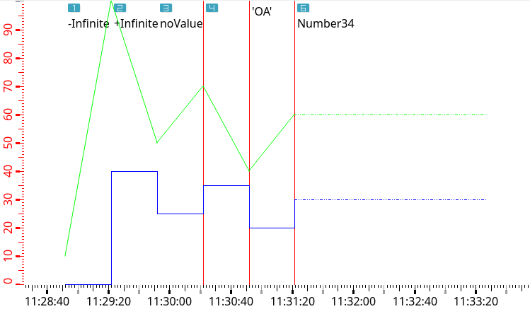
Infinite Values
inf, -inf or nan)
Event curve with infinite values and two further curves
main()
{
  time t = getCurrentTime();
  int count = 10;
  int timeStep = 30;
  bit64 status = 15;

  TREND1.curveType("#1_1", 4); // 4 = Event
  TREND1.curveLegendName("#1_1", "EventCurve");

  TREND1.addCurve(0, "#1_2");
  TREND1.curveColor("#1_2", "blue");
  TREND1.curveType("#1_2", 1); // 1 = Steps
  TREND1.curveLegendName("#1_2", "StepsCurve");
  TREND1.linkCurves("#1_2", "#1_1"); // all curves should have the same scale

  TREND1.addCurve(0, "#1_3");
  TREND1.curveColor("#1_3", "green");
  TREND1.curveType("#1_3", 2); // 2 = Linear
  TREND1.curveLegendName("#1_3", "LinearCurve");
  TREND1.linkCurves("#1_3", "#1_1"); // all curves should have the same scale

  t -= (long)(count * timeStep);

  TREND1.curveValue("#1_1", "{\"icon\": \"trendRuler_1.png\", \"text\": \"-Infinite\", \"value\": \"-inf\"}", t, status);
  TREND1.curveValue("#1_2", 5, t, status);
  TREND1.curveValue("#1_3", 10, t, status);
  t += timeStep;

  TREND1.curveValue("#1_1", "{\"icon\": \"trendRuler_2.png\", \"text\": \"+Infinite\", \"value\": \"inf\"}", t, status);
  TREND1.curveValue("#1_2", 40, t, status);
  TREND1.curveValue("#1_3", 80, t, status);
  t += timeStep;

  TREND1.curveValue("#1_1", "{\"icon\": \"trendRuler_3.png\", \"text\": \"noValue\", \"value\": \"NaN\"}", t, status);
  TREND1.curveValue("#1_2", 25, t, status);
  TREND1.curveValue("#1_3", 50, t, status);
  t += timeStep;

  TREND1.curveValue("#1_1", "{\"icon\": \"trendRuler_4.png\", \"value\": 12}", t, status);
  TREND1.curveValue("#1_2", 35, t, status);
  TREND1.curveValue("#1_3", 70, t, status);
  t += timeStep;

  TREND1.curveValue("#1_1", "{\"text\": \"'OA'\", \"value\": \"OA\"}", t, status);
  TREND1.curveValue("#1_2", 20, t, status);
  TREND1.curveValue("#1_3", 40, t, status);
  t += timeStep;

  TREND1.curveValue("#1_1", "{\"icon\": \"trendRuler_6.png\", \"text\": \"Number34\", \"value\": 34}", t, status);
  TREND1.curveValue("#1_2", 30, t, status);
  TREND1.curveValue("#1_3", 60, t, status);
  t += timeStep;
}
Trend Grid
The grid of the trend area can be customized to match your design requirements by using following functions: