
Radio box
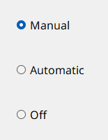
Radio boxes are lists containing small, circular buttons to the left of the entries (or options), only one of which can be selected at a time.
Radio boxes are provided to allow selection of only one option from several pre-defined alternatives. They can be used, for instance, for setting datapoint values or triggering actions such as switching between automatic mode, manual mode and "off".
How to create a radio box
- Click on the radio box tool
 .
. - Click in the panel work area. Define the size.
- Open the Property Sheet.
- Specify the name of the radio box in the field Name.
- Enter the options using the editor. The editor is opened via the ... button.
Radio box Editor
The radio box Editor is used to manage the individual entries.
It is opened either via the ... button of the editor attribute or by a double-click on the radio box in the panel during engineering.
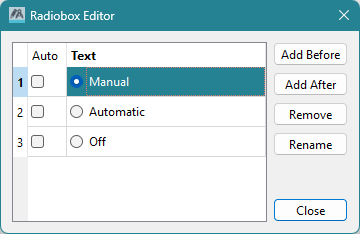
Clicking on the Add After button places the new option after the option selected in the editor. Clicking on the Add Before button places the new option in front of the option selected in the editor. An option can be renamed by clicking on the Rename button. Clicking on the Remove button deletes the selected option.
Radio box switching script
The following example contains a script for a radio box with four options indicating the status of a valve (closed, closing, opening, open). The function dpConnect() calls the switching() function whenever there is a change in the online value of the datapoint "VD01.OnOff". This sets the radio box options according to the online value. It is assumed that the online values 0, 1, 2 and 3 are assigned to the switch statuses.
main()
{
  dpConnect("switching", "VD01.OnOff:_online.._value");
}

switching(string dp, int s)
{
  setValue("", "number", s);
}
Useful Notes
The text formatting for the list options can be edited in the Property Sheet.
A radio box can be displayed either vertically or horizontally by setting the vertical property in the property sheet.
Related graphics functions can be found in the chapter Radiobox functions.
Syling the Indicators
On Windows systems, when using the native style (i.e., without a specified -style setting for the UI),
indicators are not scaled. This is because they originate from the operating system, not the Qt style system. If you need to style these
indicators, we recommend either starting the UI with the -style fusion option or specifying custom icons using a stylesheet
(see example below).
QRadioButton::indicator
{
  width: 1em;
  height: 1em;
  image: url(pictures:/radio_off.svg);
}

QRadioButton::indicator:checked
{
  image: url(pictures:/radio_on.svg);
}