Check box
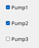
Check boxes are lists containing small, square buttons to the left of the options, one or more of which can be selected ("checked") simultaneously. Check boxes differ in appearance from radio boxes that have a round shape.
Check boxes are provided to allow selections from several pre-defined alternatives. They are used, for example, for setting datapoint values or triggering actions such as switching on the first and third pump of the three installed pumps.
How to create a check box
- Click on the check box tool
 .
. - Click in the panel work area and define the size with drag & drop.
- Open the Property Sheet.
- Edit the object name beside (Name).
- Enter the options in the check box Editor, which is opened by pressing the ... button.
Check box Editor
The check box Editor is used to manage the individual check box entries.
You can open it either by clicking the ... button of the editor attribute or by double-clicking the check box in the panel during engineering.
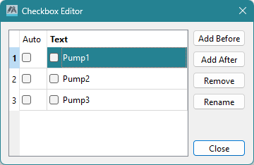
Clicking on the Add After button inserts the new option after the option selected in the editor. Clicking on the Add Before button inserts the new option in front of the option selected in the editor. Click on Rename to rename an option. Clicking on the Remove button deletes the selected option.
Checkbox Clicked example script
Different actions can be triggered depending on the position or status of the check box. Thus, the parameters "button" and "state" are passed in the main function. In the script for this example, the value of a data point will be set to 33 or 66 depending on the position and then read and output for verification. You could use a similar script to, for example, specify a valve setting with a check box for the required value.
//Function Checkbox1 Clicked()
main(int button, bool
state)
{
  float x;
  string dp;
  DebugN(button);
  if ( button == 0 )
  {
    dpSet("System1:ExampleDP_Arg1.:_original.._value", 33);
    dpGet("System1:ExampleDP_Arg1.:_original.._value", x);
    DebugN("check box 1" + "State: " + state + "Online value " + x);
  }
  if ( button == 1 )
  {
    dpSet("System1:ExampleDP_Arg1.:_original.._value", 66);
    dpGet("System1:ExampleDP_Arg1.:_original.._value", x);
    DebugN("check box 2" + "State: " + state + "Online value " + x);
  }
}
Useful Notes
You can display a check box either vertically or horizontally by setting the vertical property in the property sheet.
In the property sheet you can assign a hotkey for keyboard selection of the check box. You can specify the text format in the Property Sheet (Font).
On the Standard tab, you can set the attributes of the check box, such as color and shadows. See also the check box functions for setting parameters via script.
Syling the Indicators
On Windows systems, when using the native style (i.e., without a specified -style setting for the UI),
indicators are not scaled. This is because they originate from the operating system, not the Qt style system. If you need to style these
indicators, we recommend either starting the UI with the -style fusion option or specifying custom icons using a stylesheet
(see example below).
QCheckBox::indicator
{
  width: 1em;
  height: 1em;
  image: url(pictures:/PopupMenu/checkbox_unchecked.svg);
}

QCheckBox::indicator:checked
{
  image: url(pictures:/PopupMenu/checkbox_checked.svg);
}