
Bar Chart Widget
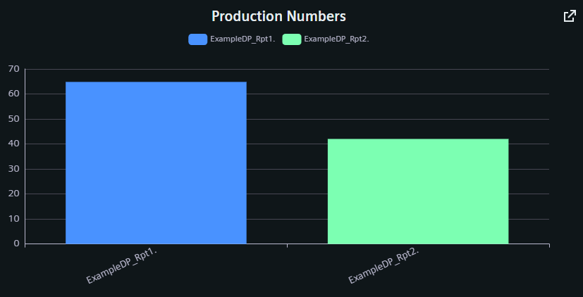
The Bar Chart shows the current values of one or more datapoints and datapoint groups as bars.
Settings
The Bar Chart Widget can have the custom appearance settings of custom title, colors and controls.
Content
The user can add multiple datapoints to the Bar Chart, each as a separate series of values. Names, Descriptions, Units and other values are typically taken from the configurations within the project, but can be overridden here. Multiple Series are placed together in one graph and can be sorted via the arrow buttons in the respective title bar. In the grouped bar chart, value series can also be combined into groups and additional groups can be created.
Formatting
The legend for the datapoint series can have a variable alignment and can be placed in a variable position on any side of the graph. As the descriptions set for each individual datapoint series will be shown in the legend, activating the scrollable option can improve handling. The y axis description, color unit and value range are set manually.
The groups can be presented stacked over each other or switched to a horizontal layout.
Supported Datatypes
| Datatype | Supported |
|---|---|
| bool | ✓ |
| float | ✓ |
| int | ✓ |
| long | ✓ |
| time | ✓ |
| uint | ✓ |
| ulong | ✓ |