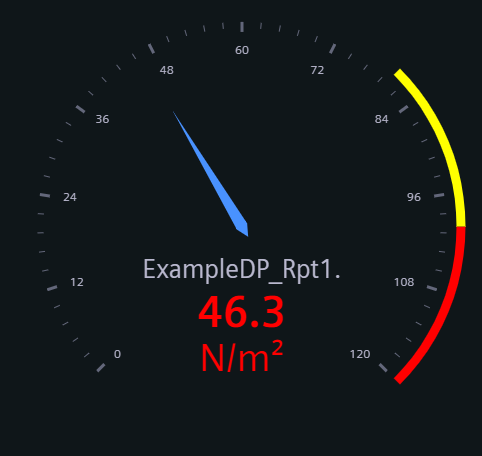
Gauge Widget
The Gauge Widget shows the datapoint value via the needle deflection inside a graph.
Gauge Widget
The Gauge Widget shows the datapoint value via the needle deflection inside a graph.
The Gauge Widget can have the custom appearance settings of custom title, colors and controls.
Content
The gauge widget takes a single series from one datapoint. The values are imported from the project with the possibility to overwrite them here.
Alarm ranges can also be imported or set here to define the ranges and areas for different gauge types. All ranges take a minimum and maximum value and a corresponding color.
Formatting
The Settings of the Gauge widget allow you to choose one of four layouts, and display the value either naturally or as percentage.
- Classic gauge format for visualizing single values within a defined range. The visualization takes the form of a dial with a pointer indicating the current value.
- Metric gauge charts to visualize KPIs and other metrics. The current value of a metric is displayed within a predefined range, often divided into different zones.
- Circle gauge charts to represent data and track progress toward a goal. A circular shape shows the percentage of completion. The circle is filled in proportion to the progress made.
- Arc gauge charts to visualize data and progress. An arc represents the degree of completion. The Arc is filled in proportion to the progress value.
A Tooltip can be activated to show the datapoint name and current value.
Supported Datatypes
| Datatype | Supported |
|---|---|
| float | ✓ |
| int | ✓ |
| long | ✓ |
| time | ✓ |
| uint | ✓ |
| ulong | ✓ |