
Dashboard Overview
The Dashboard Overview is the central navigation view. It opens directly after Login Options and shows the general navigation and an overview of all Dashboards.
After login it is available via the Overview button in the left
sidebar ( ).
).
Title Bar
The title bar of the Dashboard Overview displays the local browser time, an icon for the current connection state and the logged in user. The user icon can be opened to check the user permissions and to log out of the Dashboard.
Navigation
The navigation sidebar is always visible on the left side of the browser
and can be expanded to include icon descriptions via the arrows button( ) at the top. Beneath that, the favourites
button(
) at the top. Beneath that, the favourites
button( ) opens a view of all
Dashboards marked as favorites. The main dashboard view itself can be reached via the
Dashboard button() directly below.
The next button(
) opens a view of all
Dashboards marked as favorites. The main dashboard view itself can be reached via the
Dashboard button() directly below.
The next button( ) opens a Diagnosis
overview which shows the current state of Dashboard-related project information. The
lowest button(
) opens a Diagnosis
overview which shows the current state of Dashboard-related project information. The
lowest button( ) opens a direct link to the
Dashboard chapter within the Documentation. The very bottom of the sidebar contains the
toggle button for light and dark mode(
) opens a direct link to the
Dashboard chapter within the Documentation. The very bottom of the sidebar contains the
toggle button for light and dark mode( ).
).
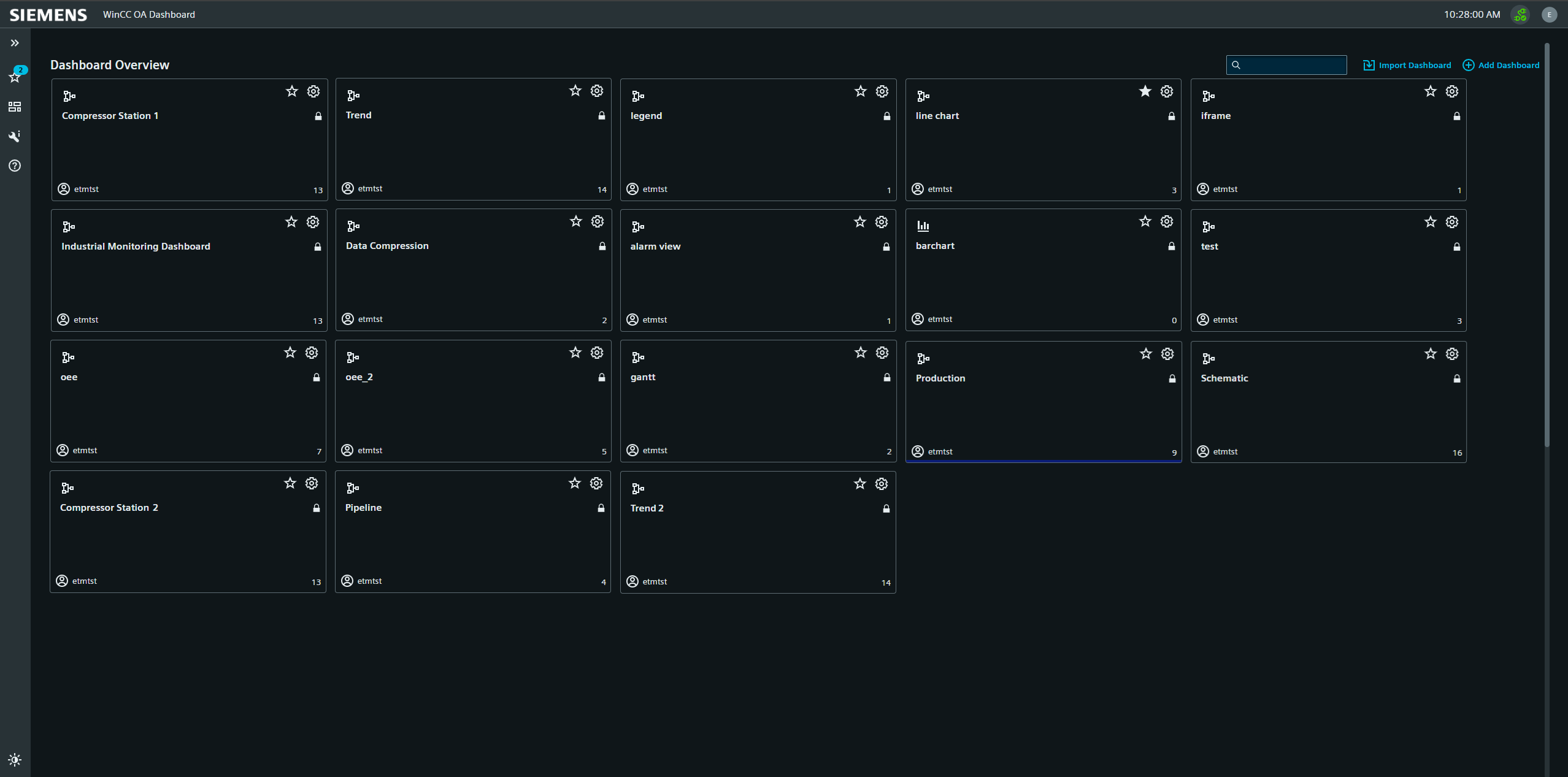
Main Dashboard Overview
This view shows all Dashboards available to the current user in the current project. The individual Dashboards are represented by tiles containing specific information and individual controls.
New dashboards are added with the Add Dashboard button to the right. This will immediately open the relevant Dashboard Settings page.
Dashboard Icon Tiles
Each Tile represents one dashboard and shows its title, icon and description. Clicking the title opens the dashboard in its standard Dashboard View mode. The favorite button adds the dashboard symbol in the navigation sidebar for quick access. The edit button beside it opens the edit menu for Dashboard Settings. Below those is the lock icon to indicate a Dashboard is set to private. The information block at the bottom shows the user who created the dashboard and the amount of widgets contained in it. The colored bar at the bottom edge of the icon shows the background color set for the dashboard.
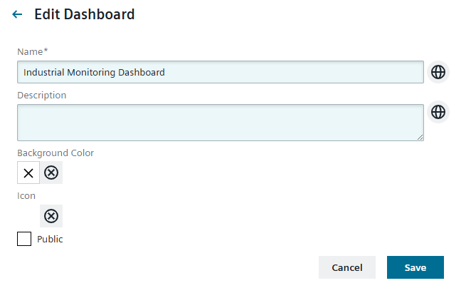
Dashboard Settings
The Dashboard Settings will open automatically upon adding a new dashboard. Here the user can edit the title and description in all available project languages. The background color for the dashboard is set with a color-selector. Via the corresponding checkbox, the dashboard can be set to private view, making it only visible to the user who created it. The buttons to the top right are used to export a Dashboard as a JSON file for use in other projects or to delete the board.
Dashboard Edit View
Individual Dashboards are created in the Edit View.
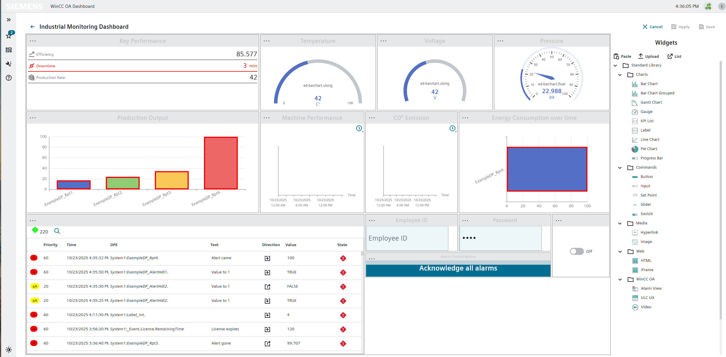
It is activated by clicking the Edit button on the right side of the standard Dashboard View. If the user does not have access, or the edit view was deactivated at login, the edit view will not be activated and the widgets remain in the view only mode. The edit view automatically shows the list of available widgets to the right. Above the widget list are the Cancel, Apply and Save controls, with which the current changes can be revoked or applied to the Dashboard. Both cancelling and saving will close the Edit View, whereas applying the changes will leave it activated for continued editing.
With the Paste button you can add a widget from the clipboard. Widget configurations can be uploaded as a JSON file via the Upload button. For this the widget type must exist in the current Dashboard. The List button opens the list of available widgets within the main edit view, for better navigation through the widget menu folders.
- Edit Settings,
- Copy the widget to the clipboard,
- Cut the widget out to add it elsewhere in the current or a different Dashboard,
- Apply Size to apply the size of a widget saved in the clipboard,
- Download configuration of the widget as a JSON file,
- Remove Widget.
Further Information about Widgets.