
Gantt Chart Widget
The Gantt Chart provides a time-interval view of the datapoint value. The width of each bar shows the period a certain value was present.
Settings
The Gantt Chart provides a time-interval view of the datapoint value. The width of each bar shows the period a certain value was present.
The Gantt Chart Widget can have the custom appearance settings of custom title, colors and controls.
Time Range
N[unit]/[modifier]. For this, N specifies a
natural number, unit the chosen unit of time and the modifier specifies the start or
end of the unit or current time (if this is not provided otherwise). The available
units are:
- s - second
- m - minute
- h - hour
- d - day
- w - week
- M - month
- Q - quarter
- Y - year
- 1d/d - 1d/d - Yesterday (full day)
- 1d - Last 24 hours
- 2h - Last 2 hours
- 1w/w - 1w/w - Last week (Monday - Sunday)
Content
A Series of datapoints can be picked from the project to be shown in the chart. The settings for each series are imported from the project, with a possibility to overwrite names in this content configuration.
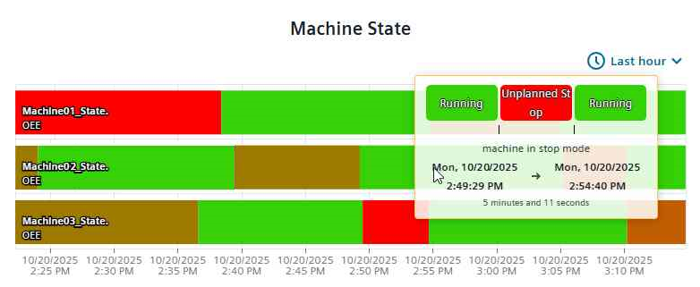
A mapping table can be chosen from the drop-down selection. It defines how values in the Gantt chart are displayed. Each mapping table contains multiple mappings, for which a value (e.g., 1, 2) is mapped to a readable label (e.g., Running, Stopped) and a color (e.g., green, red). Custom mappings can be added via a pop-up dialogue. A default state mapping is already prefilled.
Formatting
A legend for the datapoint series and the selected mapping can be shown. Grids can be set to appear along the time or y axis with the respective check boxes. The x and y axis can be displayed on either side of the chart. Additionally, the time-range selection can be set to be changeable at runtime and zoom and tooltip can be activated. The tooltip will show the current segment value, description and duration for the current segment, and the values before and after.
Supported Datatypes
| Datatype | Supported |
|---|---|
| bool | ✓ |
| char | ✓ |
| float | ✓ |
| int | ✓ |
| long | ✓ |
| string | ✓ |
| uint | ✓ |
| ulong | ✓ |
Dashboard View Controls
Within the standard Dashboard view the time range can be selected from a drop-down selector in the upper right corner. It is identical to the selection in the Settings dialogue and provides a selection of given and custom values.