
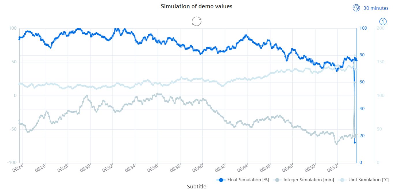
Line Chart Widget
The line chart shows one or multiple data point values in a graph.
Datatypes
| Datatype | Supported? |
|---|---|
| int | ✓ |
| uint | ✓ |
| float | ✓ |
| long | ✓ |
| ulong | ✓ |
| string | ✗ |
| char | ✗ |
| bool | ✓ |
Settings
For the Line Chart widget, the displayed time range can be adjusted to any of the predefined ranges. To make this range adjustable in the view mode, the "range selector changeable" check box must be checked. The lines can be shown with a tool tip showing the data point address.
Each line represents one series of data point values. This data can be compressed. The area below the line can be colored in and a confidence band applied. The curve can be shown linear, stepped or as a spline. The lines themselves can be styled with individual colors, line widths and three line styles. The unit for each line can be imported from the Datapoint, set maually or chosen from an overview of SI units. Individual values can also be marked in various styles. An individual y axis can be shown if necessary. This axis can be positioned left or right with an offset to the other y axes. The y axis range can either be imported from WinCC OA, generated automatically or set manually. Similarly the data point format and unit are set manually or imported from WinCC OA.
Grids can be set to appear along the time or y axes with the respective check boxes. A legend for the data point series can be placed in a variable position on any side of the graph. Beside this, the angle of the time axis steps can be set.
To enable scrolling, the zoom setting must be set to "time-axis" and an open time range must be selected. With this an additional 20% of the currently visible time range will be pre-loaded as threshold for smoother scrolling. More data will be loaded once the current scroll or zoom event is not triggered for about 1 second, enabling endless stepwise scrolling into the past. When scrolling into the past, no more live values will be added to the chart as soon as one scroll/zoom event has been registered. Additionally, the time range selector switches to "custom". To see live values again, it is necessary to either scroll to the very right chart position, press the restore button or select an open time range from the selector. If a closed time range is selected, zooming inside that time range is still possible, while scrolling outside is not. If the zoom option is disabled, neither zoom nor scrolling is available.
Data can either be shown as compressed or raw values. The compressed series aggregates data from the selected time range and splits it into 250 equally long time slots resulting in 250 data points. Each data point represents the integral mean of all values in each time slot. The compressed series have the option to visualize a confidence band, showing the minimum and maximum value within each time slot. Here, highly volatile, frequent value changes and a wide time range will result in a broader confidence band. By zooming into the chart, a broader confidence band will narrow down.
If there are less than 250 updates to a selected time range, only raw values will be displayed. These raw values do not have a confidence band because each value represents a single update to the DPE.
When compression is disabled in the options, only the newest 250 updates from the given DPEs will be loaded, regardless of the selected time range. Boolean values will always be shown uncompressed, therefore it is not possible to load more than 250 values from boolean type DPEs.
Widget View Configurations
Within the standard Dashboard view, the icon in the upper right corner shows the displayed time range and can be used to adjust it.