
Customization
The WebUI Runtime supports custom branding, theming, navigation layout, and application configuration.
Application configuration
Global application settings are defined in
apps/dashboard-wc/config/appconfig.jsonc, including
the header logo path (headerLogo), the application title
(appTitle), and the browser tab title
(documentTitle). All text fields support multilingual
objects with locale keys (for example, en_US.utf8,
de_AT.utf8) or Dashboard translation keys.
Logo customization
To replace the logo:
- Create an SVG logo (recommended viewBox: approximately 520x120).
- Copy the logo to both asset locations: libs/default-components/src/assets/ (source, bundled by Vite) and apps/dashboard-wc/public/assets/ (public copy for runtime access).
- Update the
headerLogopath in appconfig.jsonc. - Run the build.
CSS variables
The application defines custom CSS properties
(--neo-*) available on all pages.
| Variable | Default (dark mode) | Description |
|---|---|---|
--neo-accent |
#00bde3 |
Primary accent color (cyan) |
--neo-accent-dim |
rgba(0, 189, 227, 0.15) |
Subtle accent background |
--neo-accent-glow |
rgba(0, 189, 227, 0.4) |
Glow effect on active elements |
--neo-header-bg |
var(--theme-color-2) |
Header background |
--neo-nav-bg |
var(--theme-color-1) |
Navigation background |
To change the accent color, modify the --neo-accent
variable in the demo-app-ix.ts shell
component.
Dark and light mode
The theme is controlled by two attributes:
data-ix-color-schema on the html
element (for the Siemens IX framework) and
data-theme on the app component (for custom
--neo-* variables). A toggle button (sun/moon icon) is
integrated in the header. In light mode, only overlay, border, and shadow
values change; the accent color remains the same.
Login screen customization
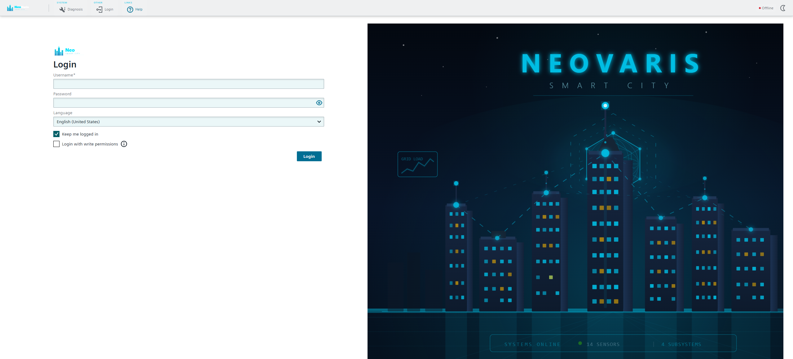
The login background is an SVG file at libs/default-components/src/assets/loginscreen.svg. Edit this SVG file, copy it to both asset locations, and rebuild.