
Structure of the XML file
This chapter describes the structure of the XML file. The properties of the file are similar to the property sheet in GEDI. This means that the same properties as in the property sheet are available in the XML file.
The XML panel file structure is shown in the following figure:
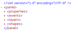
The file begins and ends with a XML tag <panel>. Inside the both tags all panel indicators are present.
Within the <properties> tag all properties of this panel are saved e.g. size, background color, position etc..
The content of the <events> tag describes all defined events of the panel (initializing, click, close, etc.).
The <layers> tag contains information on the visible layers of the panel.
The <shapes> tag contains all relevant information on the objects of this panel.
We take a closer look at the structure of the XML file with the aid of an easy example. The example is a panel with one shape type (button) and is created via GEDI. The example only contains one shape type in order to first describe the structure in detail. Other shapes like primitive text, text field, combo box etc. are described later in the chapter shape types. The panel contains an event that is executed when the panel is opened. Also the buttons of the panel contain events. One reference is added to the panel in order to demonstrate the use of references.
Example of a panel file containing buttons and a reference
- Start your project.
- Open the GEDI.
- Create a panel called OpenPanel with three buttons.
- Position the button which is called “jumpLeft” in the top left-hand corner of the panel.
- Select for the button the picture "jumpLeft.bmp" from the folder pictures in your WinCC OA installation directory using the attribute editor's option “Button Label”.
- Create a tooltip text with the following content: “Move left”.
- Position a second button with the name and button label “Open” as well as the background color gray {204, 204, 204} to the right of the button jumpLeft.
- Position a third button with the name and button label “Close” as well as the background color yellow {255, 255, 204} and the foreground color red {255, 0, 0} to the right of the button Open.
- Set additionally the hover background color to brown {153, 102, 0} and the hover foreground color to green {204, 255, 102}. Do not forget to activate the both colors! These colors will be set when the mouse is moved over the object (here a button).
- Add to this panel the reference “Led_1”.
- Open the reference catalogue via View->Catalogue->Version path.
- Add the reference “Led_1” from STD_LEDS below the buttons to the panel.
- Choose the datapoint "ExampleDP_BIT->ExampleDP_AlertHdl1" via the datapoint selector for the reference.
- Activate the color selection by unticking the checkbox Show current alert state color.
- Set the “Color 0” to blue (color of the LED when the value of the datapoint is FALSE) and the “Color 1” to STD_led_On (color of the LED when the value of the datapoint is TRUE).
- Tick the checkbox Show current alert state color again.
Figure 2. Reference configuration - LED_1.pnl 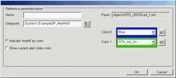
- Add an ellipse to the panel. The object name of the ellipse does not have to be changed.
-
The panel should execute an action when it is opened. When the panel is opened, the value of the ExampleDP_Arg1 datapoint is set to 4.5 and a pop-up message "The DP value was set" is shown. If the value could not be set, a message "The DP value could not be set" is shown. Create these actions for the Initialize event of the panel as follows:
main() { string dp = "ExampleDP_Arg1.:_original.._value"; float val = 4.5; //the value to be set int retVal; retVal=dpSet(dp,val); //dpSet() function call string uiDp = "_Ui_1"; /* Ui datapoint (own UI) for the popupMessage function */ if(retVal==0) /*check if the dpSet() function was executed successfully */ { langString msgText = "The DP value was set"; popupMessage(uiDp, msgText); /* show the message (defined above) if the function was executed successfully */ } else { langString msgText = "The DP value could not be set"; popupMessage(uiDp, msgText); } } -
The jumpLeft button should also execute an action when you click on it. The background color of the jumpLeft button is set to blue and the foreground color of the Open button is set to red. Thus, create the following code for the jumpLeft button (Clicked event):
main() { jumpLeft.backCol("Blue"); Open.foreCol("Red"); } -
The ellipse should be filled with the jumpLeft button and the text of the Open button should be changed to "jumpLeft" when you double-click on the jumpLeft button. Create the following code for the
DoubleClickedevent of the jumpLeft button.main() { ELLIPSE1.fill("[pattern,[tile,bmp,jumpLeft.bmp]"); Open.text("jumpLeft"); } - Save the panel in the directory panels in the panel format (OpenPanel.pnl) and in the XML format (OpenPanel.xml).
- Set the value of the datapoint element ExampleDP_BIT->ExampleDP_AlertHdl1->_original via the PARA module to TRUE.
- Try out the panel by starting it in the quicktest mode via GEDI.
- When clicking on the button jumpLeft and moving over the
button Close, the panel should look like as follows: the
LED is blinking in the alert state color (red), the datapoint value should be
set and the pop-up message should be shown. If you double-click on the button
jumpLeft, the ellipse will be filled with the
jump-Left pattern and the button text will be changed from “Open” to “jumpLeft”.
Figure 3. OpenPanel 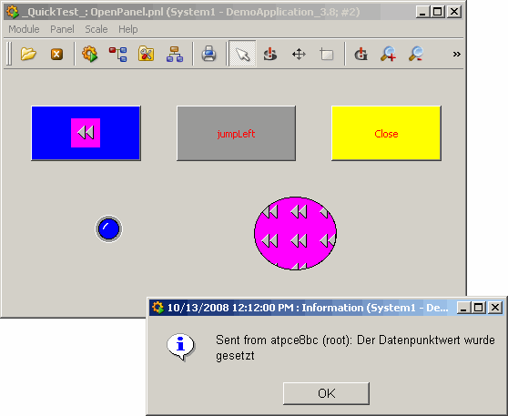
- Open the panel OpenPanel.xml from the Windows explorer.
Properties
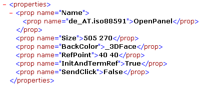
The first part of the file contains the general settings (see figure above) of the panel like
- Name of the panel (contains the language and the corresponding panel name). In case of a multilingual project all languages and the corresponding panel names are listed one below the other according to this pattern.
- Size with size specification.
- BackColor with specification of the chosen background color.
- RefPoint (location: the first number is the X coordinate and the second number the Y coordinate). The reference point is available for every shape.
- InitAndTermRef (TRUE) triggers the events Initialize and Terminate when the panel is used as reference.
- SendClick is shown if the value is set to TRUE in GEDI. If the value is TRUE the SendClick sends the x and y position of a mouse click in the panel to datapoint elements of the UI manager being used. In addition to the X and Y coordinates also the associated module and panel are saved in the datapoint. Thus, e.g. the coordinates of the last mouse click can be queried. See chapters the panel window and properties of the panel for more information on these properties.
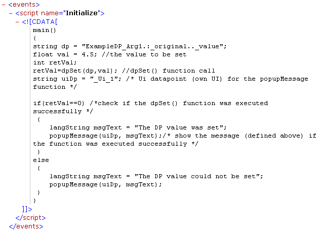
Events
The events of the panel are shown within the <events> tag. In the figure below you can see the code, which is responsible for the opening the pop-up message when a value is set to the ExampleDP_Arg1 datapoint.
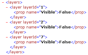
Layers
The eight different panel layers can be set visible or invisible in the panel and set editable or not. For detailed information about the layers see chapter properties of graphics object (standard tab) and the layers sheet (layer editor).
Shapes
The <shape> tag structure is almost the same as the structure of the panel (properties, events). Within the tag are described all properties and events of a graphics object or a reference. The structures of the button jumpLeft and the reference “Led_1” are described in the following.
PUSH_BUTTON properties
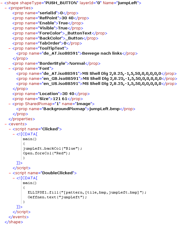
In the properties are listed all properties of an object. These are almost the same as the settings in the Attribute Editor in GEDI. The properties depend on the type of the graphics object (here PUSH_BUTTON). The specific properties of different shape types are described in the chapter shape types.
Therefore, only the XML-specific properties of an object are described here. The properties that can be selected in the GEDI attribute editor (Activate, Visible, ForeColor, BackColor, Type and Image) are described in the chapterproperties of graphics object (normal tab) .
- ShapeType - type of the graphics object (ellipse, button, polygon, etc.)
- LayerID - defines the visible layer of this object
- Name - object name
- SerialId- ascending number for the shapes of the panels. It is important when the panel is used as a reference. The shapes of a reference are identified via this ID when they are over-configured. For more information on references and over-configuration see chapter properties of references and over-configuration. The bitmaps of the shapes are numbered according to the serial numbers of the shapes. The bitmap of the shape with the serial number 0 is called 0.bmp.
- RefPoint - location: the first number is the x coordinate and the second number is the y coordinate
- TabOrder - the order in which the objects can be addressed and activated in the VISION module (in runtime mode) using the tab key. See chapter the object sheet (the tab order).
- ToolTipText - comment, which is shown when the mouse is moved above an object. The tooltip text can be set in different languages. In the XML file are displayed all texts with the corresponding language.
- BorderStyle -defines whether the borders are "normal", "3D", "sunken" or "raised".
- Font - defines the font style. For every language can be select an individual font.
- Location - location in the GEDI module
- Size - size of the object
- SharedPixmap - displays the file names and the number of images used in the graphic object.
PUSH_BUTTON events
In the events tag you can find all defined events of a graphics object. In the figure
above the events Clicked and Doubleclicked are
shown, which have been defined for the jumpLeft button in the
previous example.
PANEL_REF1 properties
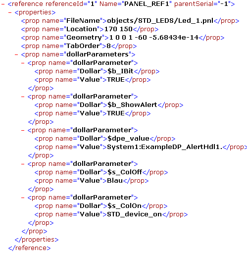
The figure above shows the XML structure of the "Led_1" reference, which has been added to the panel.
- ReferenceId- ascending number for the references of the panels and is used for the over-configuration. The references that were re-configured are identified via this ID if several references are added to the panel.
- Name- reference name
- ParentSerial- serial number of this object, which has been re-configured. The reference is identified over this number, if more than one references are used in one panel.
- FileName- file name
- Location- location in the GEDI module
- Geometry- geometrical specifications of the rotation angle
- TabOrder- the order in which the objects can be addressed and activated in the VISION module (in runtime mode) using the tab key. See chapter the object sheet (the tab order).
-
dollarParameters -shows the dollar parameters of the reference. Dollar parameter is a place holder for a datapoint identifier. The advantage of using references is that if you have e.g. several (objects) LEDs or valves etc. and want to change them, you do not have the change each valve separately, you just change the "Parent"object and all sub objects are changed. For more information on the dollar parameters see chapter properties of references and re-configuration.
$b_ShowAlert- ifTRUE, all alarm handlings are shown
$dpe_value- the value of the datapoint, which defines the alarm handling (here "ExampleDP_AlertHdl1")
$s_colOff- specifies the color of an alarm when it is off
$s_ColOn- specifies the color of an alarm when it is on
The third button Closecomprises the "HoverBackCol" and "HoverForeCol" properties. The background and foreground colors of the button are changed when you move the mouse over it.

Because the structures of the buttons are almost the same, they will not be described in this chapter separately. The XML structure of an ellipse is described in the chapter Shape types.