
Common Tab
The Common tab is where the properties of the curve are defined (color, style, name, connected datapoint element, etc.).
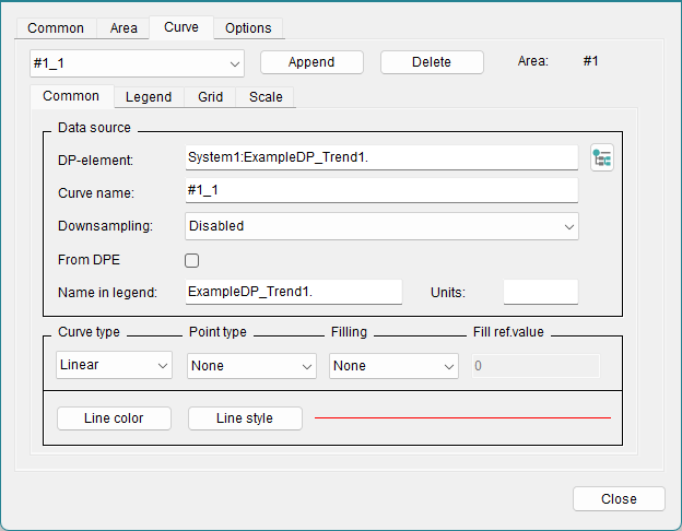
Data Source
The curve name is entered in the Common tab of the trend curve. It must be unique and should characterize the curve. Press the enter key to apply the curve name. The new curve name is updated in the combo box above the curve tabs after closing and reopening the trend editor.
The check box From DPE takes labels from the datapoint element.
The combobox Downsampling allows you to display aggregated values for the selected time range. This helps to reduced the necessary bandwidth to load data within the trend. Alternatively, the function can also be activated by using the Control function "curveResample".
Please be aware that the combobox is only available for projects which are using NGA databases and downsampling cannot be used for value-over-value trends.
The legend label for the curve is entered below. This is the name of the curve as it will appear in the legend of the trend.
Display options
Curve type
This is where you select your curve type from a choice of Points (individual points, curveType 0), Linear (points linearly connected, curveType 2), Steps (points connected in step fashion, curveType 1) and Event (Event Curve, curveType 4).
Point type
Optionally, you can select the point format for the curve type or for the minimum and maximum marking (see below). You can select one of the following types:
- Rectangle
- x
- +
- *
- O
- Triangle
- O filled
- Triangle filled
A user-defined marker can be added using the function "curvePointIcon".
Filling
The area beneath the curve can be filled with the line color.
The fill can be related to a reference value; in this case the area between the value of the curve and the reference value is filled. This reference value can also be above the line to fill the upper part of the curve.
The area above the curve can be filled with the line color.
You can also set this by using the functions "curveFillType" and "curveFilled".
Fill ref. value
Enter here the reference value to which the curve fill relates.
Line color
Opens the color selector, where you can select the color for the curve in the trend. Dynamic colors can not be displayed inside the trend widget and so must not be used.
Line style
Opens the line style selector. This can also be set with the function "curveLineType". You can select one of the following line styles:
___________________ [solid]_ _ _ _ _ _ _ _ _ _ _ _ [dashed]. . . . . . . . . . . . . . . . . [dotted]- . - . - . - . - . - . - . - . - [dash_dot]- .. - .. - .. - .. - .. - .. - .. [dash_dot_dot]
Specify the width of the line as well as how the line "Join" and line "Cap" should look like.
- Join
-
- Miter [JoinMitter]
- Round [JoinRound]
- Bevel [JoinBevel]
- Cap
-
- Flat [CapButt]
- Round [CapRound]
- Square [CapProjecting]
Buttons
- Append
- Appends additional curves to the area. Thus, the values of another data point element can be displayed in the trend. Up to 16 curves are possible within an area.
- Delete
- Deletes the curve chosen from the combo box.